
Abstract
Facilitating students learning American Sign Language (ASL) promotes inclusion and communication for people who are Deaf, yet students learning ASL face challenges. In a classroom setting, instructors are limited in how frequently they can provide feedback on student’s work, typically with many students submitting videos of their signing. Thus, we investigate software to analyze videos of ASL students’ signing and provide immediate, albeit limited, feedback about aspects of a student’s movements that are likely errors. In this study, we have conducted an investigation of a wide variety of designs for the presentation of feedback to ASL students, with a focus on the students’ subjective judgments and preferences for any specific features and whether or not the feedback provided is easily understood. As part of an interview-based study, we conducted 3 rounds of iterative re-designs with 24 participants. At each round, a static design prototype was shown to 8 participants, who provided qualitative feedback. Open-ended interview questions asked for opinions on the visual appearance of feedback messages and the language used to convey errors. At each round, common themes were extracted from the data, and changes were made to the designs. We found that participants were comfortable in suggesting specific design modifications and in requesting additional features, which were incorporated into the designs shown in the prototypes used in the subsequent round. The contribution of this research is to provide guidance on the future development of language-learning feedback systems for sign-language.
You have full access to this open access chapter, Download conference paper PDF
1 Introduction
American Sign Language (ASL) is now the third most popular foreign language studied in U.S. universities [2], and there are many people who would like to learn ASL for a variety of personal reasons: It is estimated that there are 28 million people in the U.S. who are deaf or hard of hearing [6, 7]. More than 80% of deaf children are born to hearing parents. In a study by Henderson et al. [3], the authors state that deaf individuals who acquire ASL skills at a very young age have superior ASL skills and are more capable of learning a second language than students who have picked up ASL later. A study conducted by Strong [8] showed that there is a relationship between ASL skill and English literacy. While many parents of deaf children attempt to learn ASL, they face several challenges due to the lack of tools that would allow them to practice ASL on their own. The students could benefit from a method of practicing and receiving feedback on their signing in a time-flexible manner.
Currently, ASL instructors must provide feedback to students in person (during class) or analyze the videos submitted by their students as homework assignments. The human ASL instructors must go through every video and make sure they provide quality feedback that the student can use to improve his or her learning. However, this imposes a heavy workload on the instructor, and it limits the amount of feedback an individual student can receive during a semester. We are investigating how to provide feedback when students use software that provides immediate, albeit limited, feedback of ASL students’ signing that are likely errors. This is not a complete sign language recognition software, rather the software can recognize certain pre-defined errors and give immediate feedback that can then be further supplemented by feedback from the instructor. The goal of this project is not to replace human ASL instructors (who can provide sophisticated feedback about a student’s signing), but rather to allow students to obtain some idea of how well they are signing in a timelier manner. To help with this, this study aims to find the best ways to provide this immediate feedback using a graphical user interface, based on users’ subjective preferences.
2 Prior Work
Most of the previous work in automatic sign language recognition and analysis is focused on the computer vision techniques necessary to analyze human movements. Little research has examined how this technology could be incorporated into a useful system for providing educational feedback to students. Some prior studies on multimodal educational technologies have also shown that the overall system design and the presentation of feedback can have a significant impact on the user experience [1]. Thus, it is critical to ensure that the method of providing feedback to students is easy to use and understand.
In an ASSETS ‘15 paper [4], our laboratory presented a study with 8 ASL students. In this study, we compared three different prototype designs for how a future system might give feedback to ASL students about errors in their signing: video, notes, and popup. As shown in Fig. 1, the ‘video’ condition consisted of replaying the student video for them to watch. The ‘notes’ condition consisted of displaying a written message to indicate any errors identified in the video (or correctly performed linguistic elements). The ‘popup’ condition consisted of replaying the video with messages that ‘popup’ on the video when the system identifies linguistic errors.

Feedback overlaid on a student’s own video, from our prior work [5].
The students in the study recorded a video while attempting an ASL homework assignment on one day, and then humans analyzed their video to look for errors. Video mock-ups of the three feedback conditions were produced (with a third of each student’s videos produced in each condition). The students returned to the lab during the following week, and after viewing each feedback video, the student re-attempted the homework assignment. The student answered a survey about their experience and opinion of each feedback condition, and an ASL instructor graded the quality of the student’s signing their first and their second attempt at each homework item. In this way, the team was able to look for differences in subjective preferences and in the actual impact on students’ signing skills for each feedback condition.
In [5], our lab reported the results from a second round of experimental studies in which we compared three different forms of feedback for students – popup, simple and photo. As shown in Fig. 1, the ‘popup’ condition consisted of displaying messages that appear as ‘pop-ups’ when a linguistic error is identified. The ‘simple’ condition was identical to the ‘popup’ condition, but any linguistic jargon contained within the pop-up messages was replaced with simpler text. The ‘photos’ condition was identical to the ‘simple’ condition except that photos were added to the on-screen feedback to illustrate specific aspects of ASL grammar. The students in the study were presented with an ASL homework assignment and were given 20 min to prepare to record a video of themselves. Video mock-ups of the three feedback conditions (popup, simple or photos) were presented to the participants after which they attempted their homework assignment. At the end of the study, participants were asked subjective questions regarding their experience about each of the three feedback conditions. Participants indicated higher subjective preference for the ‘photos’ condition as compared to the ‘simple’ condition. Unlike the previous study [4], where ASL experts graded the students’ homework, this study [5] focused only on the subjective preferences of the participants.
While our lab has conducted some prior work to investigate how to provide feedback to ASL students, because a resource-intensive experimental study methodology was used in the prior design prototyping studies, our research team was only able to consider a limited set of design options. To address this limitation, in this paper, we discuss a project to investigate a wider set of design parameters (involving the language used in error messages and the visual appearance of the messages – including the use of photos or videos of correct usage) to determine some optimum design mock-ups for how the system should provide feedback to ASL students.
3 Research Questions
In this new study, building upon prior work, we have conducted a more thorough investigation of a wider variety of alternative designs for the presentation of feedback to ASL students, with a focus on students’ subjective judgments about alternative designs for providing feedback on their signing through video. We investigate:
-
1.
Do ASL students report subjective preferences for particular features that they would like to have in an immediate feedback system?
-
2.
Do ASL students understand the feedback reported from using such a tool?
4 Methodology
To investigate alternative designs for the presentation of feedback to the students (e.g. about how they should improve their ASL signing), we conducted a study with 3 rounds of iterative re-designs and with a total of 24 participants. The participants consisted of 23 females and 1 male, and all were students at Rochester Institute of Technology who had at least 6 months of experience learning ASL.
Each round of the study included 8 participants who provided qualitative feedback on some designs. At the end of each round, themes were identified from their feedback and changes were made to the designs. Suggestions for changes or addition of new features became the test hypotheses for subsequent rounds of interviews.
Participants were first briefed that our lab was interested in understanding how they currently received feedback on their ASL assignments. They were then asked about their current experience of receiving feedback, the problems they faced and what changes they would like to see in the way they currently received feedback. The participants were then introduced to the idea of an automated feedback system that would provide feedback in real time. After explaining the scenario where such an automated system might be helpful, we presented the participants with non-interactive design mock-ups (some including videos of ASL) and asked them to provide feedback on the designs. We asked them some open-ended interview questions regarding their opinion about the visual appearance as well as the language used to convey the error message. The following sections discuss the prototype features shown to participants in each round, and the feedback they provided, which led to changes in the design.
5 Iterative Design – Round 1
Before showing participants any of our designs, we first asked them to describe how they currently receive feedback on their video assignments. As a follow up question, they were asked the kind of problems they faced receiving feedback. We learned that students typically received feedback through either an online feedback system called GoReact (used by RIT students learning sign language to submit their videos to the instructor and receive feedback comments) or through individual one-on-one feedback during weekly tutoring meetings with a human instructor. The feedback provided via the GoReact website would include either video or typed English comments.
The participants faced several problems with their current methods of receiving feedback. Technical video problems included frozen video, files getting corrupted, and blurry videos. P4 pointed out that the current method of “feedback is not quick enough” as it required the students to wait for the faculty to review and provide feedback.
The students also faced difficulties understanding what the professor was trying to convey in the feedback or if the professor used signs that they were not familiar with (P8, P6). This would lead the participants to watch the feedback with their friends to make sure they were getting the right message (P7). P4 described that it was difficult to “apply written comments to a visual language” while P1 indicated difficulties in translating between written English feedback and ASL.
For the first round of iterative testing, we started with testing four design features, which we presented to the participants. These features are as follows:
-
1.
Smiley Timeline versus Pointer Timeline – As discussed in [4], our system will automatically identify moments in a video when a student is making an error (of a specific, limited set) or moments when they have done something that is clearly correct. The timeline bar on the ‘My Video’ column had 2 variations of visual markers illustrating the occurrence of an error and a correct instance (Figs. 2 and 3). We wanted to understand whether students preferred seeing a cartoon face (or smiley) or some other marker. In the first variation, a straight face was used to denote an error and a happy face for a correct instance. The second variation featured red and green dashes on the timeline to denote an error and a correct instance respectively.
Fig. 2. 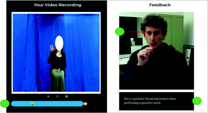
Screenshot of a design variation shown in Round 1. Label “1” indicates the smiley pointer timeline, “2” indicates presence of visual markers and “3” indicates font size of 21px.
Fig. 3. 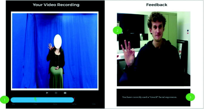
Screenshot of a design variation shown in Round 1. Label “1” indicates the green and red pointer timeline, “2” indicates lack of visual markers and “3” indicates font size of 17px.
-
2.
Arrows and No Arrows – The designs also featured two separate variations with the feedback images (illustrating a correct ASL performance) having an arrow pointing to relevant facial expression or movement – or a version without any arrows (see Figs. 2 and 3). We wanted to know whether such arrows helped students understand the error (or a correct instance) that had occurred.
-
3.
Font – In this first version, Slabo27px, a free Google Serif font, was chosen to display feedback text. To identify a suitable font size for reading feedback text, two variations of the font size, 17px and 21px, were presented to the participants.
-
4.
Image and Video – In the “Feedback” region on the right side of the designs in Round 1, we presented either static images or video clips in which a signer demonstrated correct ASL performance. The variations were used to learn whether a static image would convey enough information about the error, or whether a video demonstrating the error would be preferable to students.
-
5.
Alternative Design - An alternative design featuring both the ‘My Video’ and ‘Feedback’ columns on a white background was also presented to the participants at the end of the study (Fig. 4). This variation was incorporated to understand if the participants preferred a certain background color.
Fig. 4. 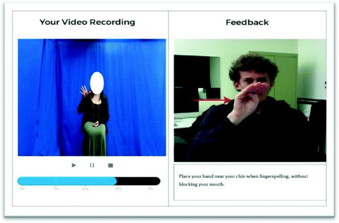
Screenshot of a design variation shown in Round 1, with white backgrounds.


5.1 Feedback on Round 1 Designs
-
Feedback Video Structure. The participants found the feedback videos to have incomplete information as it only indicated the error type that was found. Participants expressed that the feedback video should show “what was wrong, how to correct it and give an example” (P6). P3 described that a feedback video that said, “You did this, but this is how you’re supposed to do it” would provide complete information to the student receiving feedback. This is important as P8 pointed out that sometimes “I don’t see what I did wrong” and having the video showing exactly what they did wrong and how to fix it would help them understand the error and learn how to improve their signing. Further, P6 described that students may learn to sign by copying the movements in the video. This explains why participants preferred having the feedback video show the correct way to sign for the errors. The participants P6 and P7 also mentioned that the feedback video should have a light or a plain background with the person wearing contrasting colors so that there are no distracting background elements and they can clearly understand the feedback being provided.
-
Video and Text Feedback. Participants were very enthusiastic about the possibility of having the combination of video (or an image) and text feedback as it provided more information to understand the error made. While certain participants reported a preference for video feedback over static images (P5 and P2), P6 indicated that videos aren’t necessary for all the 21 errors. This finding was supported by P1 who described that videos would be necessary for more “conceptual ideas” and P7 who stated the need for videos when “movements are involved”.
-
Video Timeline. Participants reported a preference for green/red markers on the timeline as compared to the smiley faces. P4 and P5 stated that they did not understand what the smileys represented. While P6 encouraged the idea of smileys as markers on the timeline but added that the straight face (which was used to represent the case in which an error occurred) was unclear. According to the participants, the other reason for the preference of red/green markers on the timeline was that it looked “more professional.”
-
Participant Impressions about Arrows. Arrows pointing to the relevant facial expression or movement were included in the designs to understand if they help to make sense of the error. It was learned that arrows on static images made understanding the error easier in certain cases (P6). While P2 had a strong opinion on the arrows describing it as “confusing” and “not helpful”, other participants supported the idea of having arrows and described it as helpful.
-
Alternative Designs. The alternative test design condition featured the ‘My Video’ and ‘Feedback’ columns on a plain white background. P6 described the alternative design as “clean and clear” while P8 and P2 stated that the alternative design did not have a clear separation between the ‘My Video’ and ‘Feedback’ columns and thus made it difficult to visually identify which column denoted which section.
Participants in Round 1 also requested several features:
-
Participants asked for a way to “save thoughts or questions that a student might have” (P7). Participants wanted to save tips or comments for themselves that might remind them when they were viewing the feedback. Participants also mentioned that if the software picked up a certain error, they wanted a way to mark the error that was picked up and show it to their professor to get more details on the error.
-
P5 stated that a way to read aloud the feedback text would be an additional feature to consider as this would allow for another way for understanding the error. Participants also reported features such as the ability to enlarge videos and control the speed of the videos (both My Video and Feedback). Since ASL is a visual language, a student might have to replay the movements to fully understand what was being communicated. In the case when the signer is fingerspelling too fast, it would allow the students to able to view the videos at different speeds to better understand the feedback. Moreover, being able to view the videos full screen would allow the participants a better view of the feedback video or their own video.
-
P4 suggested that their own video should stop playing the moment the error had occurred and the feedback video should pop up, P1 stated that having the control to individually view their own video and the feedback video was preferable.
Participants suggested several changes in the feedback text used in Round 1 (i.e. the text displayed on the screen that communicated to the user the nature of their ASL error or what they had done correctly). In addition to some of these messages appearing on the visual prototype designs, participants were also shown a document that listed approximately 30 text messages that the system may display.
-
One of these messages indicated that the student had made an error when using a “question facial expression,” participants asked for the system to be more specific in its error message – since there are two major types of question facial expression used in ASL (‘WH’ questions and ‘yes/no questions’). As the signer should move their eyebrows differently for each type of question, participants felt that an error message referring to “question facial expression” was too vague.
-
Additionally, participants suggested incorporating the following terms into the feedback messages: “sign prosody, non–manual markers, eye gaze and role shift.” These terms are often used when describing ASL grammar in ASL courses, and such terms are especially well known among more advanced ASL students. The participants in Round 1 had higher level of ASL skills (second year or higher) and believed even beginner students would be able to understand these jargon terms. Their suggestion was to replace ‘facial expression’ by ‘non-manual markers’ and replace longer sentences with these jargon terms. For instance, they recommended that a feedback text about “usage of proper body movement,” could be replaced by a text about ‘role shift,’ and they recommended that a feedback text message about looking at a location should be replaced with a text using the term ‘eye gaze.’
Based on this feedback from participants, we revised the text of the on-screen text feedback in our prototype designs. And we used the new version of the text feedback messages in Round 2.
6 Iterative Design – Round 2
For the second round of iterative prototype testing, new design features, discussed below, were presented to the participants based on feedback received during Round 1.
-
6.
Notes – Multiple Participants in Round 1 suggested including the ability to save thoughts, comments, or tips in a form that would be easily accessible. For this reason, in the designs presented in Round 2, a ‘Notes’ feature was introduced that would allow the students to be able to save some textual notes about their thoughts or questions. Two design variations were considered: The first version shown in Fig. 5 allowed users to drag a sidebar from the left. The second version (Fig. 6) had a text box immediately below the ‘My Video’ timeline that allowed for directly typing thoughts and comments. Half of the designs that were presented to the participants made use of version one and the other half used version two.
Fig. 5. 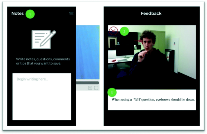
Screenshot of a design variation shown in Round 2. This image shows the different visual variations with ‘Feedback’ on dark background. Label “1” indicates the notes panel sliding from the left, “2” indicates presence of visual markers to denote errors and “3” indicates serif font. (Color figure online)
Fig. 6. 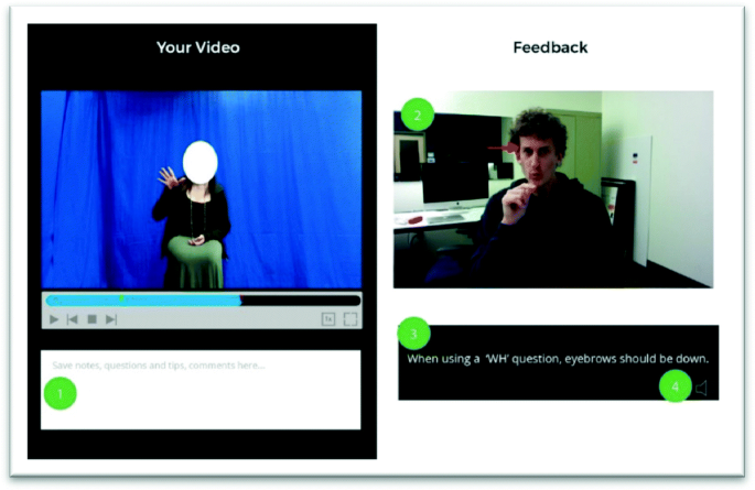
Screenshot of a design variation shown in Round 2. This image shows the different visual variations with ‘Your Video’ on dark background. Label “1” indicates the notes panel at the bottom of the student video, “2” indicates absence of x marks on the top left corner, “3” indicates sans serif font and 4 indicates Read Aloud feedback icon.
-
7.
Video Player controls – The designs in Round 1 had used static images to represent where a video could be shown in the ‘Feedback’ column, and the design lacked video controls that would be needed to play such a video. Further, participants had suggested including a feature to control the speed of the video or enable full-screen display of the video. Therefore, the designs in Round 2 incorporated these ideas.
-
8.
Read Aloud Feedback – In Round 2, the concept of ‘Read aloud’ feedback was incorporated (based on suggestions in Round 1) to learn if students would like comments to be read aloud through speech synthesis software. In this prototype design in Round 2, a sound icon with a thin gray stroke in the bottom right corner of the feedback text box was used to represent the Read Aloud feature.
-
9.
Sans Serif and Serif fonts – In Round 1, participants indicated that a font size of 21 pt. was comfortable to read. In Round 2, fonts were varied by their family – serif and sans serif to explore participant’s preferences. For the tests, Open Sans (a Sans Serif font) and Playfair Display (a Serif font), both 21pt. in size were presented as possible alternatives to the participants for displaying feedback text. The decision to switch to Open Sans was because of the speed of loading time. Slabo 27px had a 11 ms delay loading the font when compared to Open Sans which is the fastest. Further, the font ‘Slabo 27px’ is fine tuned for use at the pixel size in the name. For the reasons, we switched to Open Sans as the Sans Serif font.
-
10.
Additional Visual Cues – Participants in Round 1 suggested using shapes such as a red “X” mark and a green “check mark” to distinguish between an error occurrence and a correct instance. The designs in Round 2 incorporated such additional cues. These cues were positioned on the top left corner of the feedback images. An equal number of screens were designed that had these additional visual cues (and those that did not) to understand how participants rated the benefits of having them.
-
11.
Alternative dark backgrounds – Participants in Round 1 disliked the design with white backgrounds for both columns. For the designs in Round 2, we explored which of the two columns (My Video or Feedback) participants preferred having a dark background. Participants were presented with an equal number of design screens with ‘My Video’ on the dark background (and ‘Feedback’ on a light background) and ‘Feedback’ on the dark background (and ‘My Video’ on the light background).


As in the first round, before we showed any of our design prototypes in Round 2, we asked participants to describe issues they faced with the current method of receiving feedback from their instructor on homework assignments in which they submit a video of themselves signing. Participants described several issues they faced with GoReact. P3 expressed that it was difficult to understand how ‘edit video’ functionality works on GoReact. Moving videos to separate folders took a while for P1 to figure out. P3 also mentioned that the rubric-style feedback they received from their instructor about their ASL homework assignments did not provide enough specific information on how to sign better. P7 described that it was difficult to know what part of their video the instructor was specifically referring to in their feedback message – saying that sometimes “you don’t see what mistake you made.” P2 had a specific issue with understanding video-based feedback from their instructor in which the instructor used some fingerspelling in their signing, as the instructor’s speed was very fast. P8 described another anecdote about a time when the instructor’s feedback on a homework assignment mentioned “You could have used a different sign.” The problem was that P8 did not know what other options were available (what other sign they should use). Finally, P7 mentioned that when making a video recording for a homework assignment, if it was necessary to pause and then resume the recording process, the resulting video may have an awkward pause.
After viewing the designs shown in Figs. 5 and 6, participants in Round 2 provided some feedback:
-
First Impressions. Participants mentioned that they liked the layout of two columns showing both (My Video and Feedback video) side by side. P8 added that the title for two columns helped differentiate the two videos. Participants had diverse opinions about the background colors for the two videos. For the Round 2 designs, each participant was presented with 2 screens with ‘My Video’ on dark background and 2 screens with ‘Feedback’ on dark background. In the former case, the feedback text box had a dark background with white text while in the latter the feedback text box had a white background with black text. This was done to have contrast between the elements in the design. P1, P5, P7 and P8 preferred having ‘My Video’ on the dark background and ‘Feedback’ on a white background while P2, P3, P4 and P6 preferred the ‘Feedback’ video on the dark background.
-
Visual Cues. A red X mark and a green check mark was placed on the left corner of the feedback images to distinguish errors and correct instances. P7 pointed out that having such visual cues helped “emphasize what had happened”. P4 and P6 also described having such visual cues as a very helpful feature. P3 suggested that the visual cues be made thicker as they blended into the background making it difficult to see. The green/red markers on the video timeline was found to be more professional by participants in Round 1. Therefore, no changes were made to the markers. P3 suggested using bubbles instead of dashes as markers on the video timeline. P5 and P6 that the green/red markers were helpful in distinguishing the occurrence of errors and correct instances picked up by the system.
-
Impressions about Arrows. Participants P1, P2, P6 and P7 indicated that having the arrows pointing to facial expressions would be helpful on static images.
-
Video Controls. Participants described the ability to enlarge the video as a helpful feature (P3, P4 and P8). Controlling the speed of the videos was described as a requirement by the participants in Round 1. Therefore, speed control for both ‘My Video’ and ‘Feedback’ was incorporated in the designs for Round 2. Participants in Round 2 described that the speed control for their own video was not helpful and unnecessary (P2, P3).
-
Notes. The feature to save thoughts and comments was described by the participants as a very helpful feature. However, the icon representing ‘Notes’ was described by participants as “not clear” (P7). They suggested that changing the icon to pen and paper. Two separate designs for the ‘Notes’ feature was shown to the participants. The first version had the ‘Notes’ sliding out from the left sidebar while the second version featured a text box below the ‘My Video.’ P1, P2, P3, P6 and P7 preferred the second version wherein the ‘Notes’ were placed right below ‘My Video.’ They elaborated that the second design version of ‘Notes’ allowed them to see their video while typing (P6), was easily accessible (P7), and did not require additional steps according to P3.
-
‘Read aloud’ feedback. The feature to read aloud the feedback text was described as “not helpful” by P7, P8 and P3, “unnecessary” by P2 and P3. Participants also described that the icon for the ‘read aloud’ feedback was not clear and that the icon color did not have a strong contrast to be noticed by them.
Based on the feedback received in Round 1, the text for all the error messages that we anticipate using in this software were revised, e.g. to add more technical terminology about ASL linguistic concepts. This updated version of text feedback messages shown to participants in Round 2. Participants in Round 2 indicated that the feedback messages were still not specific enough as to what the student should do to improve their signing. For instance, one error message indicated that the student should “use a yes/no facial expression,” but the message did not explain to students that such a facial expression requires that they raise their eyebrows as their tilt their head forward. Further, 3 participants who were ASL beginners pointed out that the technical terms ‘eye gaze’, ‘non-manual markers’ and ‘role shift’ did not make sense to them, and they rejected the notion of including such words in the feedback text. (These jargon terms had been introduced into the text in this round, based on suggestions in the Round 1 study).
6.1 Features Desired by Round 2 Participants
Participants suggested that if the software were to display both video-based and a text-based feedback to them about an error in their signing, it would be better if the student were shown the video (of someone signing in ASL to convey the error message) prior to seeing the English text version of this message. Students believed that it would be more educational if they had to try to understand the ASL video message first, before seeing the English text. P7 and P8 suggested hiding the feedback text under a ‘Hint’ button which when clicked would show the error message.
In our prototype, when a student was replaying their video to see if there were any error messages, the video of their own performance would pause whenever the system had some feedback for them – and then the feedback message (shown in the video region on the right side of the GUI) would play the feedback message. P8 requested that the feedback video should not always pop up and pause their own video; this participant wanted an option to disable the presentation of feedback messages so that they could re-watch the video of their own performance completely – without interruption.
For feedback videos in which a signer conveys in ASL some comment about an error in their signing, participants suggested that the videos should have a neutral backdrop (P1, P2 and P4) so that there are no distracting background elements in the video. In our prototype, the sample feedback videos consisted of an ASL signer who used ASL to communicate an error message to the student, and each video began with the sign WRONG/ERROR. P1 indicated that having the message begin with WRONG/ERROR may be disheartening. This participant also preferred messages that conveyed “what you were doing wrong versus what you’re supposed to do.”
P7, who had indicated that students sometimes need to pause and resume while they are making a recording, asked for a feature in which the student could replay what they had just recorded, so that they could more naturally and quickly resume recording the rest of their ASL message. P7 indicated that such a feature may help to reduce the “awkward pause” or discontinuity that may result when a student pauses the recording process and resumes mid-message. P6 suggested incorporating a ‘Mute’ button to eliminate background noise when recording videos.
P8 suggested having a system that would calculate the total number of error messages (perhaps grouped by different categories of mistakes in the students signing) so that students could more easily notice if there was a pattern as to what types of errors they make more frequently in their signing.
P4 requested that if a student types any text in the “Notes” region, then the software should note the time duration in the student’s own video recording when the ‘Note’ region had been clicked – so that it would be possible to later review their notes in a time-synchronized manner with their own video.
7 Iterative Design – Round 3
For the third and final round, the following design alternatives were presented to the participants based on feedback received from the previous round.
-
12.
Color-coded Error Categories – Round 2 participants suggested using color-coded error categories and that the interface should indicate the count of errors in each category. In our Round 3 designs, this information was included in a ‘Summary’ section below the ‘My Video’ timeline. The error categories in the ‘Summary’ section featured an expandable sub-section that listed the occurrence of error and duration of feedback in a tabular form. Two separate visual variations were explored: The first variation utilized flags (Fig. 7) while the second variation made use of diamonds (Fig. 8) on the video timeline and on the ‘Summary’ section.
Fig. 7. 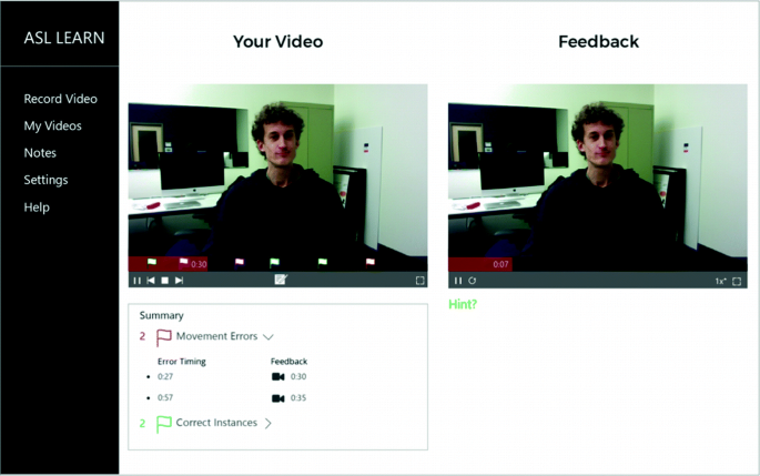
Screenshot of a design variation shown in Round 3. This image shows the interface with flags as markers and summary of errors recognized by the system.
Fig. 8. 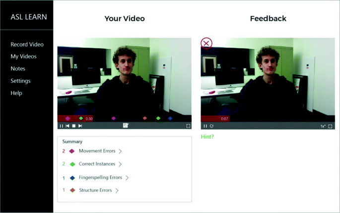
Screenshot of a design variation shown in Round 3. This image shows the interface with diamonds as timeline markers to denote summary of errors and visual markers to illustrate error.
Fig. 9. 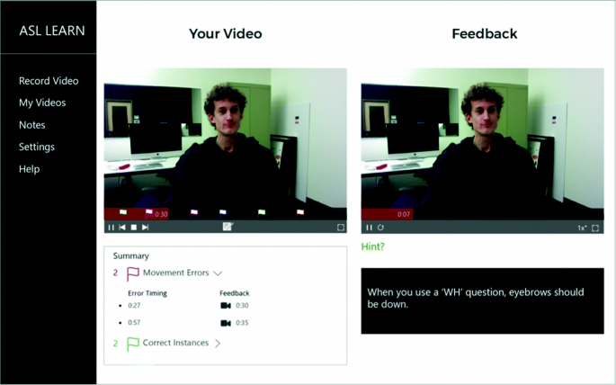
Screenshot of a design variation shown in Round 3. This image shows the interface with textual feedback that appears when the ‘Hint’ button is clicked.
-
13.
Hint Button – Participants in Round 2 indicated that the feedback text should not always be present on the screen as it would not encourage the students to learn from the feedback videos presented. However, they indicated that having a way to toggle the feedback text would be helpful. The designs in Round 3 incorporated the changes by placing a ‘Hint?’ button below the ‘Feedback’ timeline which when clicked would display the error message.
-
14.
Notes feature – The icon used to represent the ‘Notes’ feature in Round 2 was described as unclear by the participants. Therefore, the icon was changed to pen and paper for the designs in Round 3. The ‘Notes’ feature in Round 3 was designed as a sidebar drawing in from the right. This would allow the ‘My Video’ to be visible even when ‘Notes’ were being typed. It would also test whether having the ‘Notes’ slide out from the right would cause the students to face any problems or not. Additionally, the ‘Notes’ were organized by the time code highlighted on the top left corner to draw attention to the time code. The individual notes also featured a trash can icon to delete any notes that the students no longer needed.
-
15.
Sidebar Navigation – The left sidebar navigation was designed to provide the users with easy access to the system features. Participants had suggested including a way to organize their notes, see the videos they submitted to the system and a help button. Additionally, the system had to have a way to Record video and toggle Settings if necessary. Hence, the designs in Round 3 had the left sidebar always accessible that would make the system easy to use.
-
16.
Segoe UI – The results in Round 2 showed that participants described a Sans Serif font more easily readable than a Serif font. However, the Sans Serif font used in Round 2 (Open Sans) had a relatively loose kerning between characters causing uneven spaces to appear between letters. The result was that the text did not look visually pleasing. Hence, another Sans Serif font – Segoe UI (21pt. font size) was used for the feedback text in Round 3.
-
17.
Mute background noise – Participants in Round 2 pointed out problems of having background noise in their video recordings. Hence, the designs in Round 3 included a ‘Mute Background noise’ button on the recording screen that allowed participants to toggle the background noise being recorded in the video.
-
18.
Pause – Resume Recording Feature – One of the pressing problems that the participants described was having an awkward pause in their resulting video when needed to pause and resume during their recording process. Participants wanted the ability to view what was last signed to avoid relying on their memory to decide how to proceed. In the light of this issue, the resume recording feature was designed such that it would play the previous 10 s of what was signed so that there was a visual confirmation of the point where the recording was paused (Fig. 9).


Participants described their first impression of the interface as ‘simple’, ‘organized’ and ‘easy to use.’ P3 mentioned that the interface was so simple that “you don’t have to guess anything.” P1 described that the color palette used was very easy on the eyes and the fonts looked clear and good. P2 pointed out similarities between the interface and the pre-existing GoReact but added that the new interface looked simpler. P2 and P4 also appreciated the 2-column layout used to display the two videos side by side.
-
Recording. The record button in red instantly attracted the participants’ attention and they described the functionalities of the interface ‘very clear’ (P3, P4). The option to mute background noise in the video was described very helpful by P3, P5, P6 and P7. The feature that allowed participants to view previous 10 s of the recording before resuming recording was acknowledged by the participants as a good feature to have. However, P5 and P8 suggested having a manual setting that allowed to adjust the amount of time that would be replayed before resuming recording. Further, they also added that the student should be presented with the option if they wanted to replay what was last signed or continue recording anyway.
-
Color-coded flags. For the visual markers on the video timeline, 2 design variations were presented to the participants. The first variation had flags as visual markers while the second had diamonds as visual markers. The participants described the color-coded flags as “clear” and “easy” to understand. However, on seeing the second variation, P1 described that the diamonds were “easier to see.” P5 described another problem wherein the flags might crowd the video timeline making it harder to distinguish between individual flags. Overall, the ‘Summary’ section indicating errors by category was found to very helpful by the participants.
-
Notes. The designs for the ‘Notes’ was described by the participants as clear and simple. P1 and P5 pointed out that the highlighted timestamps on the individual notes was helpful.
-
Background Color. According to the participants, the white background used for designs in Round 3 was clean, clear and a more user-friendly design as compared to the dark background color.
-
Feedback Text. The idea that the feedback text would not be always visible was described by P2 as a good learning practice. While P1 and P6 found the term ‘Hint’ to be vague, P5 described that it wouldn’t be difficult to know what ‘Hint’ did, once a student used the system.
Participants in the Round 3 study commented on several design features they would like to see added to the software:
-
Participants requested was that the system have a countdown timer before beginning to record a video of their signing. Five participants had suggestions of this nature, indicating that having a countdown timer would allow them enough time to know that the system is ready to record. Further, P1 recommended that the system prompt the user if they want to stop recording in case the user accidentally pressed the stop recording button.
-
P1 found the icon for muting background noise as distracting and suggested using a neutral color for the button to keep the focus on the record video button.
-
The ‘Summary’ section consisted of expandable error categories listing errors and feedback duration in a tabular form. P1 recommended renaming the column heading from “Feedback” to “Feedback Duration” to clarify what the column represented.
-
For the ‘Notes’ feature, participants expected that the system would pick the timestamp when the note button was clicked (P5) but the students should also have the ability to change the timestamp later. Further, P2 added that the video timeline should include visual markers that indicate a note had been added at that time. P6 added that bright colors highlighting the timestamp were not necessary and could be replaced by the timing in bold. P1 suggested making use of ‘User Profiles’ that would allow students to log in and see their individual feedback and notes in one place. P5 suggested replacing the ‘Summary’ tab with ‘Notes’ when clicked to be able to view both videos at the same time while taking individual notes.
-
While participants in Round 2 had suggested that a speed control for when a student is re-watching their own video recording was not necessary, the participants in Round 3 requested a speed control for their own video. P4 and P5 described that when watching a long video that had multiple errors and correct instances, they would like the ability to change the speed of their video once they understood what had gone wrong. Additionally, P5 pointed out that the recording time of the video should be overlaid on the video as it is can be distracting. While P5 suggested having the recording time next to the ‘Stop’ button, P7 suggested having the time on top side of the video and P8 suggested having it near the video recording controls.
8 Limitations of This Work
The designs for the interface were presented to participants in this study as non-interactive visual prototypes; therefore, this study as not able to investigate participant’s opinions about any time delays that would be involved when the system processes the feedback (for instance, if the system needed a few minutes to process the student’s video prior to providing feedback, this delay time was not simulated in this study). A progress-bar or other indicator of “wait time” might be necessary if students need to wait for their videos to be processed.
Further, in this study, the system did not actually allow the participant to record and re-watch their own signing. Instead, when shown a visual design of a “rewatch your video and see feedback” page, a sample video of an ASL student’s signing performance was shown on the prototype. These example videos of student signing were all short clips, e.g. one or two sentences in length. Thus, this study did not investigate how participants would react to designs when viewing feedback on a longer video that had been submitted, e.g. a long paragraph for which there would be multiple feedback messages may need to be displayed to the student. If the system needed to provide users with multiple videos containing feedback information about their video, then some list or sequence of such videos would need to be provided.
Additionally, the participant gender demographics were imbalanced, with 23 female and 1 male participant. It is not possible to predict what effect that this gender imbalance might have had on the studies, but it would be helpful to conduct future studies with a more balanced participant demographic.
9 Conclusion
The goal of this research was to design an interface for an automated ASL system that would provide real time feedback to students who are learning sign language. The effectiveness of this automated tool lies in its ability to provide and communicate the feedback to the students. Hence, it was important to understand the visual requirements of the interface and the language that should be used to present the feedback.
Three rounds of iterative re-designs were conducted to understand the important factors that would help students in understanding the feedback provided by the system. After every round, the interface design incorporated the feedback given by the participants and subsequent changes were made. These changes were based on the common themes that emerged across a round of interviews. The study was aimed at understanding the visual requirements –and the language/wording to be used in text messages on the system that convey feedback to students.
We found that participants wanted to see a summary of errors as identified by the system so that they could understand what they need to focus on improving the most. Further, participants encouraged that if feedback is conveyed in the form of a video message (of an instructor or someone performing ASL explaining the error) and as an English text message explaining the error, then the video feedback should be the primary focus of the interface, with the feedback text secondary. Participants (all students enrolled or recently enrolled in ASL courses) indicated that this is because ASL is a visual language and having the text always visible would discourage the students from practicing their skill at watching and understanding ASL. Additionally, visual markers that indicate an error or correct usage presented on a timeline below a video were described as helpful by the participants. We also found that technical words such as “prosody, non-manual markers, etc.” should not be used in the feedback text as beginner students might not be familiar with such terms. The participants also wanted the video feedback to have a structure that would tell them what they did wrong, how to correct the mistake, and to show an example of the correct way to sign.
One of the limitations of the study was that it did not consider the time delays that would be involved while the system processes the feedback. Furthermore, this study did not investigate the issue of accuracy – as we are developing an automatic system that would give feedback to students, this prototype presented an ideal scenario wherein the system always identified the what the error was. Future work could investigate additional higher fidelity prototypes that consider the delays involved and also consider the scenarios wherein a system incorrectly identified a sign as incorrect and how students could flag them as errors.
While this current set of studies primarily gathered subjective feedback which was evaluated qualitatively, we would also like to take a quantitative approach to this problem for future work, including asking participants to rate their preferences using Likert-scale questions or testing how well they understand the feedback that is displayed. In future work, as we develop an actual working system, we would also like to test our prototypes in a real-world setting where ASL students use it for their courses.
References
Alharbi, R., Alharbi, D., Alharbi, A.: An investigation on the role of multimodal metaphors in e-feedback interfaces. Interact. Technol. Smart Educ. 8(4), 263–270 (2011)
Goldberg, D., Looney, D., Lusin, N.: Enrolments in languages other than English in US institutions of higher education, fall 2013. Modern Language Association (2015)
Henderson, V., Lee, S., Brashear, H., Hamilton, H., Starner, T., Hamilton, S.: Development of an ASL game for deaf children. In: Proceedings of Interaction Design and Children, Boulder, CO (2005)
Huenerfauth, M., Gale, E., Penly, B., Pillutla, S., Willard, M., Hariharan, D.: Comparing methods of displaying language feedback for student videos of American Sign Language. In: Proceedings of ASSETS 2015 ACM SIGACCESS Conference on Computers and Accessibility, pp. 139–146 (2015)
Huenerfauth, M., Gale, E., Penly, B.S., Willard, M., Hariharan, D.: Designing tools to facilitate students learning American Sign Language. In: Poster presented at effective access technologies conference, Rochester, New York, USA, 10 November 2015
Lin, F.R., Niparko, J.K., Ferrucci, L.: Hearing loss prevalence in the US. Arch. Intern. Med. 171(20), 1851–1852 (2011)
Mitchell, R., Young, T., Bachleda, B., Karchmer, M.: How many people use ASL in the United States? Why estimates need updating. Sign Lang. Stud. 6(3), 306–335 (2006)
Strong, M., Prinz, P.M.: A study of the relationship between American Sign Language and English literacy. J. Deaf Stud. Deaf Educ. 2(1), 37–46 (1997)
Acknowledgements
This material is based upon work supported by the National Science Foundation under award number 1400802 and 1462280.
Author information
Authors and Affiliations
Corresponding author
Editor information
Editors and Affiliations
Rights and permissions
Copyright information
© 2019 Springer Nature Switzerland AG
About this paper

Cite this paper
Shah, U., Seita, M., Huenerfauth, M. (2019). Evaluation of User-Interface Designs for Educational Feedback Software for ASL Students. In: Antona, M., Stephanidis, C. (eds) Universal Access in Human-Computer Interaction. Theory, Methods and Tools. HCII 2019. Lecture Notes in Computer Science(), vol 11572. Springer, Cham. https://doi.org/10.1007/978-3-030-23560-4_37
Download citation
DOI: https://doi.org/10.1007/978-3-030-23560-4_37
Published:
Publisher Name: Springer, Cham
Print ISBN: 978-3-030-23559-8
Online ISBN: 978-3-030-23560-4
eBook Packages: Computer ScienceComputer Science (R0)