
Abstract
Virtual Reality has enabled the evolution of distributed information architecture in the three-dimensional environment. It means that interface elements like buttons or menus are not restricted to 2D-dimensional environments: they can be now immersed in 3D space with arbitrary position and orientation. This scenario implies a need to think about different paradigms to be designed in regard to several aspects like location, field of view, selection, movement, attention etc. The present paper aims to present some aspects of information arrangement and content management in Virtual Environments, as well as provide advice for testing the effectiveness of those systems using the application RIO 360 for virtual reality as reference.
You have full access to this open access chapter, Download conference paper PDF
1 Introduction
The word VR (Virtual Reality) has gained a lot of attention and excitement over the last years. The power of the technology to create impressive and unexpected digital experiences surely is one of the main reason for this scenario [1]. This technology’s strength comes from a broad venue for creativity, freedom and multimedia capabilities that, however, happen under a heavy cost of learning curve, caveats and experimentation [2]. Although it presents a sort of opportunities for creating engagement and new experiences immersion, this event brings relevant questions like: what are the new paradigms for information arrangement in regard to the 3D space? What are the differences from interactions with 2D space? Based on a systematic literature review, this essay aims to share the discoveries of a design team when building VR Rio 360 [3], a tourism VR app focused on Rio de Janeiro and its famous attractions. Rio 360 was the first app built by a mobile solutions team in transition to create solutions for VR. The core findings were result of a multidisciplinary effort of concept design, software development, and user research studies.
2 From 2D to 3D
Information spaces support intuitive computing interaction by mapping information to real world space, allowing us to look beyond the boundaries of the computing device and perceive information where it belongs – in the surrounding environment [8]. Several frameworks related to spatial and mixed reality interactions have previously been developed for immersive virtual environments [8]. Modern graphical user interfaces are object-oriented; the user first accesses the object of interest and then modifies it by operating upon it. After gathering the information, VR Rio 360 ideation process found its way by role-playing tasks like what users should do to reach, open, preview and explore each of the touristic features. These early exercises generated insights from visual and information designs to interaction and development approaches that were reproduced in 3D environments with rough boxes and planes and very little visual concern.
Traditional app development is usually defined by the co-work of designers and engineers in an established framework remarkably segregated by competency and tools. Deliverables are often communicated remotely with little sharing of perspectives and concerns over the complexities and limitations of each side’s technology. VR, and most specifically the concept design of Rio 360, forced the whole team to break down this barrier, rethink its tools, and interact deeply on how to materialize which composition should come to life. This collaboration did not mean a complete blur of the distinct expertizes, but definitely challenged designers and engineers to exercise rationale and empathy over each other’s concerns. This way, the project gained substantial improvements from a technical sense behind designers’ decisions, and sharper instinct with refinements of developers’ routines.
There are several reasons for going with an object-oriented interface approach for graphical user interfaces. Thus, icons are good at depicting objects but often poor at depicting actions, leading objects to dominate the visual interface. Software like Unit 3D played a central role in the team’s experimented workflow, for the common interface they offer to distinct professionals like technical 3D artists, content strategists, interaction designers and front-end developers. In the task of composing a world for Rio de Janeiro, environment designers could place map elements like epic places and geographic references; they adjusted and balanced overall proportions in the same interface used by content strategists to position touristic pins and define overall place of findings across the map; yet the very same interface in which math developers exposed core variable adjustments to control movement speed and acceleration parameters that were then finely tuned by interaction designers concerned about other aspects such as motion sickness and discoverability.
3 Cognitive Aspects of Information in Virtual Environments
Research and experimental studies have clarified some cognitive aspects of information access on VE, some of them are listed below:
3.1 Perception
In virtual environments, the frequent problems with alignment and convergence, three-dimensional models and texture maps are topics that place substantive constraints on the role of bottom-up data processing in perception. Moreover, we also must considerer that we are living in a society of digital artifacts with a sort of representations and associations [9]; it means that we are able to interpret the meaning on television, smartphones, tablets, desktops but we also are learning how to interpret information and extend our actions into a virtual environment. Much of this can actually be inherited from mental models and affordances of the real world, but also can portray potential spots for confusion as the digital language ends up mixed with simulated realities, absent of anchors (corners and edges) that usually frame conventional squared interfaces.
In Rio 360 it became necessary to create a round stereotyped version of the map, emphasizing the city’s most relevant places as main visual anchors/clues that would help users to situate themselves from practically everywhere. The stylized map also dealt with the distribution of information, ensured scattered experience spots were in similar distances from each other, hooked visual compositions from one spot to nearby ones in near, mid, and far FOVs and ultimately shaped an experience of a constant rhythm for content discovery.
Furthermore, map boundaries received a special behavior combining an invisible collider and an animated cursor to signalize navigation constraints and ensure that users would remain inside the content area. When selecting and interacting with these contents, a mixed approach of ‘pin-over-map’ icon was engineered to behave as an animated character capable of drawing attention when a user gets nearby, present the title for the experiences with additional feedback for gaze interactions. All this combined approach of map and icon in a free walking experience is essentially a translation of bidimensional map interface to a reality-inspired referenced and explorable place.
3.2 Attention
A VE system can give accessible clues about the focus of a user’s attention that are not available in an ordinary desktop screen. Due to the field of view and resolution provided by those applications, users carry out navigation and orientation actions. These actions constitute an announcement, a sort of nonverbal protocol about what the user is currently attending. Some guidelines are suggested to optimize perception, attention and action [12]:
-
Consider using primarily red colors and lighting for dark scenes to maintain dark adaptation while maintaining high visual acuity for foveal vision.
-
Don’t expect users to notice or remember events just because they are within their field of view. Use salience, e.g. colorful object or a spatialized sound to capture a person’s attention.
-
Consider getting a user’s attention first through spatialized audio to prepare them in advance for an event.
-
Attention can also be captured by objects that seem out of place and by putting objects where users expect them.
-
Collect data to build attention maps to determine what actually attract users’ attention.
3.3 Learning and Memory
Although a number of research projects have studied the VE, some issues remain unsolved. In regard to the Rio 360 app, one of the core issues was: how much fidelity is required to produce desired levels of satisfaction and learning? Which type of input offers special advantages for conveying the information available? The approach for this project assumed that experienced navigators – those familiarized with Rio touristic icons – would have an easier exploring curve to find desired locations while the less experienced ones would end up discovering things by serendipity. In both cases, visual clues for lead experiences like the Sugarloaf, Christ the Redeemer, and Pedra da Gávea, would end up serving as placed references for users to locate themselves, remember the experiences they visited, and locate the next available ones. By making use of repeated gaze interaction patterns, the application’s concept model also made sure each new spot would be immediately familiar to the previous ones, in a seamless flow of exploration.
3.4 Knowledge
For each type of information that can be addressed to or learned by a user in a VE, there are potential issues to be addressed in a way to attend the cognitive processes properly. This can be viewed as a matrix of cognitive processing issues by types of information [9], some of these issues are listed below:
-
Location knowledge: many VEs allow their participants to easily change their location and their orientation while observing objects in the environment. This model of interaction can offer the user the location of objects, as well as bring and access them.
-
Part-whole knowledge: When less familiar complex objects are presented in an environment, it may be necessary to give the participant means for exploring part-whole relationships. One such means is to give the user the ability to move objects [9].
-
Procedural knowledge: it is listed to provide action sequences in order to guide the user how to perform a desired task. It must be considered that some tasks/actions will be prioritized higher than others, in regard to time, effectiveness and context of application.
4 UX for VR
4.1 Vision of the Future
People are accustomed to 1st person narratives of cinema and video games, and although they may serve as a starter point to think about VR, they do not suffice to fully understand the sense of a virtual presence. 1st person is often about the fruition of a mixed 2D/3D interface with a simulated character whose vision is translated to a squared canvas.
Two of these concepts sets 1st person apart from VR experiences: visual language and field of view. On a square canvas, visual language often makes use of letterings and infographics that usually refer to margins and corners of the screen in a way to create referential spaces for certain types of information. Unaware of the conceptual models these layouts are able to create, and of the eye’s instinctive capability to zap between and change from one scope to another, one can easily misevaluate what means to be presented. The truth is that most of nowadays’ screens exceeds the eye’s field of view (FOV), which is actually very small. So, when living the 1st person narrative, one is constrained to the eye’s limitation, with no auxiliary Field of View (FOV) and extra information, while deprived from referential screen spaces like corners and sides. It is a world, and it changes everything from the very visualization, to the entire language, which performs messages, interfaces, and visual schemas.
VR presence means that elements otherwise hooked into screens corners will have to be spatially placed in order to create a quick and instinctive referral for users. Attaching interface elements onto user FOV is often distracting and confusing, as user’s cognitive resources will be spent to constantly filter a cluttered vision and concentrate/explore through the main spatial elements. This leads to the first brand new interaction task introduced by VR: the “gaze”.
In severe contrast with the general sense of mobile app developments, users now are bound to look around, and to constantly explore away. This also means that the available information has to be well designed into VR space, not in concepts like screens or user vision; and in this matter, the development team ended up realizing nuances of this new composition paradigm. As placing things to explore all throughout the environment can sound as a good approach to VR information design, too many details or vastness of space can also alienate users, depriving them of quick recognition of current and next/possible locations, which would ultimately affect core heuristics like the ability to return and to understand current system status.
In regard to a big city like Rio de Janeiro, the strategy was to limit the content for 12 touristic spots that would not work alone without a modification of the map to maintain a certain average of space between all available spots (Fig. 1). Design for the 1st person means to design a specific place, made to be digitally explored. This matter can possibly open research venues to correctly relate other environment and architecture disciplines.

Rio 360 map with some of available spots, in red. (Color figure online)
4.2 It Feels like Reality
If good enough, a virtual interface will submerge users into a flow of signals, actions, and feedback that ultimately get them to skip their natural human perception of surroundings in favor of a distinct reality. And although this is indeed possible up to a variable extent, Rio 360 presented the team to a catchy underlining of this interaction: the balance of assumption control vs. wish fulfillment. If “real” enough, a virtual environment can potentially raise expectation towards affordances and possibilities that were not really implemented by software. And the peculiar freedom of VR presence often allows users to try those presumed tasks, which can lead to a sequence of failures and undesired frustration. So as the team gathered these early user insights, the idea of controlling user’s assumptions with a consistent interaction pattern pointed out as the solution to lead users’ attention and provoked them into features that are actually feasible. This approach performed a core function in Rio 360, as the pattern recursively endorsed itself along distinct places and objects in the environment, which fueled users into a flow of successful and enjoyable actions of controlled and fulfilled expectations.
In an attempt to smoothen the learning curve even further, the team opted to take additional advantage of gaze interaction - perhaps the most intuitive of VR tasks - to move users from one location to another. So in practical terms, users would just have to look to both move, open, enter, load, and exit from distinct content across the map. This means that users are constantly moving, as long as they are looking for something new, stopping by when the desired/selected spots fit inside their field of view. Although succeeding on taking first VR users to accomplish most of the proposed tasks, the movement paradigm faced adoption issues as gaze exploration is rarely matching users movement decisions. So even when successfully figuring out the gaze-movement approach, users complained about having controls to decide when to stop and start moving again.
5 Rio 360 Development
The goal of Rio 360 was to create an exploratory experience in first-person perspective to give the user an immersed view of some areas in Rio de Janeiro. Four types of media were used: photos, audio, video and 3D graphics. The main aspects of visual information were developed in such a way to achieve the appropriate quality for the app are listed below.
5.1 Information Arrangement
Concept design for Rio 360 offered users an opportunity to freely fly over an interactive map to discover more about the city. However, Rio de Janeiro has a remarkably narrow map, which was more suggestive to a linear and driven exploration. So, to ensure complete user freedom, the map was put into aspherical mold so as to preserve referential relationships amongst touristic icons across the city. The impact of this transformation was not sensitive to users as immersion loosens their perception of the map as a whole, but it guaranteed the rhythm and balance for information discovery in whichever direction users choose to navigate. In order to act quickly so as to verify the idea’s validity, as well as possible failures, the team managed to translate the concepts of 2D wireframing and prototyping into functional VR environments made of rough blocks. Such approach sped up the conclusions about required interaction improvements and anticipated many of the caveats/blockages that VR concepts usually offer.
5.2 Immediate Distance
VR introduces an update to traditional foreground and background concepts of cinema and game scenes. The immediate plan is central for the feeling of presence, and elements in that range offer an increased sense of “coexistence” for users (i.e.: a plane at 35,000 ft impresses way less than another at a landing distance). Conversely, even detailed 3D elements tend to be flattened when put far from the camera, as interpupillary distance fails to generate distinct information for perspectives of each eye.
5.3 Level of Detail (LoD)
It was important to save precious computing resources by giving less polygons and details for elements that users will never get close to. Furthermore, it is important to attribute a fair amount of detailing for elements in the foreground, with really sensitive adjustments to LOD as eye capacity to capture them grows exponentially as they get closer to the user’s vision. Textures also play an important role on this, as 2D volume faking techniques are still effective at enriching an element’s reality. The use of VR early in the design process forced the detailed development of the interior space as much as the exterior. By having the opportunity to “go inside” the design and see it from within, the designer was forced to solve complex connections and details, which would not have been apparent with other media. The design was developed much more than those of other students not using VR as a design medium. With VR, the designer had to develop the entire three-dimensional model to a convincing level of detail, whereas other students concerned themselves with only specific views and details. Once the model was colored and detailed such that there were more than 10,000 polygons to be rendered, the simulation was slowed down to unacceptable frame rates (3–4 Hz).
In order to continue developing the design in greater detail, a separate model was generated representing a portion of the design. This second model was then developed to a high level of detail not easily accomplished by traditional architectural modeling methods. When this was simulated, we found that the Spaceball and monitor (non-immersive VR) aided in the perception of details and connections, but it was quite difficult to maneuver in tight spaces. It was necessary to view the model more intuitively so that the details and connections could be more easily studied. At this point, we attempted immersive simulation with a tracked HMD and wand. This was a whole new paradigm for evaluating spatial qualities of the design.
The frame rate was extremely low (1–2 Hz) and therefore quite disorienting, but we were able to inspect details and connections quite competently by having more intuitive control over the viewpoint. In both the immersive and non-immersive VR, flying through the design, as opposed to walking through it, had some advantages as well as some disadvantages. Flying provided a means of adopting viewpoints that could not be easily achieved in the real environment. This was useful for inspecting interior details, or for evaluating the exterior of the building from a number of viewpoints. However, there was a certain loss in the sense of scale due to the absence of any effort required to move to a location. This suggested a need for some type of treadmill to improve the navigational interface. However, once a critical threshold of detail was represented in VR, the designer was able to perceive spatial characteristics of the design that may not have been apparent with other design media. Before the complexity of the model reached a certain level, the use of VR as a design tool seemed to be a viable, but not unique, tool of representation.
The real-time simulations became more useful as a design tool as the level of detail of the model (color, transparency, and geometric complexity) increased. However, the level of detail needed to be kept in check to keep the frame rate at an acceptable level. The challenge presented by this conflict required both the generation of a second, more detailed model, and the skills of the designer to abstract the models. Although more powerful geometry engines are continually being developed, it is unlikely that we will ever be satisfied with the level of detail that can be simulated in real time. This may indicate a need for new ways to display complex geometry to the viewer, both in terms of rendering algorithms and in terms of the arrangement of the database [7].
5.4 Low Resolution
The need for details is handicapped by the amount of screen pixels that are actually able to fit in the Field of View (FOV), which opposes to the standard mobile and desktop mainstream paradigm, in which higher pixel densities are consistently reached year over year. The lack of pixels, along with immediate distance heuristics, creates a tricky approach to achieve pixel perfection levels and crisper details, taking long hours to be refined. Text readability is especially critical in that sense, as they are primarily composed by a sequence of narrow lines and gaps which can easily fail in blurred and poorly aliased situations.
5.5 Movement and Scale
Moving the user camera in Rio 360 generates an extra level of complexity to distance fine-tunings: defining dynamic scene shots. As users are able to reach a given content from any of its sides with varying distances, all composition would have to change in an indefinite number of situations. In order to work around this, Rio 360 makes use of distinct distance definitions, object scales and pixel densities for UI and landscape elements so that the composition among them will never hit, collide or overlap with each other.
A complex 3D-model is derived from a solid material by carving and sawing. This is promising for the design of highly detailed objects. Through the use of interpolated voxels and textures, Wang & Kaufman attempt to generate realistic looking results [5]. For our purposes we don’t need such fine graduation in design. Our approach is from the opposite end - the coarse, simply ‘bordered’ model, the elementary form. The above approaches aim for ‘near-as’ photorealistic virtual images. This brings with it the resulting well- known problems associated with rendering time, resolution, texturing, etc. The second major criticism is the limited ace of the users action/movement. Most of today’s VR applications are desktop-based, some allowing the user to interact on a one square-meter. We want to emphasize the space required for Doing. That means that we want to support a 1:1 experience for the user/actor [6].
5.6 Sound
Researches related to intersensory research concluded that certain perceptual qualities perceived by one sensory system can be influenced by the qualities of other sensory systems [9]. In terms of auditory-visual interaction, there are many similarities between visual and auditory perceptual groupings. Studies suggest that the auditory and visual modalities seem to interact in order to specify the nature of certain events within a perceiver’s environment [10]. As a way to provide information, a combination of direct and indirect sound can be used; this model is largely used in VE for games. In regard to the context, some experts say that sound can be 50% of the VR experience, if a user hears a sound that doesn’t match a typical human experience in a world that feels like a human experience, it tends to cause confusion and sounds unrealistic [11]. The authors also recommend to be careful to spatialize sound and align it to the directions the characters face, objects and content position.
5.7 Controlling Sickness
Camera movement, as one of the paradigms to explore virtual environments, offers a dramatically positive impact in user immersion. However, it also has possibly the highest of the development tradeoffs: motion sickness and control paradigms. By deploying a really granular control for modeling acceleration math, Rio 360 offered a great deal of experience in avoiding motion sickness. Everything is really eased and capped to avoid involuntary bumps, breaks, and sidewalk sensations, enabling difficult transportation tasks through the horizontal and vertical axes. As VR is quite new to most people, supporting users with distinct levels of sensitivity and familiarity to simulations is highly recommended. Several studies according to recommendations by Oculus [4] discuss how the camera movement is one of the major factors for the occurrence of motion sickness in virtual environments, stating that less movement will result in less discomfort.
6 UX Evaluation
For creating a measurement system on VE applications, two levels of measures should be considered. The primary level measures focus on outcome, indicating what the user accomplished in the VE system. The secondary measures help us interpret and elaborate on why performance was successful or not [9]. Aiming to identify points of improvement focusing on content comprehension, interaction flows, and overall usability, two processes of evaluation in different stages were conducted. Firstly, UX sessions were conducted with 9 internal employees, based on a qualitative task analysis when the final release was ready. The task analysis process was used to observe the participants while they performed the tasks required. Secondly, aiming to contribute for the first app update an expert review was applied.
6.1 UX Sessions
The study was conducted with 5 male, and 4 female individuals, ranging between 19 and 44 years old. Android was mentioned by most of them as their main operational system, while Samsung was the most used smartphone brand. Aiming to cover the aspects related to touristic interests in Rio de Janeiro, most of users had the habit of travelling. When asked about their planning process and if there was some kind of service that they would like to have, the most common request was for a service that would gather different types of information in only one place, e.g., city attractions and nearby restaurants. When asked about their experience with VR and devices related to it, there were 3 main answers: never used it (2 users), brief experience (4 users) and experienced (3 users). Users who were experienced had contact with contents from more than one device, e.g., Oculus rift, HTC VIVE and Gear VR. The study was split into three stages: initially, the participants were requested to explore the content freely for at least 1 min. Secondly, they were invited to talk about what they were figuring out into the new place and its surroundings and to perform a set of tasks:
-
Move in different directions.
-
Identify the Interface components. (e.g. landmarks, connection buttons).
-
Access the videos.
-
Identify the information available on videos.
-
Access the postcards.
-
Identify the information available on postcards.
At the end, a self-report per participant was applied aiming to obtain responses for points of improvements and additional information needs. The sessions lasted 1 h and 20 min (in average). Rio 360 is a VR application developed by SIDIA (Samsung R&D Center in Brazil) for Samsung Gear VR. Therefore, the participants tested the content through this device.
6.1.1 UX Sessions, Results
From the UX sessions it was possible to identify major points of improvements mainly related to navigation and speed, interaction with video, markers, and tutorial.
The issues were classified into three categories: major, minor and cosmetics.
-
Major issues: mainly related to navigation and speed. Some users felt some level of motion sickness while on the application’s initial screen, mostly because of the involuntary movement. They complained about the navigation speed. Defining it as inconsistent, most of them said that the speed made navigating uncomfortable - they were also unable to stop on particular spots; once inside the video, users had difficulty exiting it. They did not properly understand the video’s exit display - some thought that it was signaling the tourist spot’s actual location on the video and others thought that they would find more content through it; the display’s color (green) an its icon was also mentioned by the users, according to them it did not seem like an exit method.
-
Minor issues: mainly related to the comprehension of information available on the postcards’ tips (Fig. 2). According to the users, the tips seemed to be links to more content elsewhere or even on the application itself. Most users spent some time looking for a way to close the card, instead of instantly looking away from it to close it. Two users did not find a way to return to the map. With a sort of possibilities to be presented, maps are a powerful way to provide information and familiarity to users. However, some principles must be considered when these tools are implemented on VE: spot on the map where you want to go, provide a sense of overall space - even if the user tries to explore a detail, they must know how to go back to the original position. Focus on primary content, watch out for redundant information [12]; they also mentioned that the options’ colors were not clear and commented that it seemed like each function had its own color, or that the option in red was inactive/had an error. In regard to the connection window’s position (Wi-fi and 3G), users said that it was high enough so it would not get in the way of navigation. Some of them commented that they did not expect to find this type of settings’ options there.
Fig. 2. 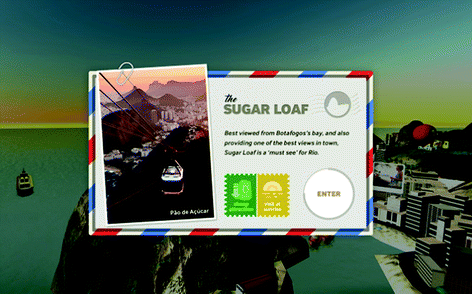
Rio 360 postcards
-
Cosmetic issues: mainly related to map markers. Users mentioned that some markers were placed in odd places. The major complaint about the markers was that some, even with their red color, seemed to be hidden. Users said that they could be placed higher on the map to make it easier to find them.

Additionally, the users were invited to suggest improvements after using the app. They highlighted the following topics:
-
A tutorial could be created to explain how to navigate and interact with the items available on the application.
-
An option could be added to choose the application’s navigation speed as a whole, e.g. YouTube’s video speed system.
-
Some participants imagined that each option on the Connection Window (Wi-fi and 3G) could have individual switches.
-
The application’s options (regarding navigation and connection) could be bundled in only one menu.
-
It would be interesting to have an area of the application with a list with all the tourist spots available, so it would become easier to find experiences. Users also mentioned that this list could have indicators of which experiences were already seen/visited, in order to keep track of how much of the application had already been explored.
-
In order to avoid motion sickness, there could be an option to navigate by teleporting the user from one point to another.
6.2 Usability Inspection
After the first release, aiming to minimize the effects related to motion sickness while playing the videos, a cognitive walkthrough (CW) was applied. Usability specialists analyzed the 12 videos, focusing on: identifying system lag and latencies, verifying warning for videos with susceptibility to motion sickness, and overall visual problems. During this approach, the four CW questions [13] were also considered: 1. Will the users try to achieve the right effect? Does the user know what to do? Is it the correct action? 2. Will the user notice that the current action is available? Is the action visible? Will users recognize it? 3. Will the user associate the correct action with the effect to be achieved? If the action is visible, will the user understand it? 4. If the correct action is performed, will the user see that progress is being made toward the solution of the task? Is there system feedback to inform the user of their progress? Will they see it? Will they understand it?
6.2.1 Usability Inspection, Results
Most videos presented motion sickness issues in three or two moments, mainly due to rapid movements, low frame rate, and proximity with people on the scene recorded. Overall visual problems were related to transition between videos and contrast of colors - some footage seems to have washed out colors. It was observed that the footage quality, in regard to bright, luminance, shadow and others factor during the scene recording totally affect the quality of color in the VE videos.
7 Conclusions
VR Rio 360 became an opportunity to research, review and learn important aspects for developing a tourism application for a virtual environment. Initially, our main challenge was how to set the camera’s movement to as natural as possible. We did not have a clear idea about which type of patterns users could have about VR usage. Would they know how to use a touchpad? Due to this, it was decided to focus the interaction of movements and control through the eye position, disregarding other models. After UX sessions, it was observed that other models could be explored. Our next steps will consider this.
Due to the lack of reference standards on VEs, some users initially mentioned they did not have previous ideas about the position of items like the tutorial or connection window button. From these results, it was possible to identify opportunities for future studies aiming to comprehend how core information could be presented/selected in regard the VEs. E.G. Where could a tutorial appear? Does it go away after selection or can it remain visible?
Due to the diversity of human factors that can influence the possibility of motion sickness occurrence (like gender, age, postural instability, high anxiety, exposure schedules, psychological characteristics such as fatigue, concentration, etc.), research which may indicate some level of susceptibility in regard to all of those factors can help all the VR community to increase the quality of interaction and information assessment into VEs.
In addition to that, we also observed how sound can decrease or increase discomfort while navigating. During the UX sessions, the background music seemed familiar and relaxing for some people, and perhaps it helped them while they explored the map. It could be an interesting topic for our next studies. Research can also be conducted to contribute on the development of a framework for evaluating virtual environments, especially one aiming to measure the level of effort required to comprehend and gain information regarding different types of stimuli and media.
References
Chahal, M.: Why 2016 will be virtual reality’s breakthrough year (2016). https://omobono.com/insights/blog/designing-vr-applying-usability-heuristics-virtual-reality. Accessed 2 Dec 2016
Chan, C.S.: Virtual reality in architectural design. In: Liu, Y.T., Wang, T.C.C., Hou, J.H. (eds.) CAADRIA 1997 Workshops, pp. 1–10. Hu’s Publisher Inc., Taipei (1997)
Rio 360 VR App on Oculus Store. https://www.oculus.com/experiences/gear-vr/1105507662843899/. Accessed 2 Dec 2016
Oculus Best Practices Version 310-30000-02. https://static.oculus.com/documentation/pdfs/intro-vr/latest/bp.pdf. Accessed 2 Dec 2016
Wang, S.W., Kaufman, A.F.: Volume sculpting. In: Proceedings of the 1995 Symposium on Interactive 3D Graphics. ACM Press, Monterey (1995)
Donath, D., Regenbrecht, H.: VRAD (Virtual Reality Aided Design) in the Early Phases of the Architectural Design Process (1995). https://cumincad.architexturez.net/system/files/pdf/8955.content.pdf
Campbell, D., Wells, M.: A Critique of Virtual Reality in the Architectural Design Process (2003). http://papers.cumincad.org/data/works/att/0e58.content.pdf
Ens, B., Ramos, J.D.H., Irani, P.: Ethereal Planes: A Design Framework for 2D Information Spaces in 3D Mixed Reality Environments (2014). http://hci.cs.umanitoba.ca/assets/publication_files/EP-SUI-CR__website_version.pdf. Accessed 6 Feb 2017
Lampton, R.D., Bliss, J.P., Morris, C.S.: Human performance measurement in virtual environments. In: Handbook of Virtual Environments Design, Implementation, and Applications. Lawrence Erlbaum Associates, Inc. (2002)
Bregman, A.S.: Auditory Scene Analysis. MIT Press, Cambridge (1990)
Fictum, C.: VR UX: Learn VR UX, Storytelling & Design. CreaterSpace Independent Publishing Platform (2016)
Jerald, J.: The VR Book: Human-Centered Design for Virtual Reality. Association for Computing Machinery and Morgan & Claypool, New York (2015)
Lewis, C., Wharton, C.: Cognitive walkthroughs. In: Helander, M., Landauer, T.K., Prabhu, P. (eds.) Handbook of Human Computer Interaction, 2nd edn. Elsevier, New York (1997)
Acknowledgement
The conception of this essay was the result of the combined efforts from SIDIA’s Solutions Team and UX & Design team. It is also important to highlight the company’s performance in supporting and promoting research and development for systems that are present in the domestic market’s leading technology products. For all those people involved in this project, our sincere appreciation is made manifest here.
Author information
Authors and Affiliations
Corresponding author
Editor information
Editors and Affiliations
Rights and permissions
Copyright information
© 2017 Springer International Publishing AG
About this paper
Cite this paper
Maciel, F., Lourenço, A., Carvalho, P., Melo, P. (2017). Visual and Interactive Concerns for VR Applications: A Case Study. In: Marcus, A., Wang, W. (eds) Design, User Experience, and Usability: Designing Pleasurable Experiences. DUXU 2017. Lecture Notes in Computer Science(), vol 10289. Springer, Cham. https://doi.org/10.1007/978-3-319-58637-3_40
Download citation
DOI: https://doi.org/10.1007/978-3-319-58637-3_40
Published:
Publisher Name: Springer, Cham
Print ISBN: 978-3-319-58636-6
Online ISBN: 978-3-319-58637-3
eBook Packages: Computer ScienceComputer Science (R0)