
Abstract
Based on the summary analysis of the development rules of mobile App iteration process, this paper selected six popular mobile phone software whose main navigation styles are iterated from drawer navigation to tabbed navigation, conducted a usability test of six old and new version software through the eye movement experiment, and compared the usability differences before and after the change in navigation style to study which navigation style is more suitable for mobile phone software. It carried out a comparative analysis of the usability of six old and new version software based on task completion rate, task loss degree, the completion time of search task (gaze time), the number of fixation points in browsing task, the time of entering ROI for the first time in browsing task and the time of triggering ROI for the first time obtained from the experiment, combining participants’ subjective satisfaction questionnaires and in-depth interview after the experiment. The results showed that the use of tabbed navigation software is better than that of drawer navigation software, and the usability difference caused by this navigation style is not related to the software type. In addition, this paper summed up usability problems in navigation design according to the experimental results, and provided a reference for interface designers and interaction designers to choose the navigation style and design interface.
You have full access to this open access chapter, Download conference paper PDF
1 Introduction
The rapid development of Mobile Internet has promoted the rapid rise of mobile APP application industry. By the end of 2016, the total number of applications in Apple’s APP stores had reached 2.93 million [1], and the Android Market had provided dozens of applications for downloading services. The normal life cycle of a software needs to undergo user need analysis, product conceptual design, information architecture design, interface interaction design and product usability assessment [2]. In order to meet the demands of consumers, mobile softwares have to undergo an iteration and updated process after being put on the market. In the software iteration process, users often reflect that the new version of the software is inferior to the old one, so it becomes a focus that designers need consider how to make use of usability assessment to find a nice design, to grasp the correct design trends and to continuously improve the software usability in the iteration process.
In the iteration process, the software involves an iteration of information architecture, interface interaction, and so on. In recent years, some scholars began to pay attention to the usability research of information architecture and interaction design. Ku [3] (2009) etc. found that websites with a wide range of information architecture and natural atmosphere can relieve users’ pressure and improve the usability of websites. They [4] also studied the influence of touch input mode and navigation style on the usability of ecological education system, and found that tabbed navigation with long touch had more superior usability. Minghui and Liming [5] studied the usability of information architecture in the early stage of digital library development by introducing the framework of usability design based on software architecture, and verified the impact of each indicator of information architecture on usability characteristics and attributes by examples.
After the literature review, it is found that there are a lot of research on the framework layer such as information architecture [6, 7] and interface interaction design [8, 9] in recent years while the research on the availability of mobile devices mainly focuses on the presentation layer such as interface layout [10, 11], icon design [12,13,14], interface details [15,16,17]. The research of information architecture is lacking. Due to the relatively mature website usability research, there is a reference for the research of other objects. Therefore, the study of the usability of mobile devices will gradually shift to the research of the framework layer.
Navigation design is an important part of the interface interaction design, and the choice of the appropriate navigation style can help users quickly switch freely and improve efficiency in the use of mobile devices. In this study, we summarized the iteration process of eleven commonly used mobile phone Apps. Nine of them are based on changes in the navigation style, among which six are iterated from drawer navigation to tabbed navigation and are iteration of first class navigation style. It can be seen that designers are increasingly inclined to tabbed navigation when designing. In order to explore whether this design trend is scientific and reasonable, we selected six popular mobile phone software whose main navigation styles are iterated from drawer navigation to tabbed navigation to compare usability difference before and after the change of navigation style, summarize the applicability of the two navigation styles, and verify the rationality of design rules. At the same time, we put forward some targeted suggestions to improve the usability of existing navigation by comparing the usability problems of two navigation styles.
2 Experiment Design
This study mainly evaluated the impact of navigation style on usability. In order to ensure the validity of experiment, we controlled irrelevant variables (such as interface layout, font size, color, navigation architecture, etc.) through the following ways: firstly, Axure was used to eliminate the impact of other factors and secondly, experiment tasks were set up strictly to ensure usability differences caused by different navigation styles.
2.1 Experiment Task
The experiment tasks mainly included purposeless browse task and purposeful search task. According to the complexity of the software structure, time allocation for purposeless browse was different, but the same browsing time was guaranteed for two different versions of the same software. Purposeless browse task mainly helped users familiar with the software, eliminate user anxiety. At the same time, the participants were surveyed about the degree of discovery and use of different navigation icons when using the software. Purposeful search task mainly determined the search efficiency of the participants, that is, whether they can quickly find the task entry and switch effectively.
2.2 Experiment Participants
The 38th China Internet statistics report by CNNIC [18] shows that the age distribution of Chinese Internet users is dominated by 20–29-year-old users, which accounts for about 30% of the total number of users. Therefore, this study selected similar age groups of students as participants, and participants with the same level of experience were screened out through the questionnaire to understand the user’s frequency of use and familiarity of six software to avoid the effect of differences in participants’ level of experience on the experiment. At the same time, all participants are with normal vision or corrected visual acuity, colorless, weak, etc.
There are 12 objects (6 software * 2 versions) and the experiment is divided into A and B groups. Group A is the same kind of software namely community reading software and group B is different kind of software (Fig. 1). Each group contains 10 participants, half male and half female.

Experiment objects
2.3 Experiment Equipment
The experiment equipment consists of Tobii X120 desktop eye tracker, eye tracker mobile test stand, Microsoft LifeCam Studio camera and two 5.5-in. redmi Note2 Phone (Fig. 2).

Experiment equipment
2.4 Experiment Process
The experiment required 2 experimenters. Experimenter A is responsible for debugging the experiment equipment, recording the experiment operation of participants to prepare for the interview after the test and experimenter B is responsible for guiding the participants to complete the pre-test and post-test questionnaires, explaining usability tasks and assisting participants to complete the eye movement test including answering questions raised by participants.
2.4.1 Experiment Preparation Stage
Experimenters should not only ensure that the connection of experimental equipment is normal, the experimental software is installed in place and the speed of experimental environment is well, but also explain the purpose, processes and precautions of this experiment to participants. At the same time, about one minute was given to participants to be familiar with the mobile phone used in the experiment to prevent them from misuse due to being unfamiliar with the experiment equipment.
2.4.2 Eye Movement Experiment Stage
-
(1)
The first task of the experiment is to browse the experiment software, whose time is counted by experimenter A. Participants can freely browse the software within specified browsing time, and the eye movement data will also be added into the result analysis (Fig. 3).
Fig. 3. 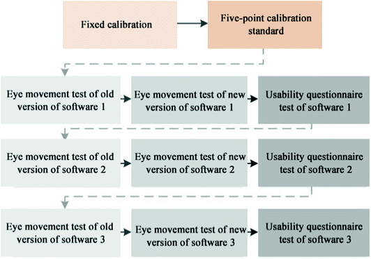
The flow of eye movement test
-
(2)
After participant browse, the interface returns to the main interface. Experimenter A reads the task 2 to participant and ensures that the participant knows experiment tasks well. Then the experiment starts.
-
(3)
The maximum completion time for each task is 30 s, and experimenter B records time. When the time reaches 30 s, the experimenter B stops timing and the task is marked as a failure.
-
(4)
All the experimental tasks of a software are completed by repeating step (2) and (3).
-
(5)
Phone A is replaced by phone B and tasks of another version of the same software are completed by repeating the above steps.
-
(6)
Participant fills the satisfaction test questionnaire.
-
(7)
All tasks of six software are completed by repeating the above steps.

In order to avoid the influence of learning effect on the experiment results, the test sequence of phone A and phone B and the experimental sequence of the three software on the same device are random in the experiment.
2.4.3 Post-test Interview Stage
Interview is divided into two parts. (1) Review and think aloud. Participant and experimenter together reviewed the experiment process of eye movement video. Experimenter asked questions and the participant answered. (2) In-depth interviews. Experimenter A had a in-depth interview with the participant according to the record results. The experiment ended after the interview.
3 Analysis of Experiment Results
The eye movement data obtained from the experiment were recorded and exported by Tobii Studio software. The remaining data were recorded by experimenter and written by participants. All data were analyzed by SPSS software.
3.1 Effectiveness Indicators
3.1.1 Task Completion Rate
Task completion rate (Table 1) refers to the proportion of participant who completed the experiment independently in all participants in each task, and the task completed under the tips of experimenter was not counted as task completion.
The results showed that in the 23 tasks of the old version of software using drawer navigation, 12 tasks were not completed by all participants while only one task of the new version of software using tabbed navigation were not completed by all participants. It can be seen that task completion rate of the old version is far lower than that of the new version. There are several main reasons for unfinished tasks according to the task analysis that the completion rate was lower than 90%. Firstly, participants did not find a drawer navigation icon, or clicked the navigation icon and then searched only in the first level navigation list without entering the secondary navigation, which led to the failure of the task. Secondly, the level of the target is deeper and the participants who did not finish the task were lost in more secondary and tertiary classification. Thirdly, icons are too scattered and the target entrance is not in the main navigation. Fourthly, the secondary navigation is not obvious and can not be directly observed. Fifthly, the poor layout of the page caused that participants had no illusion of content below. Among the above reasons, all but one was caused by page layout, the remaining tasks were not completed due to insufficient navigation design.
3.1.2 Lostness
Lostness [19] is a unit of measurement which measures participants’ effectiveness in finding targets during the completion of a search task and is often used to evaluate the efficiency of navigation and information structures. Lostness can be calculated using the following formula:
Note: N refers to the number of different pages visited when the task is completed. S refers to the total number of pages visited when the task is completed and the pages that are repeatedly visited are marked as the same page. R refers to the minimum or optimal number of pages that must be visited when the task is completed.
The calculated participants’ average lostness of the different versions of six software was shown in Fig. 4. An optimal lostness score should be 0, and when the lostness score is greater than 0.5, the user will have a markedly lost profile.

Average lostness of participants
Significance test of lostness of new and old versions of software was carried out (Table 2). The results showed that there was significant difference (P < 0.01) in the lostness of the old and new version of Netease News, Amazon and Youdao cloud notes. The difference (P < 0.05) in the lostness of DGtle software was significant while there was no significant difference between Zhihu and path. During the experiment, it is found that when using the new version of tabbed navigation, participants were more inclined to try to find more targets by keeping clicking because of the lower cost of mistakes, so the number of click was more. On the contrary, participants were more inclined to look for, confirm the target and then click because of the high cost of mistakes when using the old version of drawer navigation. Therefore, the non-significant difference in lostness of Zhihu and path software was caused by the above reasons to a certain extent.
3.2 Efficiency Indicators
This study selected the following four factors as the efficiency indicators for usability evaluation, namely, the completion time of search task (gaze time), the number of fixation points in browsing task, the time of entering ROI for the first time in browsing task and the time of triggering ROI for the first time.
3.2.1 Task Completion Time (Gaze Time)
During the experiment, the participants were asked to observe the screen when the task began and stop observing after completing the task. After the experiment, the experimenter used Tobii studio software to designate the entire interface area of mobile phone software as ROI 1 to ensure that the time that the participant’s eyesight entered ROI 1 and left ROI 1 was the time to complete the task.
The participants’ average task completion time of the six new and old versions was in shown in Fig. 5. It is found that the task completion time of old version was longer than that of new version. The significance test results were shown in Table 3. There was significant difference in the task completion time of the old and new versions of six software, which further verified the above reasons for the non-significant difference in lostness, namely, participants spent less time completing little different clicks. It indicated that tabbed navigation has a higher page-switching efficiency than drawer navigation.

The average task completion time of six software (s)

Average number of fixation points in browsing task of six software(s)
3.2.2 The Number of Fixation Points
It costs little time for participants to complete the search task and resulting in less fixation points, so that we only count the total number of fixation points when the participants doing the browsing task about old and new versions of 6 software respectively (Fig. 7).

Attention trajectory of tabbed navigation and drawer navigation
Figure 6 shows that in the browsing task, the average number of points showing in the old version is less than the new version, which is valid in all the 6 software. More fixation points indicating that the interface is easier to understand, which means that participants can browse more content and process more information in the same amount of time. Older versions of the software have fewer fixation points, indicating that the interface is difficult to understand and that the participants need to spend longer time to process a message. At the same time, the study of the trajectory of the participants found that trajectory distribution of tabbed navigation is evenly and neatly while drawer is scattered and irregular (Fig. 5).
3.2.3 First Entry Time/First Trigger Time
After the experiment, the navigation area of the interface is defined as ROI 2 by the experimenter which recording when the participants enter the ROI 2 and when they click the navigation for the first time. From this, we calculated the average first entry time for the old and new version of the six software (Fig. 8). And we did an analysis of the difference significance (Table 4).

Average first entry time of six software(s)
Figure 8 shows that when using the new version of the software, the first entry time to the navigation area that participants use is far less than that of the old version, and the difference is significant between the old and the new versions of the six software. As a result, the new version using tabbed navigation is more available than the older version using drawer navigation when the first entry time is rated.
The comparison of the old and new versions of one software in the first entry and trigger time shows that there are 4 kinds of behaviors of the participants: Not enter the ROI 2 (not observed navigation icon), enter but not click the ROI 2, enter but not click immediately, enter and click immediately. In the old versions of the 6 software, there are 3 participants not observing the drawer navigation. During the interview after the experiment, the participants said that the drawer navigation is located in the upper left corner of the interface, people usually pay little attention to this area. After analyzing the hot picture of the interface, it was found that the participants’ eyes were concentrated in the middle and lower area of the screen, and the discoverability of the upper left corner area was not enough. In the task of browsing the old version of the software, there are 9 people entered but not clicked the ROI 2, 16 people entered but not clicked immediately, a total of 25 which is much high than 4 people in the new versions. After the experiment, three participants indicated that they did not understand the meaning of the drawer navigation icon, so they did not click after seeing it, which reflected that the drawer icon was not recognizable enough.
3.3 Satisfaction Index
After the eye tracking test, each group of participants was asked to complete the system usability scale (SUS). The result (Fig. 9 and Table 5) will be used as an index to evaluate the user’s satisfaction. The results showed that participants were more satisfied with the new version of software than the old version of the software, and the difference was significant.

The average satisfaction score of six software(s)
3.4 The Comprehensive Score Based on the Usability Assessment Model
In the process of establishing the evaluation model, the data collected by the eye tracker are different types of data, such as time, number, score and so on. Before calculating the comprehensive score, each data indicator needs to be converted into a unified percentile standard. There are standard scores with full marks, those with no full marks are counted as high scores, other marks are converted according to the ratio, and the standard scores after conversion are shown in Table 6.
After the scores of each index are determined, according to the ratio of each index in the usability assessment model, the comprehensive score of the two navigation styles of the six software can be obtained (Fig. 10). The comprehensive usability scores of tagged navigation are far higher than the drawer navigation, and the difference is very significant (Table 7).

Comprehensive scores of the old and new versions of six software(s)
4 Comparative Analysis of Availability
The experimental results show that both group A with the same software and group B with different types of software are all better using tabbed navigation than using drawer navigation, and there is no difference between the two groups. The result shows that the influence of navigational styles on usability has nothing to do with the type of software. The conclusions drawn from this experiment are summarized as follows:
-
(1)
Drawer navigation is lack of discoverability and recognition.
“What you see is what you get”, when users first touch a software that uses drawer navigation, it is highly likely that they only focus on the front page content because they fail to notice the navigation icon or do not understand the meaning of the icon, and this lack of detection is particularly evident in two level and below navigation.
-
(2)
Drawer navigation has high operation costs and is inefficient.
Even with drawer navigation and a clear software navigation architecture, using drawer navigation requires more clicks and time.
-
(3)
Drawer navigation’s classification is not clear and scattered.
Tabbed navigation usually appears at the top of the interface or the entire line below the interface, the number of tags is around 3 to 5, arranged neatly and classified clearly. While the drawer navigation information will be classified without classification, the participants need to search one by one in all the information which will increase the burden of searching for the participants.
In addition, there are some navigation icons scattered out of the drawer navigation which will result in search inefficiencies for users will be habitual to search after entering the main navigation.
-
(4)
Drawer navigation is poor of navigation.
When the drawer navigation is switched, the navigation hide and the participants can not know where they are. As a result, the subjects continuously return to the homepage during the operation, switch their positions clearly which increases the operating burden. The label-based navigation tab, at the bottom of the page, has not been hidden, participants can always know where they are.
-
(5)
There are different operation modes when using two navigation styles.
When using drawer navigation, participants tend to search first to find the target and then confirm to click; while using tabbed navigation, the participants are accustomed to find the target in the constant switching, thus ensuring the completion of the task to improve efficiency.
-
(6)
In the software with many navigations and deep level, the deeper level of navigation should be shown to users.
Take Amazon as an example, in the older version, the participants need to enter three interfaces with broad categories while they are looking for books in Chinese history. In this case, participants were easily lost in any one of the navigation. In the new version of Amazon, it combines these three pages into one page, reducing the possibility of loss.
-
(7)
Navigation style in the same level needs to be consistent.
Interface design should follow the principle of consistency [20]. There are two types of tagged navigation design style: pure icon, icon and text. But in the same software, the same level of navigation must be the same design style. There are three types of drawer navigation type: pure icon, plain text, icon plus text. And in the same software, the same level of navigation design styles are different, resulting in low completion rate of the task. We can see that consistency is very important in interface design.
-
(8)
Drawer navigation is suitable as a sub navigation style.
Drawer navigation provides greater operating space for users taking account the invisibility of drawer navigation, though it is not suitable as the main navigation. The drawer navigation can be used as a sub navigation style, and the operation functions with low frequency of use can be placed in the drawer, which ensures that the user can efficiently switch using the tagged main navigation and the sub navigation does not occupy the user’s excessive operation interface at the same time.
5 Conclusion and Forecast
Based on the above analysis, it can be concluded that the usability of using tabbed navigation software is superior to that of using drawer navigation software. The difference in availability caused by this navigation style has nothing to do with the type of software, indicating that the reason why a design approach can become a trend has its own reasons. At the same time, this study found the usability of the interface design, which provided a reference for the interface designer to choose the navigation style and design interface.
Although this paper studies the usability of drawer navigation and tagged navigation, the breadth and depth of the research are still not enough. The author believes that follow-up research can be expanded from the following aspects:
-
(1)
This research only chooses six software for comparison, and only six software can not represent all the software. When conditions allow, we should choose more types of mobile software to research;
-
(2)
This research proves that tabbed navigation has better usability. However, the navigation position, navigation structure and icon design in tagged navigation design are all factors that affect the usability. In the follow-up, the usability of different types of tagged navigation can be further studied.
References
Classic Network: Apple App Store is expected to exceed the number of applications 5000000 [DB/OL]. https://www.ishuo.cn/show/1142211.html. Accessed 15 Aug 2016
Qi, H., Wei, B.: Interaction Design, pp. 9–10. Zhejiang University Press, Zhejiang (2012)
Ku, C.J., Doong, J.L., Chen, L.C.: The effects of information architecture and atmosphere style on the usability of an ecology education website. In: Human Centered Design, First International Conference, HCD 2009, Held As. DBLP, pp. 749–757 (2009)
Ku, C.J., Wang, K.H., Doong, J.L., et al.: The effects of touch input modes and navigation bar styles on the usability of an ecology education system. Ac.rd.ttu.edu.tw
Minghui, Q., Liming, Z.: Research on the availability of information architecture in early stage of digital library development. J. Inf. Sci. 5, 18–23 (2014)
Chuchu, L.: Study of website navigation design usability. Jiangsu Normal University (2013)
Shengling, Z.: An empirical study on the influence of navigation structure on the availability of B2C E-commerce website. Huazhong University of Science and Technology (2008)
Xiaofang, Y.: Analysis of business webpage availability based on human-computer interaction interface. In: 2014 International Design Expo China (Wuxi) International Design Fair and Design Education Redesign Series International Conference (III) - Philosophy Concept Paper. China Industrial Design Association, Wuxi Municipal People’s Government (2014). 3
Xiaoming, W.: Visual design of interactive interface mechanism in B2C website. Hubei University of Technology (2012)
Nakagawa, T., Uwano, H.: Usability evaluation for software keyboard on high-performance mobile devices. In: Stephanidis, C. (ed.) HCI 2011. CCIS, vol. 173, pp. 181–185. Springer, Heidelberg (2011). https://doi.org/10.1007/978-3-642-22098-2_37
Jingqian, Z., Renke, H.: Study on usability test of android mobile application interface layout. Packag. Eng. 35(10), 61–64 (2014)
Hao, Y., Kai, C., Dianliang, C.: Availability of flat icons in graphical user interface. Pack. Eng. 16, 99–102 (2016)
Wenming, J., Zhixin, Y., Min, J., et al.: Study on usability of icon design for smartphone application. Chin. J. Ergon. 21(3), 21–24 (2015)
Yongfeng, L., Chen, J., Liping, Z.: A study on the availability of mobile phone icon size based on the preferences of the elderly. Pack. Eng. 16, 103–106 (2016)
Shiwei, C.: Research on context-aware mobile device adaptive user interface design. Zhejiang University (2009)
Fangyuan, C.: Available evaluation of graphical user interface design for smartphone APP based on eye tracker. Packag. Eng. 8, 55–59 (2015)
Yubo, Z., Peilun, R.: Study on design elements of tablet electronic reading software interface based on iOS. Chin. J. Ergon. 19(4), 42–46 (2013)
CNNIC: The 38th Statistical Report on Internet Development in China [DB/OL]. http://www.askci.com/news/hlw/20160805/17065450828_4.shtml. Accessed 5 Aug 2016
Tullis, T., Albert, B.: User Experience Measurement - Collection, Analysis and Presentation, pp. 131–150. Publishing House of Electronics Industry, Beijing (2016)
Shneiderman, B., Plaisant, C.: User Interface Design - Effective Human-Computer Interaction Strategy, 5th edn, pp. 350–353. Publishing House of Electronics Industry, Beijing (2014)
Author information
Authors and Affiliations
Corresponding author
Editor information
Editors and Affiliations
Rights and permissions
Copyright information
© 2018 Springer International Publishing AG, part of Springer Nature
About this paper

Cite this paper
He, C., Gu, J., Ji, Z., Yang, X. (2018). Comparative Study on the Usability of Navigation Style in Iteration Process of Mobile Software. In: Marcus, A., Wang, W. (eds) Design, User Experience, and Usability: Designing Interactions. DUXU 2018. Lecture Notes in Computer Science(), vol 10919. Springer, Cham. https://doi.org/10.1007/978-3-319-91803-7_44
Download citation
DOI: https://doi.org/10.1007/978-3-319-91803-7_44
Published:
Publisher Name: Springer, Cham
Print ISBN: 978-3-319-91802-0
Online ISBN: 978-3-319-91803-7
eBook Packages: Computer ScienceComputer Science (R0)