
Abstract
The number of older adults using technology is steadily increasing. However, this group of users has faced a variety of user interface (UI) usability issues due to various and multiple age-related limitations they have. Four different strategies designed to solve the usability issues older adults have while interacting with user interfaces were analyzed. When placed in a context of mobile interfaces for older adults, Universal Design (UD), Design for Aging, Universal Usability (UU), and Guidelines for handheld mobile device interface design were not found sufficiently complete and inclusive to meet the usability needs of older adults. There is a need to address these usability needs and reconcile inconsistencies between the four strategies. The purpose of this research study was to develop a robust, integrative set of design guidelines based on the four design strategies to ensure usability of mobile devices by older adults. An example of the application of the guidelines to the mobile interface is presented in the paper.
You have full access to this open access chapter, Download conference paper PDF
Keywords
- Accessibility guidelines
- Design for aging
- Human factors
- Older adults
- Universal design
- User interface design
1 Introduction
As the population ages, more older adults are becoming technology users [1]. However, many older adults experience declines in one or more abilities, including reduction in ranges and levels of abilities, such as vision, cognition and dexterity, that can limit their ability to use and interact with technology user interfaces (UIs). Common problems include an inability to understand common icons, taking a long time to complete a task or having poor task performance, making an inordinate number of errors, having difficulty in seeing text, and having problems understanding the relationship between the touchscreen and button manipulation with the response of the interface [2–4]. Despite these issues, product and user interface design can help older adults by incorporating their particular sensory-perception, motor, communication, and mental needs into the design of the interfaces [5].
To address issues of usability of UIs by older adults and others with functional limitations, a number of different design strategies have been proposed. Four of the most widely accepted strategies were analyzed as part of this project: Universal Design, Design for Aging, Universal Usability, and Guidelines for handheld mobile device interface design. Universal Design (UD) [6] is a strategy that supports the diverse ranges and combinations of abilities and limitations that characterize this population of users. The purpose of UD is to design for everyone and by doing so, to overcome the barriers to usability that come with aging [7]. In contrast to UD, Design for Aging [8] focuses on older adults’ specific and singular limitations. Design for Aging is a strategy that explores the factors that constrain the use of products and user interfaces by older adults, as well as aspects of human-computer interface design that accommodate older users with age-associated disabilities and limitations [9]. Based on UD, which was initially intended to cover design of physical environments (e.g. buildings, spaces, products, graphics), Universal Usability (UU) was developed to support usability, inclusivity, and utility of information and communication technology [10]. It consists of the eight guidelines, called the Eight Golden Rules of Interface Design. Guidelines for handheld mobile device interface design [11] were based on UU, modifying its Eight Golden Rules of Interface Design and adding the guidelines applicable to mobile and touchscreen platforms (See Table 1).
When placed in a context of mobile interfaces for older adults none of these four strategies alone were sufficiently complete and inclusive to meet the range and diversity of usability needs of older adults. To address these usability needs and reconcile inconsistencies among the four strategies, a robust, integrative set of guidelines to ensure usability of mobile devices by older adults was developed. This paper reviews the development and content of the Universal Design Mobile Interface Guidelines (UDMIG), which is based on the four strategies, the extension of the original guidelines into a more comprehensive, inclusive set of design guidelines and details the results of a project to design a mobile interface based on these guidelines [12].
2 Development Process of Universal Design Mobile Interface Guidelines (UDMIG)
The first version of the guidelines, UDMIG v.1.0, which has been previously reported [13], was created by applying Design for Aging, Universal Usability, and Guidelines for handheld mobile device interface design to Universal Design guidelines and its seven principles. UDMIG v.1.0 was developed by expanding the UD principles and guidelines to include components of the other three sets of guidelines. Universal Design was kept as an organizing strategy because of its broad application, inclusiveness, and consideration of all users’ ranges and combinations of abilities from the beginning of the design process [14, 15].
However, UDMIG v.1.0 were too simplistic and were based too much on the UD Principles. As a result, they needed further refinement. We further developed and grouped all four design guidelines anew based on the two organizing principles: Person-Environment (P-E) Fit Model [16] and the Guideline Objective as being Prescriptive- vs. Performance-based (See Table 2).
P-E Fit Model. P-E Fit defines the degree to which individual and environmental characteristics match in order to promote healthy aging. Both UDMIG and P-E Fit Theory explore the interaction between aging individuals and their environments [17]. The P-E Fit model examines the match or fit between the competence (or functional ability) of a person and demand of the environment component. When there is a match between person and environment usability is achieved [18]. However, barriers in the environment can create different types and levels of usability problems depending on a person’s functional capacity [19].
Here, the person component is a part of all the guidelines, which all describe how to accommodate people with different abilities. The environment component includes the guidelines that describe the design of the touchscreen mobile interface as well as the space requirements and context of use. It is divided into two parts: Micro Environment guidelines (e), which represent those that pertain to the design of the interactive mobile interface, and Macro Environment guidelines (E), which describe guidelines that direct the design of space and context in which the mobile interface is used. The fit (F) component includes the guidelines that guide the design of the interaction between the older adult and the touchscreen mobile interface (See Table 2).
Prescription vs. Performance. The four strategies were also grouped into the prescription vs. performance guidelines. Performance-based guidelines suggest how design can meet the usability goals and objectives without prescribing what to do. In contrast, prescriptive guidelines specify what should be designed to achieve usability. Only several Design for Aging guidelines are prescriptive, while the other three strategies, including the resulting UDMIG v.2.0, are performance guidelines in whole. In addition, a number of Design for Aging guidelines are both performance and prescriptive (See Table 2).
3 Results
3.1 Cross-Walking the Guidelines
To develop a second version of the UDMIG, the four design strategies were cross-walked and categorized by the P-E Fit and Performance/Prescriptive dimensions. Equivalent guidelines from each of the four strategies were mapped onto each other, while unique guidelines were added to the final set to create UDMIG v.2.0 (See Table 3.).
The final version of UDMIG 2.0 included all of the guidelines, either in whole or modified, from Universal Usability, Guidelines for handheld mobile device interface design, and Universal Design, whereas 4 of the 52 number of the guidelines in Design for Aging were excluded because of their application to desktops (See Table 4). As an example, half of the 8 UU guidelines (i.e., enable frequent users to use shortcuts, offer informative feedback, design dialogs to yield closure, and support internal locus of control) were included in whole as they apply to mobile devices. In contrast, the other half of the guidelines (consistency, reversal of actions, error prevention and simple error handling, and reducing short-term memory load) was modified to fit the touchscreen mobile environment. In addition, 8 UD guidelines that cover low physical effort (Principle 6) and size and space for approach and use (Principle 7) were slightly modified to fit the mobile touchscreen environment.
3.2 UDMIG V.2.0
Resulting UDMIG v.2.0 grouped into Fit (F), Micro Environment (e), and Macro Environment (E) guidelines are presented bellow (See Table 5).
3.3 Application of UDMIG V.2.0
A voting ballot was designed using UDMIG 2.0 to integrate visual and audio output without any special adaptations [20]. EZ Ballot interface was designed to meet the guidelines for Fit (F), Micro Environment (e) and Macro Environment (E) as follows:
Fit Guidelines (F).
-
F1. Same means of use. Ballot interface comprises one voting system to all voters regardless of their abilities.
-
F2. The range of literacy and language skills. Universal and recognizable icons were used for text size, audio speed, and contrast; simple Y for Yes, N for No, and I for instructions, and video the instructions on how to use the ballot.
-
F3. Choice in methods of use. Multiple means of input (e.g., touch, stylus) and navigation methods (e.g., Yes/No touch buttons, scroll, and swipe gestures), and output characteristics, including visual (text size, contrast) and audio (speed, volume) were provided.
-
F4. Support of the internal locus of control. Choices of input and navigation methods, multiple visual (text size, contrast) and audio (speed, volume) characteristics, consistency in system navigation, and easy access to all the content (main control pane) were added to enable older adults feel that they are in control.
-
F5. Right-, left- or no-handed use. Inputs were made usable for right- or left-handed older adults by putting the navigation and touch buttons in places that were in natural locations that were easy to reach with either left of right fingers.
-
F6. Accuracy and precision. Large touch-buttons with enough space between the buttons minimize the need for accuracy and precision.
-
F7. Adaptation to users’ pace. Ballot interface was designed to support any voter’s pace with multiple audio speed options, linear and random access interfaces, and providing a choice for skipping instructions, any races or propositions.
-
F8. Consistency with expectations. The answer to the question on each page was Yes or No. Touchscreen buttons were designed to look touchable.
-
F9. Dialogs that yield closure. Ballot interface provided older adults with the satisfaction of accomplishment and completion, a sense of relief, and an indicator to prepare for the next group of actions.
-
F10. Clear and understandable navigation structure. The instruction was provided to guide on the use of and navigation through the interface, and Review was designed to take the voter to any particular point in the voting system so that older adults could have Clear and understandable navigation structure.
-
F11. Multiple and dynamic contexts. The default setting of the audio output was turned on.
-
F12. Minimized hazards and unintended actions. Yes and No touch buttons were located at the farther left and right sides of the touchscreen, and other touch buttons were placed on the main control panel. The UI began with instructions.
-
F13. Natural body position. Main input buttons were designed at the locations where older adults’ hands are in neutral body position (Figs. 1, 2 and 3).
Fig. 1. 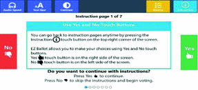
Instruction page 1
Fig. 2. 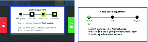
Contrast (left) and audio speed adjustment (right) pages
Fig. 3. 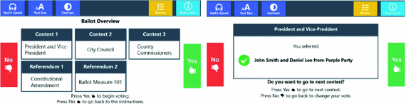
Ballot overview (left) and President and Vice-President selection (right) pages


Micro Environment (e).
-
e1. Design appealing to all. Familiar design features were used, institutional appearance was avoided, and human voice was used as an audio sound.
-
e2. Simple and natural use. Guided linear or random access structure that matches the audio interface were provided, the piece-by-piece process broke down a complex task into several easy-to-complete subtasks to reduce complexity, visual clusters were removed, and multiple contest pages on one screen were avoided.
-
e3. Informative feedback. Two ways for verification, a prompt and a sub-review message were provided.
-
e4. Different modes of use. Simultaneous visual and audio ballot interface and tactile indicators for locating the touch buttons were provided. Universal icons along with redundant cues (e.g., color, text, and symbols) were used.
-
e5. Maximized “legibility” of essential information. Information was displayed in sans serif and in at least two font sizes: 3.0–4.0 mm (the height of an upper case letter in the smaller text size) and 6.3–9.0 mm (the height of an upper case letter in the larger text size); based on the VVSG (Sect. 3.2.2.1.b.) recommendation. The page title was made bold.
-
e6. Simple error handling. The warnings (under voting, over voting) were designed to prevent mistakes during a voting process, with two ways for verification, a prompt and a sub-review message. Review and Instruction touch buttons were located on the main control panel to be easy to find while isolated from the most used Yes/No touch buttons.
-
e7. Easy reversal of actions. Review page provided easy reversal of actions.
-
e8. Low physical effort. The physical buttons were taken out and instead used large touch buttons, multiple actions (e.g., double tap, split-tap) were avoided, and a single tap was used, tactile icons were used to navigate the older adults’ fingers to the location of the touch buttons to ensure Low physical effort.
-
e9. Variations in hand and grip size. Large touch buttons and large tactile icons on the cover of the screen, and sufficient space between buttons were designed for different size of fingers and grip (Fig. 4).
Fig. 4. 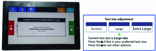
Tactile cover (left) and text size adjustment page (right)
Fig. 5. 
A prompt message (left) and review page (right)


Macro Environment (E).
-
E1. Appropriate lighting and glare. Adjustable display and adequate lighting need to be provided at the voting poll.
-
E2. Adjustable positioning. Ensure adjustable height, depth, width, and angle from a seating position at the voting poll.
-
E3. Minimized background noise and reverberation. Wireless headphones should be provided to voters.
-
E4. Space for the use of assistive devices needs to be arranged at the voting poll (Fig. 5).
4 Discussion
Older adults as mobile technology users are in a need of user interfaces that fit their needs and abilities. While Universal Design, Universal Usability, and Guidelines for handheld mobile device interface design all guide design of interfaces, when placed in a context of designing interactive mobile user interfaces for older adults these were not found complete. Moreover, UU and UD guidelines were not originally developed for mobile interfaces. UD recently included this platform to a certain extent. In addition, Design for Aging focuses on older adults with their particular limitations usually associated with this end-user group, failing to acknowledge ranges and combinations of limitations older adults have. Adaptation and addition of some of the guidelines were necessary to accommodate design for the interactive mobile interfaces for older adults.
UDMIG v.2.0 are an inclusive and complete set of the guidelines developed to guide design process of interactive mobile interfaces for older adults. They are divided into three sets of guidelines: Fit (F), Micro (e) and Macro Environment (E). Fit Guidelines relate to the interaction between older adults and their environment, Micro Environment guidelines guide design of the touchscreen mobile interface, and Macro Environment guidelines help with the design of the space and context of use. Person component is present in all the guidelines, which all describe how to accommodate people with different abilities, and it was not used as a way of grouping the UDMIG.
The guidelines were based on the established strategies for desktop and mobile user interfaces for older adults and published research on interactive mobile interfaces and designing for aging population. Their significance is in their completeness, and integration of the four common strategies for designing interactive mobile interfaces for older adults. This unique set of the guidelines is useful to Human-Computer Interaction (HCI) researchers working in a field of usability and mobile user interface design as well as to industry leaders who develop mobile devices and applications for our aging population.
References
Fisk, A.D., et al.: Designing for older adults: principles and creative human factors approaches. CRC Press, Boca Raton (2012)
Becker, S.A.: A study of web usability for older adults seeking online health resources. ACM Trans. Comput.-Hum. Interact. (TOCHI) 11(4), 387–406 (2004)
Bederson, B.B., et al.: Electronic voting system usability issues. In: Proceedings of the SIGCHI Conference on Human Factors in Computing Systems. ACM (2003)
Chadwick-Dias, A., McNulty, M., Tullis, T.: Web usability and age: how design changes can improve performance. In: ACM SIGCAPH Computers and the Physically Handicapped. ACM (2003)
Morrell, R.W.: Older Adults, Health Information, and the World Wide Web. Psychology Press, Hillsdale (2001)
Mace, R.: Universal Design: Housing for the Lifespan of all People. US Department of Housing and Urban Affairs, Washington DC (1988)
Law, C.M., et al.: A systematic examination of universal design resources: part 1, heuristic evaluation. Univ. Access Inf. Soc. 7(1–2), 31–54 (2008)
Nichols, T.A., Rogers, W.A., Fisk, A.D.: Design for aging. In: Salvendy, G. (ed.) Handbook of Human Factors and Ergonomics, 3rd edn, pp. 1418–1445. Wiley, Hoboken (2006)
Zajicek, M. Interface design for older adults. In: Proceedings of the 2001 EC/NSF Workshop on Universal Accessibility of Ubiquitous Computing: Providing for the Elderly. ACM (2001)
Schneiderman, B.: Eight golden rules of interface design. Disponible en (1986)
Gong, J., Tarasewich, P.: Guidelines for handheld mobile device interface design. In: Proceedings of DSI 2004 Annual Meeting. Citeseer (2004)
Kascak, L., Rébola, C.B., Sanford, J.: Integrating Universal Design (UD) principles and mobile design guidelines to improve design of mobile health applications for older adults. In: 2014 IEEE International Conference on Healthcare Informatics (ICHI). IEEE (2014)
Kascak, L.R., Lee, S., Liu, E.Y., Sanford, J.A.: Universal Design (UD) guidelines for interactive mobile voting interfaces for older adults. In: Antona, M., Stephanidis, C. (eds.) UAHCI 2015. LNCS, vol. 9178, pp. 215–225. Springer, Heidelberg (2015)
Ruptash, S.: Universal Design through Passion, Knowledge and Regulations? Trends in Universal Design, p. 24 (2013)
Sanford, J.A.: Universal Design as a Rehabilitation Strategy: Design for the Ages. Springer, New York (2012)
Lawton, M.P., Nahemow, L.: Ecology and the Aging Process. Lawton, Spokane (1973)
Nahemow, L.: The ecological theory of aging: Powell Lawton’s legacy. The many dimensions of aging, pp. 22–40 (2000)
Iwarsson, S.: A long-term perspective on person–environment fit and ADL dependence among older Swedish adults. Gerontologist 45(3), 327–336 (2005)
Iwarsson, S., Ståhl, A.: Accessibility, usability and universal design-positioning and definition of concepts describing person-environment relationships. Disabil. Rehabil. 25(2), 57–66 (2003)
Lee, S., et al.: EZ ballot with multimodal inputs and outputs. In: Proceedings of the 14th International ACM SIGACCESS Conference on Computers and Accessibility. ACM (2012)
Author information
Authors and Affiliations
Corresponding author
Editor information
Editors and Affiliations
Rights and permissions
Copyright information
© 2016 Springer International Publishing Switzerland
About this paper
Cite this paper
Ruzic, L., Lee, S.T., Liu, Y.E., Sanford, J.A. (2016). Development of Universal Design Mobile Interface Guidelines (UDMIG) for Aging Population. In: Antona, M., Stephanidis, C. (eds) Universal Access in Human-Computer Interaction. Methods, Techniques, and Best Practices. UAHCI 2016. Lecture Notes in Computer Science(), vol 9737. Springer, Cham. https://doi.org/10.1007/978-3-319-40250-5_10
Download citation
DOI: https://doi.org/10.1007/978-3-319-40250-5_10
Published:
Publisher Name: Springer, Cham
Print ISBN: 978-3-319-40249-9
Online ISBN: 978-3-319-40250-5
eBook Packages: Computer ScienceComputer Science (R0)