
Abstract
The reflective stage, which is crucial for behavior change, can be facilitated with suitable visualizations that allow users to answer specific questions with regard to their health data. To date, effective visualizations which combine time series data and the appraisal of this data in one chart are, however, rare. To close this gap in research, twenty participants compared two alternative long-term visualizations of health behavior: an accumulated bar chart and a point chart which both include appraisals of the underlying health data based on current recommendations of leading health organizations, such as the World Health Organization or the European Food Information Council. Participants answered three types of question (progress over time, correlations between different health behaviors, and health consciousness). The sequence of visualization for the underlying data sets was cross balanced over participants. The accumulated bar chart resulted in more trials in which participants were unable to answer. In some cases, this type of visualization also resulted in biased interpretations with regard to progress over time and health consciousness. Summarizing, we recommend the point chart, in which the background is colored according to the recommendation of the respective health behavior. Both types of visualization are, however, not optimal for the identification of correlations.
You have full access to this open access chapter, Download conference paper PDF
Keywords
1 Introduction
Followers of the quantified self trend assume that collecting biological, physical, behavioral, or environmental information can help to improve one’s well-being and performance [1]. In line with this idea, self-monitoring is a frequently used method in behavior change interventions [2]. One risk of this approach is, however, that self-monitoring applications do not help people to reach their personal, actual goals (e.g., reducing subjective stress level), but the collection of data itself becomes the goal [3]. Therefore, the reflective stage [4, 5] is a crucial one before the intended behavior change can occur [6]. To facilitate this stage, it is essential to provide suitable visualizations to allow users to answer health-related questions and to decide whether a certain behavior should be maintained or adapted [7]. Some of these questions about the user’s behavior have already been identified by Li and colleagues [8]. In the context of the visualization of long-term health data we suggest that the following three types of question are of special interest:
-
1.
Progress over time (Has my consumption of e.g. alcohol changed over time?)
-
2.
Correlations between different health behaviors (Is there a correlation between e.g. my subjective stress level and sleep behavior?)
-
3.
Health consciousness (Am I health conscious with regard to e.g. my consumption of coffee?)
2 Data Visualization in Health Apps
Some data visualization heuristics which facilitate the reflection of personal health data are summarized by Cuttone et al. [7]. Aside from avatars [9, 10], notifications [11], and abstract arts [12], charts [5, 13, 14] are the most common form of data visualization in modern health technology.
The common representation for explorations of patterns in time series data is the line plot [7]. The bar chart with time on the x-axis is also often used for long-term visualization (e.g., Sony LifeLog, Fitbit). Superficially, these visualizations seem to be perfect for the first two question types. However, they do not take into consideration how the respective health behavior should be appraised and therefore do not allow making decisions for or against behavior change [15]. Fitbit saves this gap, e.g., by providing additional goal fulfillment charts, which depict in a colored ring to which degree the personal goal of the user is achieved. To date, effective visualizations, which combine time series data and the appraisal of this data in one chart are, however, rare.
3 Methods
3.1 Types of Visualization
To solve this issue, we compared two alternative long-term visualizations of health behavior: an accumulated bar chart and a point chart (see Fig. 1). In the accumulated bar chart, each bar represents the appraisals of data entries for one week (red = not recommendable, yellow = might still be recommendable, green = recommendable). In the point chart, time is displayed on the x-axis and the data values on the y-axis. The background is colored according to current health recommendations by the World Health Organization [16], the European Food Information Council [17], the German Nutrition Society [18], and the National Sleep Foundation [19, 20].

(a): Accumulated bar chart based on appraisals of data entries for one week for each bar. (b): Point chart with time on x-axis, value on y-axis, the background is colored according to the respective health recommendations (red = not recommendable, yellow = might still be recommendable, green = recommendable) (Color figure online)
In order to compare these two designs with respect to their suitability to answer the presented question types, four fictional datasets covering the following ten health behaviors and stress-related factors were constructed: sleep [21, 22], exercise [16], portions of unsweetened drinks [23], fruits and vegetables [24], caffeinated drinks [17], alcoholic drinks [25] positive [26] and negative events [27,28,29], mood [30], and subjective stress level. The data sets covered a period of 8 and 16 weeks.
3.2 Participants
Twenty young adults participated. All except one (a trainee) were students of the University of Kaiserslautern. The mean age was 23.1 years (age range = 20-27 years, standard deviation = 1.80 years). Participants were randomly assigned to two groups which did not differ with respect to gender distribution (5 males and 5 females per group). The mean age was, however, higher in group A (mean age = 24 years) than in group B (mean age = 22 years), t(18) = 2.53, p = .02. All participants had former experience with smartphones or tablets.
3.3 Procedure
All participants answered three questions with regard to progress over time, correlations between different health behaviors and stress-related factors as well as health consciousness for all four datasets (3 × 3 × 4 = 36 questions). The sequence of visualization for the data sets was cross balanced over participants (group A: bar chart for dataset 1 + 2, point chart for dataset 3 + 4; group B: point chart for dataset 1 + 2, bar chart for dataset 3 + 4). After having completed the questions for each type of visualization, participants were asked to rate the usability of each type of diagram based on the following subscales of the Mobile Application Rating Scale (MARS) [31]: performance, ease of use, navigation, layout, visual information, graphics, and visual appeal. The whole procedure was embedded into an interview to allow general comments justifying why the respective answers were chosen. The interview took about 45 min.
3.4 Data Analysis
The two types of visualization were compared with regard to differences in response pattern for each question, the number of questions for which participants were unable to pick an option, perceived difficulty to answer the question, as well as usability aspects based on MARS [31].
4 Results
4.1 Response Patterns for the Two Types of Visualization
Differences in response pattern between the two types of visualization were found for all question types, but not in each trial. Pearson’s Chi2 tests revealed significant differences for the following questions and data sets.
Progress Over Time
-
“How has the consumption of fruits and vegetables developed over time?” resulted in the following response patterns: bar chart with 90% “improved” and 10% “stayed the same” answers, point chart with 50% “improved” and 50% “fluctuating” answers, χ2(2) = 7.14, p = .03 (see Fig. 2).
Fig. 2. 
Both versions of visualization for the consumption of fruits and vegetables in data set 2 (left bar chart and upper point chart) and the consumption of caffeinated drinks in data set 3 (right bar chart and lower point chart).
-
“How has the amount of caffeinated drinks developed over time?” resulted in the following response patterns: bar chart with 90% “increased” and 10% “stayed the same” answers, point chart with 10% “increased” and 90% “stayed the same“answers, χ2(1) = 12.80, p ≤ .01 (see Fig. 2).

Correlations
-
“Is there a correlation between the amount of exercises and the consumption of water?” resulted in the following response patterns: bar chart with 20% “unable to pick an option” and 80% “no correlation” answers, point chart with 50% “positive correlation” and 50% “no correlation” answers, χ2(2) = 7.69, p = .02. (actual correlation of scales: r = .51, see Fig. 3).
Fig. 3. 
Both versions of visualization for the amount of exercise in data set 4 (left bar chart and upper point chart) and the consumption of water in data set 4 (right bar chart and lower point chart).
-
“Is there a correlation between the amount of sleep and the consumption of alcohol?” resulted in the following response patterns: bar chart with 100% “no correlation” answers, point chart with 10% “positive correlation”, 50% “no correlation”, and 40% “unable to pick an option” answers, χ2(2) = 6.67, p ≤ .04. p = .02. (actual correlation of scales: r = .09, see Fig. 4).
Fig. 4. 
Both versions of visualization for the amount of sleep in data set 4 (left bar chart and upper point chart) and the consumption of alcohol in data set 4 (right bar chart and lower point chart).


Health Consciousness
-
“Is the person who inserted these data health conscious with regard to the amount of exercises?” resulted in the following response patterns: bar chart with 90% “yes” and 10% “no” answers, point chart with 60% “yes” and 40% “no” answers, χ2(1) = 5.50, p = .02 (see Fig. 5).
Fig. 5. 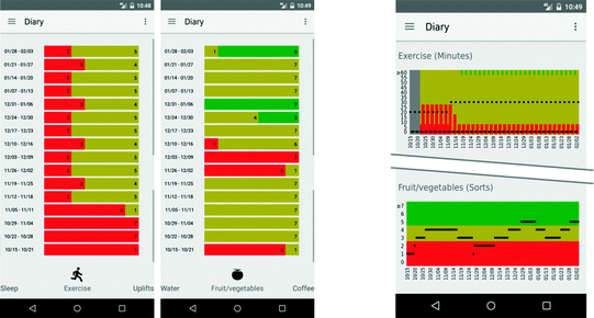
Both versions of visualization for the amount of exercise in data set 2 (left bar chart and upper point chart) and the consumption of fruits and vegetables in data set 2 (right bar chart and lower point chart).
-
“Is the person who inserted these data health conscious with regard to his or her consumption of fruits and vegetables?” resulted in the following response patterns: bar chart with 20% “yes” and 80% “no” answers, point chart with 100% “yes” and 0% “no” answers, χ2(2) = 20.00, p ≤ .01 (see Fig. 5).

4.2 Inability to Pick an Option
Concerning the inability to pick an option, an analysis of variance (ANOVA) with sequence of visualization types as between subject factor (group A: bar chart for dataset 1 + 2, point chart for dataset 3 + 4; group B: point chart for dataset 1 + 2, bar chart for dataset 3 + 4) and the within subject factors question type (type 1 = change over time, type 2 = correlations, type 3 = health consciousness) and data sets (data set 1, data set 2, data set 3, data set 4) revealed a main effect of question type, \( \text{F}(2\text{,}36) = 14.28, \text{p}<.01, \eta_\text{p}^{2} = .44 \), that can be explained by the fact that there was no single trial for question type 1 (progress over time) in which participants were unable to choose an option. In contrast, the other two question types (correlations and health consciousness) did not differ from each other, t(19) = 1.44, p = .17. Moreover, the bar chart (group A data set 1 + 2 and group B data set 3 + 4) resulted in more trials in which participants could not pick an option compared to the point chart (group A data set 1 + 2 and group B data set 3 + 4), t(19) = 2.46, p = .02, indicated by a significant interaction between sequence of visualization types and data sets, \( \text{F}(1\text{,}18) = 5.76, \text{p}<.03, \eta_\text{p}^{2} = .24 \) (see Fig. 6).

Mean sum of “I don’t know answers” for all three question types, illustrated for the two groups and the different datasets. Trials in which data sets were presented in the bar chart (group A data set 1 + 2 and group B data set 3 + 4) resulted in more “I don’t know” answers, as compared to trials in which the data sets were presented in the point chart (group A data set 3 + 4 and group B data set 1 + 2).
4.3 Perceived Difficulty to Answer
The ANOVA for perceived difficulty of answers revealed the following results: There was no systematic difference between the two versions of visualization for perceived difficulty. There was a main effect of question type, F(2,36) = 23.97, p < .01, ηp2 = .57, indicating that question type 2 (correlations) is perceived as more difficult compared to question type 1 (change over time), t(19) = 4.64, p < .01) or question type 3 (health consciousness), t(19) = 7.45, p < .01, which did not differ from each other, t(19) = .81, p = .43.
4.4 MARS Ratings
Finally, one ANOVA for each MARS subscale was conducted. The results for the usability aspects were mixed with preference for the point chart with regard to performance, F(1,18) = 6.79, p = .02, ηp2 = .27, and preference for the bar chart with regard to graphics, F(1,18) = 9.97, p < .01, ηp2 = .36 and visual appeal, F(1,18) = 7.13, p = .02, ηp2 = .28. No preferences were found for the remaining scales (ease of use, navigation, layout, and visual information). The overall usability scores were medium to high for both types of visualizations.
5 Discussion
Based on these results, we will discuss the advantages and disadvantages of both versions of visualization and refer to additional tools for the effective visualization of correlations in health apps.
5.1 Comparison of Both Visualization Types
Based on the pattern of results, we identified three main differences be-tween the two types of visualization:
-
1.
Detection of fluctuations
-
2.
Interpretation of the raw data
-
3.
Interpretation of the full color spectrum
Besides the identification of trends within time series data, the detection of periodic patterns has been pointed out to be fundamental [7, 32]. The fluctuations in data set 2 (see Fig. 2) were, however, more frequently detected when presented in the point chart, indicating that the accumulation algorithm of the bar chart covers up some of the periodic variance in the original data.
Moreover, our results support the assumption that participants used the information from the raw data and the y-axis when it was available. Passing the border from green to yellow in data set 3 was interpreted as an increasing trend for coffee intake in the accumulated bar chart, whereas participants who rated the point chart mostly did not observe this trend, as they probably considered the total amount of cups (see Fig. 2). This means that people do not seem to be overloaded by too much information when both the raw data and the corresponding appraisals are provided. This is also supported by the fact that ratings of perceived difficulty to answer did not differ between the two types of visualization and that the point chart resulted in fewer trials in which participants were unable to pick an option.
Finally, the presentation of the full color spectrum of appraisals also seems to play a role. Persons rated the exercise sheet of data set 2 more frequently as to be health conscious when it was presented in the bar chart (see Fig. 5); probably because in contrast to the point chart, it was not obvious that the full color spectrum also includes green ratings. This bias might be stronger for inexperienced users of such a system, as the traffic light feedback system should be adopted easily over time [33].
Taken together, although both charts resulted in satisfying overall usability scores, our findings are in favor of the point chart, as it allows detecting fluctuations more easily and does not distort the original data. There were no indications of information overload when both raw data and appraisal are presented within one chart.
5.2 Visualization of Correlations
The analysis of the participants’ perceived difficulty to answer revealed that the questions regarding correlations were rated with the highest difficulty. This was found for both types of visualization. However, the number of trials in which participants were unable to pick an option was higher for the bar chart. As a result, we recommend using the point chart instead of a cumulated bar chart.
Some participants also suggested using trend lines instead of single points only to facilitate the observation of correlations in the point charts, as this approach reduces unavoidable noise [7]. The most critical factor that complicated the observation of correlations, however, was that the two diagrams were not displayed simultaneously on the screen. Therefore, we recommend using an additional tool in which two point charts or trend lines can be displayed at the same time. Other approaches to visualize correlations have been summarized in Cuttone et al. [7], including scatterplots, scat-terplot matrices, and corrgrams [34].
5.3 Conclusion
The visualization of long-term health data is a challenging task. We suggest that by coupling quantified-self data and appropriate feedback, users can decide more easily, whether they are reaching their goals and if not, how they can adapt their behavior to achieve them. This work provides first insights how appraisals of the respective health data can be integrated by means of a traffic lights feedback system in a bar or point chart.
References
Swan, M.: The quantified self: fundamental disruption in big data science and biological discovery. Big Data 1, 85–99 (2013)
Abraham, C., Michie, S.: A taxonomy of behavior change techniques used in interventions. Health Psychol.: Official J. Div. Health Psychol. Am. Psychol. Assoc. 27, 379–387 (2008)
Marengo, A., Rapp, A.: Visualization of human behavior data. In: Huang, M.L., Huang, W. (eds.) Innovative Approaches of Data Visualization and Visual Analytics, pp. 236–265. IGI Global, Hershey (2014)
Fleck, R., Fitzpatrick, G.: Reflecting on reflection. In: Viller, S., Kraal, B., Brereton, M. (eds.) OZCHI 2010 [electronic resource]. Conference Proceedings, Brisbane, Australia, 22–26 November 2010, p. 216. ACM Press, New York (2010)
Li, I., Dey, A., Forlizzi, J.: A stage-based model of personal informatics systems. In: Mynatt, E., Schoner, D., Fitzpatrick, G., Hudson, S., Edwards, K., Rodden, T. (eds.) CHI 2010 - We Are HCI. Conference Proceedings : The 28th Annual CHI Conference on Human Factors in Computing Systems, p. 557. Association for Computing Machinery, New York (2010)
Fogg, B.J.: Persuasive technology. Ubiquity 2002, 2 (2002)
Cuttone, A., Petersen, M.K., Larsen, J.E.: Four data visualization heuristics to facilitate reflection in personal informatics. In: Stephanidis, C., Antona, M. (eds.) UAHCI 2014. LNCS, vol. 8516, pp. 541–552. Springer, Cham (2014). doi:10.1007/978-3-319-07509-9_51
Li, I., Dey, A.K., Forlizzi, J.: Understanding my data, myself. In: UbiComp (ed.) Proceedings of the 2011 ACM Conference on Ubiquitous Computing & co-located workshops Large 2011, MLBS 2011, NoMe-IoT 2011, PETMEI 2011, RDURP 2011, SAGAware 2011, SCI 2011, TDMA 2011, UAAII 2011, UbiCrowd 2011, Beijing, China, 17–21 September 2011, p. 405. ACM, New York (2011)
Lin, J.J., Mamykina, L., Lindtner, S., Delajoux, G., Strub, H.B.: Fish‘n’steps: encouraging physical activity with an interactive computer game. In: Dourish, P., Friday, A. (eds.) UbiComp 2006. LNCS, vol. 4206, pp. 261–278. Springer, Heidelberg (2006). doi:10.1007/11853565_16
Froehlich, J., Dillahunt, T., Klasnja, P., Mankoff, J., Consolvo, S., Harrison, B., Landay, J.A.: UbiGreen. In: Greenberg, S, et al. (ed.) The 27th Annual CHI Conference on Human Factors in Computing Systems. CHI 2008 (2008), p. 1043. Association for Computing Machinery, New York (2009)
Bentley, F., Tollmar, K.: The power of mobile notifications to increase wellbeing logging behavior. In: Mackay, W.E., Brewster, S., Bødker, S. (eds.) CHI 2013. Changing Perspectives - The 31st Annual CHI Conference on Human Factors in Computing Systems, Conference Proceedings, Paris, France, 27 April–2 May 2013, p. 1095. ACM, New York (2013)
Fan, C., Forlizzi, J., Dey, A.K.: A spark of activity. In: Dey, A.K., Chu, H.-H., Hayes, G.R. (eds.) UbiComp 2012. Proceedings of the 2012 ACM Conference on Ubiquitous Computing, Pittsburgh, USA, 5–8 September 2012, p. 81. Association for Computing Machinery, New York (2012)
Li, I., Medynskiy, Y., Froehlich, J., Larsen, J.: Personal informatics in practice. In: Konstan, J.A. (ed.) Proceedings of the 2012 Annual Conference Extended Abstracts on Human Factors in Computing Systems, p. 2799. ACM, New York (2012)
Cuttone, A., Lehmann, S., Larsen, J.E.: A mobile personal informatics system with interactive visualizations of mobility and social interactions. In: Singh, V.K., Chua, T.-S., Jain, R., Pentland, A.S. (eds.) PDM 2013. Proceedings of the 1st ACM International Workshop on Personal Data Meets Distributed Multimedia, Barcelona, Spain, 22 October 2013, pp. 27–30. Association for Computing Machinery, New York (2013)
DiClemente, C.C., Marinilli, A.S., Singh, M., Bellino, L.E.: The role of feedback in the process of health behavior change. Am. J. Health Behav. 25, 217–227 (2001)
World Health Organization: Global recommendations on physical activity for health. http://www.who.int/dietphysicalactivity/leaflet-physical-activity-recommendations.pdf
European Food Information Council (EUFIC): Koffein und Gesundheit. http://www.eufic.org/article/de/artid/Koffein-Gesundheit/
Deutsche Gesellschaft für Ernährung (German Nutrition Society): 10 guidelines of the German Nutrition Society (DGE) for a wholesome diet. https://www.dge.de/index.php?id=322
National Sleep Foundation: National Sleep Foundation Recommends New Sleep Times. http://sleepfoundation.org/how-sleep-works/how-much-sleep-do-we-really-need, bzw. http://sleepfoundation.org/media-center/press-release/national-sleep-foundation-recommends-new-sleep-times
Hirshkowitz, M., Whiton, K., Albert, S.M., Alessi, C., Bruni, O., DonCarlos, L., Hazen, N., Herman, J., Katz, E.S., Kheirandish-Gozal, L., et al.: National sleep foundation’s sleep time duration recommendations: methodology and results summary. Sleep Health 1, 40–43 (2015)
Alvarez, G.G., Ayas, N.T.: The impact of daily sleep duration on health: a review of the literature. Prog. Cardiovasc. Nurs. 19, 56–59 (2004)
Gallicchio, L., Kalesan, B.: Sleep duration and mortality: a systematic review and meta-analysis. J. Sleep Res. 18, 148–158 (2009)
Popkin, B.M., D’Anci, K.E., Rosenberg, I.H.: Water, hydration, and health. Nutr. Rev. 68, 439–458 (2010)
Oyebode, O., Gordon-Dseagu, V., Walker, A., Mindell, J.S.: Fruit and vegetable consumption and all-cause, cancer and CVD mortality: analysis of Health Survey for England data. J. Epidemiol. Community Health 68, 856–862 (2014)
Deutsche Gesellschaft für Ernährung (German Nutrition Society): Prävention durch moderaten Alkoholkonsum? https://www.dge.de/uploads/media/DGE-Pressemeldung-aktuell-02–2010_Alkohol-Karneval.pdf
Cohen, S., Hoberman, H.M.: Positive events and social supports as buffers of life change stress1. J Appl Soc. Pyschol. 13, 99–125 (1983)
DeLongis, A., Coyne, J.C., Dakof, G., Folkman, S., Lazarus, R.S.: Relationship of daily hassles, uplifts, and major life events to health status. Health Psychol. 1, 119–136 (1982)
Kanner, A.D., Coyne, J.C., Schaefer, C., Lazarus, R.S.: Comparison of two modes of stress measurement: daily hassles and uplifts versus major life events. J. Behav. Med. 4, 1–39 (1981)
Lu, L.: Daily hassles and mental health: a longitudinal study. Br. J. Psychol. 82(4), 441–447 (1991). (London, England: 1953)
DeLongis, A., Folkman, S., Lazarus, R.S.: The impact of daily stress on health and mood. Psychological and social resources as mediators. J. Pers. Soc. Psychol. 54, 486–495 (1988)
Stoyanov, S.R., Hides, L., Kavanagh, D.J., Zelenko, O., Tjondronegoro, D., Mani, M.: Mobile app rating scale: a new tool for assessing the quality of health mobile apps. JMIR mHealth and uHealth 3, e27 (2015)
Larsen, J.E., Cuttone, A., Lehmann, S.: QS Spiral: visualizing periodic quantified self data. In: CHI 2013: Changing Perspectives, Conference Proceedings - The 31st Annual CHI Conference on Human Factors in Computing Systems, Paris, France, 27 April–2 May 2013. ACM, New York (2013)
Eikey, E., Poole, E., Reddy, M.: Information presentation in health apps and devices: the effect of color, distance to goal, weight perception, and interest on users’ self-efficacy for accomplishing goals. In: iConference 2015 Proceedings (2015)
Friendly, M.: Corrgrams. Am. Stat. 56, 316–324 (2002)
Author information
Authors and Affiliations
Corresponding author
Editor information
Editors and Affiliations
Rights and permissions
Copyright information
© 2017 Springer International Publishing AG
About this paper
Cite this paper
Christmann, C.A., Zolynski, G., Hoffmann, A., Bleser, G. (2017). Effective Visualization of Long Term Health Data to Support Behavior Change. In: Duffy, V. (eds) Digital Human Modeling. Applications in Health, Safety, Ergonomics, and Risk Management: Health and Safety. DHM 2017. Lecture Notes in Computer Science(), vol 10287. Springer, Cham. https://doi.org/10.1007/978-3-319-58466-9_22
Download citation
DOI: https://doi.org/10.1007/978-3-319-58466-9_22
Published:
Publisher Name: Springer, Cham
Print ISBN: 978-3-319-58465-2
Online ISBN: 978-3-319-58466-9
eBook Packages: Computer ScienceComputer Science (R0)