
Abstract
The explosion of information has led to the proliferation of Big Data as an influential business and research domain. Data center infrastructure management is a sector largely affected by Big Data, however the visualization of, and interaction with, Big Data in the context of a data center room is a challenging endeavor. This paper presents the iterative design and development of a 3D Data Centre Visualization application featuring gesture-based interaction with a high resolution large screen display. As result of the design iterations three distinct system versions were developed, evolving the supported functionality, the User Interface and the interaction methods. The paper presents the evolution of the system, the results of an expert-based evaluation which was carried out during the development life-cycle, as well as the challenges faced and lessons learned regarding the User Experience design of a big data application deployed in a large display, supporting gestural interaction.
You have full access to this open access chapter, Download conference paper PDF
Keywords
- Big data
- Big data visualization
- 3D data center
- Data center infrastructure management
- Gestural interaction
- Natural interaction
- Large screen display
- User experience design
- UX
1 Introduction
Information Technology has penetrated all aspects of life, leading to the era of born digital natives [1] who do not know life without smartphones, tablets or computers. This paradigm shift has led to an “explosion” of data and the proliferation of Big Data as part of every sector and function of the global economy [2]. Data center infrastructure management is a sector largely affected by Big Data, as it provides the means for supporting Big Data storage, retrieval and monitoring [3], while it uses Big Data itself.
Several challenges have been identified in the literature regarding Big Data, many of which refer to the visualization of data in order to be meaningful and useful for the targeted audiences [4, 5]. This paper presents the User Interface of a 3D Data Centre Visualization application [3] and the interaction techniques employed, identifies specific UI design and interaction challenges that were encountered and addressed during the iterative process that was followed, and ends up with design tips that pertain to gesture-based interaction with large screen displays for the manipulation of the 3D Data Centre.
The paper is structured as follows: Sect. 2 discusses related work in terms of big data visualization and gesture-based interaction with large screen displays. Section 3 provides an overview of the 3D Data Centre and describes how its UI and interaction design evolved during an iterative process. The lessons learned are summarized in Sect. 4, while Sect. 5 provides conclusions and future work directions.
2 Related Work
Data centers are routinely employed by large companies for storage, web search and large-scale computations; with the rise of cloud computing, service hosting in data centers has become a multibillion dollar business that plays a crucial role in the future Information Technology (IT) industry [6]. Although several solutions for data center management are available, it has been reported that there is a lack of efficient tools to assist operators in handling situations that cannot be addressed by autonomic control systems [7], a gap which can be bridged using appropriate visualization tools. On the other hand, in terms of visualization approaches, technologies are now mature to move beyond the desktop metaphor towards new multi-sensory modalities supporting novel interactions [8]. For instance, it is reported that using a larger display with more pixels increases the number of observations made by the users, and affords the acquisition of more complex and integrative insights [9]. The 3D Data Centre Visualization application presented in this paper takes advantage of novel interaction technologies with the aim to address users’ needs in the context of a control room, and thus supports gesture-based interaction with a large display. Two main issues were explored during the iterative design of the application, namely data visualization and interaction techniques for the given context.
Data visualization can be characterized as a sense-making tool, assisting users to identify meaningful correlations and explore them to develop models and theories [10], and make good decisions [11]. A challenge for big data visualization is the large size and high dimension of Big Data, which can be tackled using not only aesthetics but also functionality to achieve intuitive and effective knowledge presentation [4]. There is currently an important amount of research and innovation in the field of visualization, i.e., techniques and technologies used for creating images, diagrams, or animations to communicate, understand, and improve the results of big data analyses, such as tag clouds, clustergrams, history flows, and spatial information flows [2]. A widely used Big Data visualization technique is OLAP [12], which allows users to analyze multidimensional data interactively from various perspectives. An important limitation of 2D visualizations such as the aforementioned ones is the increased clutter which is imposed, and which discards humans’ visual system’s natural ability to perceive and interpret 3D spaces [13]. A 3D visualization, on the other hand, allows designers the freedom of layering information in 3D to reduce clutter and potentially improve comprehension and performance [13]. Nevertheless, user interaction in 3D user interfaces is challenging due to the additional degrees of freedom, requiring complex manipulation controls and a rich interaction vocabulary [14].
Gestures are a powerful feature of human expression, which can be used in such 3D UIs, however an important challenge is that although gesture-based systems and natural interfaces in general are widely accepted and have great potential, gestures are unconstrained and are apt to be performed in an ambiguous manner [15]. Furthermore, gesture-based systems lack standardization, since a universal gesture vocabulary does not exist yet [16], so a good gesture vocabulary may only match one specific application and user group. A gesture vocabulary should be tailored for the specific application and context of use so as to contain gestures that are ergonomic, intuitive, easy to perform and remember, which are metaphorically and iconically appropriate for the addressed functionality [17]. The biggest problem with making gestures self-revealing is getting over the idea that gestures are somehow natural or intuitive, as it has been shown that users cannot and will not guess any custom gesture language [18]. This problem can be overcome if UI affordances are put on the screen to which users can react. Furthermore, research in gestural vocabularies has suggested that gestures triggering manipulation of objects should be dynamic iconic representations of the motion required for the manipulation, rather than static iconic hand poses, while gestures to trigger tasks that suggest the use of a tool should pantomime the actual action with imagined tool in hand and gestures in space to trigger manipulation of objects should be two-handed [19].
On the other hand, large high-resolution displays impose their own interaction challenges, since traditional desktop metaphors do not always scale well to large format displays, bringing forward the need for novel metaphors and interaction techniques. Usability issues and interaction challenges reported in the literature include reaching distant objects, pointing and selecting, managing space and layout and transitioning between interactions [20]. In terms of visualization, large screen displays facilitate scaling up the amount of information represented by hosting more data entities, offering greater data dimensionality, providing more data details, accommodating more data complexity and heterogeneity and providing more space for processing, sense making, and collaboration [21].
The 3D Data Centre Visualization application that is described in this paper discusses how some of the aforementioned challenges were faced in the domains of big data visualization and gesture-based interaction with a large screen display used for presenting 3D Big Data. The main requirements that have shaped the design and development of the application were to make the Big Data visualization useful and decision-enabling for data center operators, to support an easy to learn and use gestural vocabulary, and to employ the large screen display in an optimal way to achieve a powerful visualization and finally to facilitate user interaction with the large screen display.
3 Design of the 3D Data Centre Visualization Application
The development of the 3D Data Centre Visualization Application has followed an iterative approach, continuously evolving the supported functionality, the User Interface and the interaction methods. Three major application versions emerged during the evolution of the application, as it is described in summary in Table 1 and illustrated in Figs. 1 and 2. More specifically, the first version of the application aimed at providing a 3D visualization of a data center room, while the second version incorporated gesture-based interaction and an updated user interface which better exploited the screen real estate and provided a more contemporary look-and-feel. The second version of the application was assessed through heuristic evaluation [22] by three User Experience (UX) experts. Based on the results of the evaluation, the third version of the application was implemented, featuring UI improvements and new functionality to support users’ spatial orientation in the visualized room.

Evolution of the UI of the data center room view across the three versions

Evolution of the UI of the selected rack close-up view across the three versions
3.1 Initial Design
The main screen of the 3D Data Centre Visualization application features a virtual representation of a data center room populated with 3D server racks, controls to navigate in the virtual world, and options to filter the displayed racks (Fig. 3a). Each rack is placed in the virtual room according to its physical location and may contain at most 40 units, each displayed as a slice with a specific color, annotating its current condition. The virtual environment that encloses the scene is spherical and the servers’ grid is placed at the center, so that users can have a 360 degrees overview. Navigation in the scene is achieved through navigation controls for zooming in/out and moving forward, backward, right and left. On the left side, options are available for filtering the displayed units according to the following fundamental attributes of a server: temperature, CPU load, power consumption, network Bytes In/Out, and Disk I/O. For each of the aforementioned visualizations the criticality level filter facilitates the exclusion of visualized elements according to their state, allowing for example the user to focus only on servers in critical state. Finally, users can define the desired level of visualization sparseness according to their needs and preferences.

Initial design approach: (a) Data center room (b) rack close-up view (Color figure online)
In order to facilitate the efficient handling of critical situations, the system also provides a mechanism for the representation of anomaly detections regarding temperature or power consumption. When a problematic unit is detected, the color of the rack that contains this unit changes to red and a notification message pops-up above it, displaying a short description of the problem and the unit’s number.
A close-up rack view (Fig. 3b) is provided upon selection of a rack, in order to facilitate further inspection of the rack’s information at a per-server level, through viewing the current values of the server’s attributes (e.g., temperature, CPU load, etc.) along with line charts. Any of these charts can be enlarged upon user request, in order to provide a more detailed view. The close-up view of a rack provides up-down navigation to the user for selecting a particular unit. When the user does so, the current values of the selected unit are illustrated on the left side of the screen, while history values are depicted as line charts on the right side.
Interaction with the system is achieved through applying a cursor metaphor (hand-mouse). In more details, through a hand tracking mechanism, the user’s hand movements are mapped to mouse cursor movements. When the user moves their right hand in the space in front of them, the mouse moves accordingly in the scene. In order to select an interactive element, the user has to raise one hand and open the palm, pointing at the same time with their other hand at the component to select.
3.2 Re-design
The main goal of the redesign iteration was to improve the overall user experience through a better organization of the menu options and an update of the look and feel of the user interface, as well as through augmenting interaction with gestures beyond the hand mouse metaphor. Additionally, the following functionalities were added to the system in order to better address user needs: data center room selection, play/pause of live data retrieval, lock/unlock interaction with gestures.
Augmenting the interaction with gestures was considered necessary in order to achieve a more natural interaction moving beyond the mouse metaphor and to allow experienced users to speed-up their interaction. From a UX perspective, gestures were designed so as to be easily to remember following a natural mapping approach, applying the concept of image schemas and primary metaphors [23] and taking into account design guidelines for the development of gestural vocabularies [16,17,18]. More specifically, the gestural vocabulary includes the following (Fig. 4):

Gestural Vocabulary: (a) move backward, (b) move forward, (c) move up, (d) move down, (e) rotate left and (f) rotate right
-
Move Forward/Backward: Both hands are open and move forward/backwards.
-
Move Up/Down: Both hands are open and move up/down.
-
Move Right/Left: Both hand are open and move right/left (panning).
-
Turn Left/Right: Both hands are open and one hand in a smaller depth than the other.
A fundamental observation that guided the redesign was that although the application was deployed in a large screen, the screen real estate that was eventually available for displaying the actual data was not adequate since the various options were scattered all around the screen. As a result, an important change that was made was to reorganize the main menu at the top of the screen and the navigation controls at its left (Fig. 5). In more details, the new horizontal menu featured the following options:

Updated data center room design (version 2)
-
Lock/unlock button, to enable or disable the interaction with gestures, using an icon illustrating a closed/open lock.
-
Play/pause button, to enable or disable retrieval of live data and update of the view and information regarding the racks and servers. The typical play/pause icons employed in media players were employed.
-
View by drop-down menu, to change the visualization of racks and servers according to the fundamental server attributes. The drop-down menu replaced the six vertical buttons that were used in the first version. Furthermore, each option of the drop-down menu was accompanied by an icon to further enhance the understandability and intuitiveness of the UI.
-
Options to filter the racks displayed, according to the selected timestamp, sparseness, or criticality level of the servers for the selected representation. By changing the “displayed colors” horizontal slider value the user can select the minimum criticality level of the displayed servers. Warmer colors indicate higher criticality, while cooler colors indicate servers in good status.
As already mentioned, the application was enhanced with gesture-based interaction, allowing users to navigate in the room through appropriate gestures. With the aim to support multimodality, navigation controls were added to provide equivalents for all the potential gestures. The updated navigation controls were placed on the left side of the screen. More specifically, the navigation controls were as follows:
-
the first control moves the camera up, right, down, or left
-
the second control moves the camera forward, backward and supports rotation (i.e., implements the metaphor of moving in the room), and
-
the third control features two buttons, one to elevate and one to lower.
It should be noted that the controls were implemented following a joystick approach. Therefore, it is not required that a user carries out consecutive click actions to one of the four arrows of the button. Instead, a more “continuous” interaction is pursued as follows: once a user “clicks” on the control - by carrying out the select gesture - a knob appears, indicating the currently selected area of the control, which can be anywhere in the periphery of the circle. As long as a user keeps his one fist closed (therefore a “release” action is not carried out), they can move the knob by moving the pointer finger of their other hand and therefore alter the direction of the movement in a continuous manner. In addition, the joystick-like controls are sensitive in terms of speed, as their effect is increased when the knob is moved towards the radius of the circle and eliminated when approaching the center.
Below the navigation controls, an indication of the currently selected data center room is displayed, accompanied by a pop-up menu for selecting a different room. In addition, an evidence of the number of servers and issued alerts for the selected room is displayed.
In addition to the horizontal main menu and vertical navigation menu changes, the updated UI featured the following major redesigns:
-
sans-serif fonts were employed to increase legibility
-
a teal color has been consistently used to indicate the currently active menu option
-
alerts were no longer indicated by moving white arrows, but by red location pins.
Finally, the information displayed for a rack when the user moves the hand pointer over it has undergone changes, with the aim to provide important information at a glance (Fig. 6). When no alerts have been issued for the rack, a teal pop-up indicates the visualized attribute via an appropriate icon (e.g., CPU load), rack number (e.g., L36), name of the server (e.g., Unit 32) and CPU load value of that unit (e.g., 86%). When at least an alert pertains to the specific rack, a red pop-up indicates the visualized attribute via an appropriate alert icon (e.g., temperature anomaly), the number of the temperature anomalies detected in the specific rack and the rack number. The exact details of the alert (e.g., duration, the cause and the status) are available once the user selects to view the rack more closely, or selects the alert to expand information. If more than one anomaly types have been detected for the units of a rack, all the corresponding icons are included in the location pin.

Alerts redesign: (a) version 1 (b) different pop-ups for a rack without alerts and a rack with alerts (c) alert details (Color figure online)
Finally, the rack close-up view went through major redesign, so as to reduce visual clutter and facilitate focusing on the actual data. In more details, in the first version of the application, when a user selected a rack, the rack visualization was overlaid on top of the room, accompanied by four charts in the right side of the screen. The redesigned rack close-up view featured:
-
the horizontal menu located consistently at the top of the screen. The time window filter option has replaced the sparseness option from the room view, allowing users to set the time frame used for the calculation of the visualization of the mean values illustrated by the graph representations (charts)
-
a close-up view of the rack itself and the contained servers in the right side of the screen, allowing users to navigate upwards and downwards to the servers through the up and down arrows, or via gestures
-
detailed information about the selected rack and the currently selected unit in the left side of the screen (Fig. 7), featuring: the rack and selected unit name; an exit button to return to the room view; four charts illustrating the server temperature, CPU load, power consumption and network and disk I/O for the selected timestamp; buttons for switching to specific chart view; and server overview including the room it is located in, the selected timestamp, and numerical values of all its attributes.
Fig. 7. 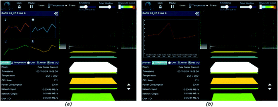
Selected rack close-up view: (a) Overview of a selected unit (b) Temperature of a selected unit

In summary, the first redesign attempted to eliminate any evident UI design errors and apply established UI design guidelines - such as minimalistic design, consistency, feedback, error prevention, recognition, etc. - to improve the usability of the application. However, the most important change that was pursued was to facilitate users in focusing on the data itself, to enhance the visualization with meaningful and useful information in order to assist end-users decision making, and to encourage natural interactions.
3.3 Heuristic Evaluation
The redesigned 3D Data Centre Visualization application was first evaluated by three UX experts, following the Heuristic evaluation method [22], according to which a small number of evaluators examine the interface and try to identify if it follows recognized usability principles. Each evaluator inspects the interface by carrying out as many iterations as needed with the aim to locate if it violates recognized usability principles, named heuristics [24] or other relevant to the system usability principles. Each evaluator reports the problems that were located, and explains which principle is violated by each problem [25]. Given that several problems may be identified by different evaluators, all the evaluation reports are consolidated into a single report, listing each usability problem only once. Then, the evaluators review the unified list of problems and provide a severity rating for each one ranging from 0 to 4 [25], with the aim to prioritize them.
For the heuristic evaluation of the 3D Data Centre Visualization application, each evaluator was initially introduced to the system, its purpose, functionality and the supported interaction methods. Then, the evaluator inspected the system through free exploration and reported the problems that were found. Given the novelty and the domain-specificity of the system, a facilitator was present during each session to assist evaluators - if required - regarding the interaction, or the terminology used. In total, 25 unique problems were identified and aggregated into one single report, which was reviewed by each evaluator with the aim to rate each problem regarding its severity. The final severity of each problem resulted from averaging the ratings of all three evaluators. Problems were sorted according to severity and classified into the following categories: room view, close-up view, interaction. All the problems that were identified during the heuristic evaluation are presented in Table 2, organized in categories and sorted according to their severity per category.
In summary, the evaluation highlighted that an important concern regarding the 3D visualization was the orientation of users in the simulated room, which should be assisted by the application. In addition, experts highlighted that physical strain might be imposed to users given that all interaction is feasible only through gestures, and especially since the interactive elements have been placed at the top of the screen. Finally, the experts agreed on the intuitiveness of the navigation gestures, however they suggested that additional tests with users should be carried out to assess their learnability.
3.4 Final Design
Following the heuristic evaluation results, the 3D Data Centre Visualization application went through some additional changes in order to improve its usability, both in the room view and the rack close-up view. In addition, the issues regarding the cursor movement (problems with id 22 and 23) were addressed, by increasing the mouse pointer smoothing factor and increasing each unit’s interactive area. Finally, the cursor changed to be shown only while the user raises the pointer finger and not while applying hand gestures (problem 25).
An important problem that has been identified by the evaluators is that of the user’s orientation in the room (problems 02, 03, 04, 07). To help users so as to better orient themselves and avoid confusions, the following changes were introduced:
-
Initially users view the room zoomed out, so that they can build a mental model of it and orient themselves more easily
-
Moving beyond the map view was disabled. As a result, users will not be able to move far away from the room and lose orientation
-
A mini-map functionality has been added, as well as a “reset” button which resets the map view to its initial state. The mini-map represents the scene as a blue circle, given the spherical layout of the room’s 3D representation. The user is represented as a white bullet inside the room, while the metaphor of holding a torch was used to indicate the user’s movement direction.
In addition, the following changes were made to address other identified problems:
-
The moving background was removed (problem 01)
-
A less bright shade of criticality level colours was employed, while criticality was represented on a green-red scale (problems 09 and 10)
-
The label “Timestamp” was replaced by the label “Visualized Time” (problem 12)
-
The label “Filters” was removed (problem 11), which “earned” horizontal space, and allowed placing the selected room indication and room selection pop-up, in the top-right corner.
Finally, changes were accomplished to resolve the problems that were found regarding the navigation buttons:
-
The navigation buttons were moved to the right, right below the mini-map (problems 05 and 08). As a result, all the components relevant to the user’s navigation in the room – including the room title, the mini-map and reset view button, and the three navigation buttons – were grouped in one side of the screen
-
The behaviour of the third set of buttons (elevate/lower) was adapted to work consistently with the other two buttons, in a continuous manner (problem 06).
The final representation of the selected room view features a horizontal top menu and a vertical navigation menu, placed at the right side of the screen, as shown in Fig. 8. Last, with the aim to address the interaction issue that was identified for the slider controls placed at the top of the screen (problem 24), once the user selects an option of the horizontal menu which involves handling a slider, a large vertical slider is displayed, facilitating interaction and handling. Furthermore, the “Visualized Time” control was replaced by a scrollable list containing the exact values which can be selected in an easier way, since the slider employed in the previous version induced difficulties and physical strain for selecting the preferred value.

Final design of the data center room view (Color figure online)
Moreover, components of the close-up view have been rearranged in order to resolve the problems that were identified by the heuristic evaluation (Fig. 9). Namely, the following major changes were made:

Rack close-up view
-
The close-up view of the rack servers was moved towards the right side of the screen, occupying less space (problem 21), while in order to better exploit the available space, the move up and down buttons were placed correspondingly overlaid on the topmost and bottom servers.
-
Left to the close-up view, a list of legends indicating the unit number was placed, clearly marking each unit (problems 17 and 20).
-
The selected rack color was changed to teal, as employed in the room view for highlighting the selected items (problem 20), while the hover color remained white (problem 18).
-
The currently visualized rack title was placed below the room title, in teal, while right next to it the exit button was placed (problem 16). The selected room and rack names, as well as the exit button were made to occupy the same horizontal space as the current room indication and selection menu of the room view.
-
The left side of the screen was expanded, featuring six charts presenting information for the selected rack, regarding the six server attributes visualized by the application (problems 17 and 19).
-
On top of the charts, the selected unit server name in large teal font color was placed. Furthermore, the left side (with the charts) was divided by the right side (with the visualized rack) by a thick teal vertical line, which ends in an arrow pointing right towards the currently selected unit server (problem 20).
-
The alert icons were placed inside the various units in the right side with the close-up view (problems 14 and 15). If a user places their finger over the alert icon, or selects the icon, a pop-up window is displayed presenting the details of the alert.
-
All the textual information from the left side has been removed and the entire left space is occupied by six large charts, one for each server attribute (problem 19).
Furthermore, it should be noted that charts are selectable, allowing users to view information in more details if they wish to. The zoomed versions of the charts are further enhanced with specific value markers. However, given that the space occupied by the charts has expanded, users are expected to be able to get a good overview of the server status through the initial view and select to enlarge charts only for specific cases, were problems may have occurred.
4 Challenges Encountered and Lessons Learned
The iterative process of evaluating and redesigning the 3D Data Centre Visualization application principally aimed to meet the goal of creating a visualization that would be useful and decision-enabling for data center operators who would have to use the application in a large data center room in a large display. During this phase several obstacles were encountered which yielded useful tips for big data visualization and gesture-based interactions with large screen displays, which are discussed in this section.
Big Data need large visualization spaces - don’t waist a bit of your screen’s real estate with unnecessary UI elements. A key challenge that the first redesign addressed was the exploitation of the entire screen and the removal of visual clutter, in order to allow users to focus on the Big Data and not the interface. It was observed that the large screen had initially misled the design towards scattering interaction elements all around the screen, leaving less space for the actual visualization. The updated design aimed at a better information organization, using space more wisely, giving the focus to the Big Data itself.
Animations are bad – large screen, Big Data animations are even worse. An important concern for Big Data visualization is how to draw user’s attention to a change that has been made or a point that they should look at in the data set. Although several approaches can be applied for accommodating this need, an alternative that should be definitely avoided is the use of animations. In such a large data set, there may be eventually many points that will satisfy the condition which determines that a user should be alerted, which will lead to a visualization with plenty of animations urging the user to pay attention to them, leading to user frustration. In the case of the 3D Data Centre, when the application was running and fed with real-time data, a multitude of moving arrows appeared above racks, indicating that one of the 40 units hosted in each rack had triggered an alert. This approach could in the end have the opposite effect and stress the user instead of assisting them to better prioritize their actions.
Strive for minimalistic and aesthetic design – the opposite can be quite disruptive in Big Data visualizations. In any UI design it is good to aim for aesthetic and minimalistic design. In a Big Data application however, it is imperative to choose colors with great consideration. The evaluation indicated that too many and too bright colors were used to represent units in a rack, resulting in a color pollution effect. Given the diversity of Big Data, it is highly possible that the visualization will employ a great number of colors. Therefore, colors should be selected with caution, avoiding very bright shades. Furthermore, this color diversity will leave only a few colors for the application UI elements, which should be again very carefully selected so as not to stand out too much and allow the user to focus on the data visualization. For example, in the 3D Data Centre, dark grey and white were used for the menu items, teal for highlighting the currently selected menu item, and a shade of red for displaying alerts and servers in critical state.
Users may become lost in the visualization – support orientation with tools and cues. A Big Data visualization by definition accommodates a large volume of data, therefore usually providing tools for zooming in specific data. As users navigate in the data, it is quite easy to lose orientation, as they would in the real world if cues were not provided by the environment itself. Therefore, as streets in a real world feature names and numbers, so the Big Data visualizations should provide a unique identification of the user’s whereabouts. For instance, in the 3D Data Centre each rack is uniquely identified by a column and row number. When appropriate, additional tools may be employed to assist users’ orientation, as the mini-map with the torch metaphor in the 3D Data Centre and the reset button. Such functionality that allows users to undo their movements and return to the initial view of the visualization can act as a safety net in situations where the user may be lost and frustrated.
Gesture-based interaction with a large screen may become strenuous, if frequently used options are placed in screen locations that require users to make coarse movements. A primary requirement for Big Data visualizations is to facilitate users’ focusing on the data and not design a UI that will easily take their attention away, either due to animations and colors used or the placement of the controls. However, this requirement imposes one more challenge in the context of gesture-based interaction with a large screen display, since if objects are place too far away, users will encounter difficulties reaching them. This trade-off was addressed in the 3D Data Centre by placing the navigation controls, which are expected to be used more often, lower in the screen. Furthermore, it was noticed that the gesture-detection system recognizes a gesture in a relative manner, i.e., in relation to the users’ hand posture when the gesture was initiated. Therefore, users are expected to be trained in avoiding the need for large abrupt movements by “re-calibrating” their hands closer to their torso. Given that the target users of the application are expected to soon become experts in the system, as they are daily users, this system feature is anticipated to become a powerful asset towards efficient and effective user interactions. Yet, the efficiency and learnability of the gestural vocabulary remains to be evaluated with real users.
5 Conclusions and Future Work
This paper has presented the evolution of the 3D Data Centre Visualization application, a Big Data visualization system deployed in a large screen display which can be handled remotely via gestures. Three major application versions were developed during the evolution of the application, and have been presented in the paper, each one addressing different needs. The first version of the application aimed at providing a 3D visualization of a data center room supporting all the fundamental functionality for navigating in the room and retrieving information. The second version was targeted towards incorporating gesture-based interaction and improving the UI so as to better exploit the real estate of the screen and enhance operators’ decision making by allowing them to focus on the data. The third version of the application applied UI and interaction improvements based on the results of an expert-based evaluation that was carried out.
The iterative design and development process of the 3D Data Centre Visualization application was mainly guided by the requirement that the Big Data visualization should be a powerful tool for the intended users, fostering decision-making and facilitating their daily tasks, while user interaction with the technologies employed should not only be effective but also efficient. During this process, based on the difficulties that were met and the solutions that were explored, several useful conclusions for the design of Big Data visualization applications were reached, which have been discussed in details. Although the expert-based evaluation has substantially assisted the visualization and interaction design of the application, the need for a user-based evaluation is indisputable to further validate the design decisions and assess the gestural vocabulary that has been developed in the context of this work. Future activities will therefore include a user-based assessment of the 3D Data Centre Visualization application, as well as the exploration of positive impact of other novel technologies, such as augmented or immersive reality.
References
Palfrey, J.G., Gasser, U.: Born Digital: Understanding the First Generation of Digital Natives. Basic Books, New York (2013)
Manyika, J., Chui, M., Brown, B., Bughin, J., Dobbs, R., Roxburgh, C., Byers, A.H.: Big Data: The Next Frontier for Innovation, Competition, and Productivity. McKinsey Global Institute (2011)
Drossis, G., Birliraki, C., Patsiouras, N., Margetis, G., Stephanidis, C.: 3D visualization of large scale data centres. In: Cardoso, J., Ferguson, D., Muñoz, V.M., Helfert, M. (eds.) Proceedings of the 6th International Conference on Cloud Computing and Services Science (CLOSER 2016), Rome, Italy, 23–25 April, vol. 1, pp. 388–395. SCITEPRESS, Portugal (2016)
Chen, C.P., Zhang, C.Y.: Data-intensive applications, challenges, techniques and technologies: a survey on big data. Inf. Sci. 275, 14–47 (2014)
Fox, P., Hendler, J.: Changing the equation on scientific data visualization. Science 331(6018), 5–8 (2011)
Bari, M.F., Boutaba, R., Esteves, R., Granville, L.Z., Podlesny, M., Rabbani, M.G., Zhang, Q., Zhani, M.F.: Data center network virtualization: a survey. IEEE Commun. Surv. Tutor. 15(2), 9–28 (2013)
Fisher, D., Maltz, D.A., Greenberg, A., Wang, X., Warncke, H., Robertson, G., Czerwinski, M.: Using visualization to support network and application management in a data center. In: Internet Network Management Workshop (INM 2008), pp. 1–6. IEEE (2008)
Roberts, J.C., Ritsos, P.D., Badam, S.K., Brodbeck, D., Kennedy, J., Elmqvist, N.: Visualization beyond the desktop–the next big thing. IEEE Comput. Graph. Appl. 34(6), 26–34 (2014)
Reda, K., Johnson, A.E., Papka, M.E., Leigh, J.: Effects of display size and resolution on user behavior and insight acquisition in visual exploration. In: Proceedings of the 33rd Annual ACM Conference on Human Factors in Computing Systems, pp. 2759–2768 (2015)
Bollier, D., Firestone, C.M.: The Promise and Peril of Big Data. Aspen Institute, Communications and Society Program, Washington, DC (2010)
Shah, S., Horne, A., Capellá, J.: Good data won’t guarantee good decisions. Harvard Bus. Rev. 90(4), 23–25 (2012)
Cuzzocrea, A., Mansmann, S.: OLAP visualization: models, issues, and techniques. In: Wang, J. (ed.) Encyclopedia of Data Warehousing and Mining, 2nd edn, pp. 1439–1446. IGI Global, Hershey (2009)
Reda, K., Febretti, A., Knoll, A., Aurisano, J., Leigh, J., Johnson, A., Papka, M.E., Hereld, M.: Visualizing large, heterogeneous data in hybrid-reality environments. IEEE Comput. Graph. Appl. 33(4), 38–48 (2013)
Drossis, G., Margetis, G., Stephanidis, C.: Towards Big Data Interactive Visualization in Ambient Intelligence Environments. In: Streitz, N., Markopoulos, P. (eds.) DAPI 2016. LNCS, vol. 9749, pp. 58–68. Springer, Cham (2016). doi:10.1007/978-3-319-39862-4_6
Norman, D.: Natural user interfaces are not natural. Interactions 17(3), 6–10 (2010)
Dong, H., Danesh, A., Figueroa, N., El Saddik, A.: An elicitation study on gesture preferences and memorability toward a practical hand-gesture vocabulary for smart televisions. IEEE Access 3, 43–55 (2015)
Nielsen, M., Störring, M., Moeslund, Thomas B., Granum, E.: A procedure for developing intuitive and ergonomic gesture interfaces for HCI. In: Camurri, A., Volpe, G. (eds.) GW 2003. LNCS, vol. 2915, pp. 409–420. Springer, Heidelberg (2004). doi:10.1007/978-3-540-24598-8_38
Wigdor, D., Wixon, D.: Brave NUI World: Designing Natural User Interfaces for Touch and Gesture. Elsevier, Amsterdam (2011)
Grandhi, S.A., Joue, G., Mittelberg, I.: Understanding naturalness and intuitiveness in gesture production: insights for touchless gestural interfaces. In: Proceedings of the SIGCHI Conference on Human Factors in Computing Systems, pp. 821–824. ACM (2011)
Ni, T., Schmidt, G.S., Staadt, O.G., Livingston, M.A., Ball, R., May, R.: A survey of large high-resolution display technologies, techniques, and applications. In: Virtual Reality Conference, pp. 223–236. IEEE (2006)
Andrews, C., Endert, A., Yost, B., North, C.: Information visualization on large, high-resolution displays: Issues, challenges, and opportunities. Inf. Vis. 10(4), 41–55 (2011)
Nielsen, J., Molich, R.: Heuristic evaluation of user interfaces. In: Proceedings of the SIGCHI Conference on Human Factors in Computing Systems, pp. 249–256. ACM (1990)
Hurtienne, J., Stößel, C., Sturm, C., Maus, A., Rötting, M., Langdon, P., Clarkson, J.: Physical gestures for abstract concepts: inclusive design with primary metaphors. Interact. Comput. 22(6), 75–84 (2010)
Nielsen, J.: Enhancing the explanatory power of usability heuristics. In: Proceedings of the SIGCHI Conference on Human Factors in Computing Systems, pp. 152–158. ACM (1994)
Nielsen, J.: Heuristic Evaluation. In: Nielsen, J., Mack, R.L. (eds.) Usability Inspection Methods, pp. 25–62. Elsevier, Amsterdam (1994)
Acknowledgements
This research has been partially funded by the European Commission under project LeanBigData (FP7-619606).
Author information
Authors and Affiliations
Corresponding author
Editor information
Editors and Affiliations
Rights and permissions
Copyright information
© 2017 Springer International Publishing AG
About this paper
Cite this paper
Ntoa, S., Birliraki, C., Drossis, G., Margetis, G., Adami, I., Stephanidis, C. (2017). UX Design of a Big Data Visualization Application Supporting Gesture-Based Interaction with a Large Display. In: Yamamoto, S. (eds) Human Interface and the Management of Information: Information, Knowledge and Interaction Design. HIMI 2017. Lecture Notes in Computer Science(), vol 10273. Springer, Cham. https://doi.org/10.1007/978-3-319-58521-5_20
Download citation
DOI: https://doi.org/10.1007/978-3-319-58521-5_20
Published:
Publisher Name: Springer, Cham
Print ISBN: 978-3-319-58520-8
Online ISBN: 978-3-319-58521-5
eBook Packages: Computer ScienceComputer Science (R0)