

Abstract
Time series classifiers are not only challenging to design, but they are also notoriously difficult to deploy for critical applications because end users may not understand or trust black-box models. Despite new efforts, explanations generated by other interpretable time series models are complicated for non-engineers to understand. The goal of PIP is to provide time series explanations that are tailored toward specific end users. To address the challenge, this paper introduces PIP, a novel deep learning architecture that jointly learns classification models and meaningful visual class prototypes. PIP allows users to train the model on their choice of class illustrations. Thus, PIP can create a user-friendly explanation by leaning on end-users definitions. We hypothesize that a pictorial description is an effective way to communicate a learned concept to non-expert users. Based on an end-user experiment with participants from multiple backgrounds, PIP offers an improved combination of accuracy and interpretability over baseline methods for time series classification.
Index Terms—: Interpretability, Trustworthy Machine Learning, Time Series Classification
I. Introduction
Systems that use machine learning (ML) to process time series data are increasingly being integrated into our everyday lives, from voice recognition in many consumer products [1] to assistive medical tools [2]. However, the growing complexity of ML algorithms has made the reasoning behind their predictions difficult for end-users, and even algorithm developers [3] to understand. The enigmatic quality of popular ML algorithms for critical applications, such as deep neural networks (DNNs) for medical applications, may cause a sub-optimal user experience because the mistakes made by these algorithms are incomprehensible. As an example of a safety-threatening error, one DNN labeled a ‘stop’ sign with a few added black tape strips as a ‘speed limit 45’ sign [4].
Recently within the ML community, there has been a growing body of research attempting to develop interpretability techniques. There are two common approaches: 1) glass-box ML models that are inherently interpretable (e.g., ProSeNet [5], and GAM [6]) and 2) post-hoc explanation techniques that are designed to interpret the prediction of black-box models (e.g., SHAP [7], and LEFTIST [8]). Despite this proliferation of techniques, there is a lack of methods for explaining ML-learned classes to non-expert users, especially for time series classification. Additionally, a non-expert user references a person that has minimal expertise in ML and has a rudimentary understanding of raw time series data that are collected in their application domain. For example, nurses may want to understand an ML model that processes smartwatch data for automated activity recognition. By understanding the data and generated model, these care providers can better assess a patient’s health status and intervene in a timely manner. Viewing the raw time series data (especially multi-variate data) may not conjure up the concept they represent to a non-expert user. Consequently, discerning time series classes is difficult for non-experts.
While time series data such as raw sensor data may be difficult for domain experts to interpret, most people can understand the concept represented by a descriptive image. In this work, we introduce a network architecture with built-in interpretability – PIP (Pictorial Interpretable Prototype learning), that jointly learns a set of prototypes and a function to transform the prototypes into meaningful pictures. In PIP, the prototype pictures illustrate the learned classes, as shown in Figure 1. A user may sketch a picture for each class before initiating PIP training. We hypothesize that prototype pictures derived from such sketches will enhance user understanding of the data, the learned model, and resulting predictions. While hand-drawn pictures have been utilized to visually convey information that may be difficult to express in writing or speech, they have not been utilized to explain a time series model’s predictions. Prior work in cognitive and educational psychology illustrates that sketching concepts enhanced learning and resulted in realistic judgments [9].
Fig. 1:
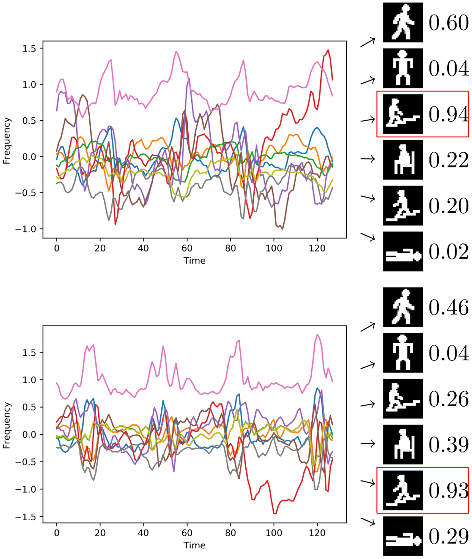
(left) Time series plots of accelerometer and gyroscope readings (top: walking upstairs, bottom: walking downstairs). (right) Learned prototypes and corresponding similarity scores. PIP learns concepts from multivariate time series data, thus similarity scores are based on a combination of the lines shown in the graph. Red squares highlight PIP predictions.
Rather than explicitly explaining how a learned model generates a prediction, PIP instead learns a set of prototypes for each class, building on the users’ pictorial interpretation of those classes. PIP’s classification of an instance can then be interpreted based on its similarity to the visual prototypes. Figure 1 illustrates the difficulty of interpreting raw time series data. In this example, wearable sensor data are used to identify a person’s current activity. To aid with the interpretation of learned classes, PIP compares the similarity of the input to the set of learned prototypes and generates a prediction based on the similarity score. Additionally, end-users design the pictorial prototypes, thereby tailoring the model’s explanation to suit their needs. Because PIP learns the final set of prototypes, the resulting pictures may represent a combination of the original user sketches. These learned pictorial representations offer novel insights to the end-user. For example, when a prototype blends two sketches, this indicates that the corresponding data points lay on the boundary between two similar classes. This process helps users understand and mirror the algorithm’s inferences.
To evaluate the effectiveness of PIP visual explanations, we assessed an end-user experience by comparing the PIP explanation with another prototype learning model and a decision tree. Based on the result from 35 users, we found that end-user experience was enhanced across the dimensions of classification accuracy, response time, and model comprehensibility using PIP explanations compared to the decision tree and other prototype models. As one of the clinicians suggested, PIP’s prototypes can help them make timely decisions based on sensor data, thus improving response time in critical situations and providing more-informed treatment plans. These results suggest that PIP’s approach to automatically generate pictorial explanations based on end-user sketches offers a useful explanatory mechanism for time series data. Contributions: (1) We introduce a novel method to jointly learn visual prototypes and models for time series classification. (2) Our algorithm incorporates user-provided sketches to enhance model interpretation. (3) We demonstrate the improved efficacy of our approach over prior methods for a variety of end-users for interpreting activity classes from sensor-based time series data.
II. Related Work
Our work contrasts with prior research that seeks to improve the understanding of time series predictions using post-hoc interpretations [8], [10]–[13]. These approaches provide feature importance, or relevance, at a given time step. Although listing the most discriminating features is insightful, the resulting explanations are often regarded as misleading and unreliable [14]. In contrast, PIP weaves interpretability into its training process. While domain knowledge is needed to understand post-hoc visualizations, PIP pictures are based on the end-users’ background. For example, post-hoc methods can isolate portions of an accelerometer signal that cause the learned model to predict human activity. However, the provided information may not be useful to a nurse nor informative. Alternatively, PIP provides a picture explanation of the classification, offering patients and caregivers an intuitive explanation of the finding.
Creating glass-box models for time series classifiers has also previously been considered. IETNet [15] graphs a heatmap of the class-influential channels during multivariant time series classification. DPSN [16] tackles few-shot learning by employing a prototypical network [17] to learn a prototype for each class from a symbolic Fourier approximation transformation of the data. Gee et al. [18] and ProSeNet [5] utilize prototype networks. These models integrate a designed layer into the network architecture to learn the prototypes.
The approach of Gee et al. [18] and the ProSeNet algorithm [5] can be considered case-based approaches to interpretability. These methods learn explainable prototypes and classify new data based on similarity to the prototypes. This type of network includes an encoder and a prototype layer. The encoder can be any network structure that encodes input data, such as a convolutional neural network (CNN) or a recursive neural network (RNN). The prototype layer aims to learn a prototype that is close to at least one of the encoded inputs. Gee et al. [18] adapt an image prototype classifier introduced by Li et al. [19] by coercing time series data to appear as graph images. The image prototype classifier contains a decoder that transforms the encoded data and prototypes into the original image. Likewise, Gee et al. [18] employ a decoder to transform learned prototypes into time series graphs. Since time series are not readily interpretable as images, Gee et al. [18] feed training inputs into the model post-training to determine what class each prototype represents. ProSeNet [5] does not include a decoder in its architecture and illustrates the prototypes as it learns. ProSeNet’s learned prototypes are intangible because they are based on encoded inputs. Like Gee et al. [18], ProSeNet [5] adds a post-training step to determine each prototype’s class.
PIP represents a case-based prototype learner that offers distinct contributions from these previous works. Unlike prior approaches, PIP learns visual interpretations based on externally-provided sketches; thus, they do not need to be labeled after training. Furthermore, PIP’s prototypes do not require significant expertise to understand. Because these methods optimize multiple criteria (e.g., classification accuracy and interpretability), they rely upon multi-term loss functions. While previous methods employ a costly cross-validation step to tune the ratios between these loss terms, PIP directly learns these ratios during training.
III. Methods
Complex models such as ensemble and deep neural networks have demonstrated the ability to achieve high accuracy on time series data [20], [21], but they are difficult to interpret. To address this dichotomy between performance and interpretability [7], PIP learns a set of prototypes by leaning on user-defined explanations (hand-drawn sketches). Before training, users sketch a picture for each of the C classes. This customization allows PIP to adapt its prototypes to suit the needs of each audience. For instance, a clinician may design different signs than an engineer for a set of wearable sensor data.
a). PIP Architecture:
Figure 2 illustrates the PIP architecture. Our model consists of four main components: an encoder, a prototype layer, a generator, and a fully-connected layer. The encoder f(x) maps the input time series to a fixed-length vector, z. The encoder can be any block of neural networks that process time series input data. We employ a 1D-CNN as the encoder in our study because of its demonstrated ability to handle time series data [20]. The prototype layer contains m prototypes, where the number of prototypes is at least as large as the number of classes, m ≥ C. The goal of the prototype layer is to learn a set of vectors that are positioned close to the encoded input data. Therefore, the length of each prototype pi is equal to the length of the encoded input z. The prototype layer computes the squared Euclidean distance between the encoded input z and each prototype, . To normalize these values, we then compute the final score as ai = (di − min(d))/(max(d) − min(d)). A score of one means the prototype pi is identical to the encoded input z, and zero means that they are completely different. Finally, a fully-connected layer (FC) computes a weighted sum of these scores υ = Wa, where W is a C × m weight matrix. A Softmax layer is then applied to compute the probability distribution over C classes. The prototypes are not interpretable on their own because the distance measure between prototypes and observation is measured in a flexible latent space. The generator transforms the encoded input z to its corresponding picture ypic by reshaping the encoded vector z to a n × n matrix and employing a 2D-CNN. The advantage of including a generator is that it can transform the learned prototypes into their pictorial representations after training.
Fig. 2:
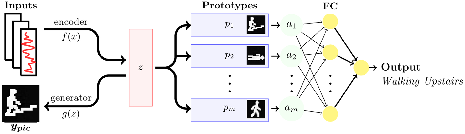
The PIP architecture. The model consists of four components: an encoder f(x) that transforms the input to the latent space z, a prototype layer p with m prototypes, a fully connected layer FC with a softmax layer for multi-class classification, and a generator g(z) for converting the latent space to a correct sketch representation of the data. PIP learns the prototypes p by minimizing the distance between embedded input z and each prototype pi. Additionally, PIP minimizes the distance between each prototype pi and the embedded data z, thus encouraging each prototype to cluster around one class. The input to the fully connected layer FC is the normalized distance a between the encoded data z, and each prototype p. PIP simultaneously utilizes the generator to transform the encoded data g(z) into their respective picture ypic. Since the prototypes are based on the encoded data, the generator converts the learned prototypes into their corresponding pictures after training.
b). Optimization:
PIP’s objective is to simultaneously achieve both high accuracy and high interpretability. To obtain this goal, we jointly minimize the parameters of all model components using stochastic gradient descent, similarly to work described by Gee et al. [18] and Li et al. [19]. Let be a labeled time series dataset having k dimensions. Throughout the remainder of the paper we use xt to denote the set of k values observed at time t. Here, T is the length of multivariate sequence x, y ∈ {1, ⋯, C} is the true label, and ypic ∈ {1, ⋯, C} is a corresponding picture for the true class. The optimization problem minimizes the following:
| (1) |
where Θ represents the set of all trainable model parameters and λ = {λE, λM, λ1, and λ2} represent the term ratios. E is the cross-entropy loss defined as:
| (2) |
and M is the mean squared error of the generator, as follows:
| (3) |
We introduce a regularizer, R1, that encourages each prototype to be positioned close to at least one of the training samples. Additionally, regularizer R2 ensures that similar inputs cluster around one prototype:
| (4) |
| (5) |
PIP learns the weights for the individual loss terms during model training. For each of a specific number of epochs, we adjust the ratio, λ, for one selected term, ℓ ∈ (E, M, R1, R2). The selected term is penalized if the corresponding value is greater than a threshold τ. The term is penalized by increasing its ratio, λℓ. Similarly, we reward the term if it performs better than the threshold τ by lowering the corresponding λℓ. This method is inspired by game theoretic methods introduced by Arora et al., which supports data-driven learning of the parameters [22]. For our experiments, we set τ = 0.1. We initialize all λs to one for a fixed learning rate ϵ ≤ 0.5. At the end of each epoch e, we choose a term to adjust during the next epoch. Ratios λ are selected with probability proportional to their values , where . We update the selected λ based on its loss function value m, as follows:
| (6) |
We terminate this procedure after a specific number of epochs in which consistently decreases since indefinite updates of λs could make the model training unstable. We observe that updating λs for 20 consecutive epochs of decreasing values is enough to learn the λs. Algorithm 1 details the PIP training process.1
An important question is how to select the number of prototypes to learn. Previous work [5], [18], [19], [23] specifies a number of prototypes that is greater than the number of classes. This allows the model to learn at least one prototype for each class.. When classes are complex, such detailed explanations can be helpful. At the same time, users may be confused when a single class is represented by multiple pictures. In earlier work, anecdotal observations analyzed these tradeoffs. In our case, we report results for alternative numbers of prototypes. To make a final selection, we first consider the number of prototypes to be equal to the number of classes. We then select the final number of prototypes by increasing the number until performance (loss minimization) converges.
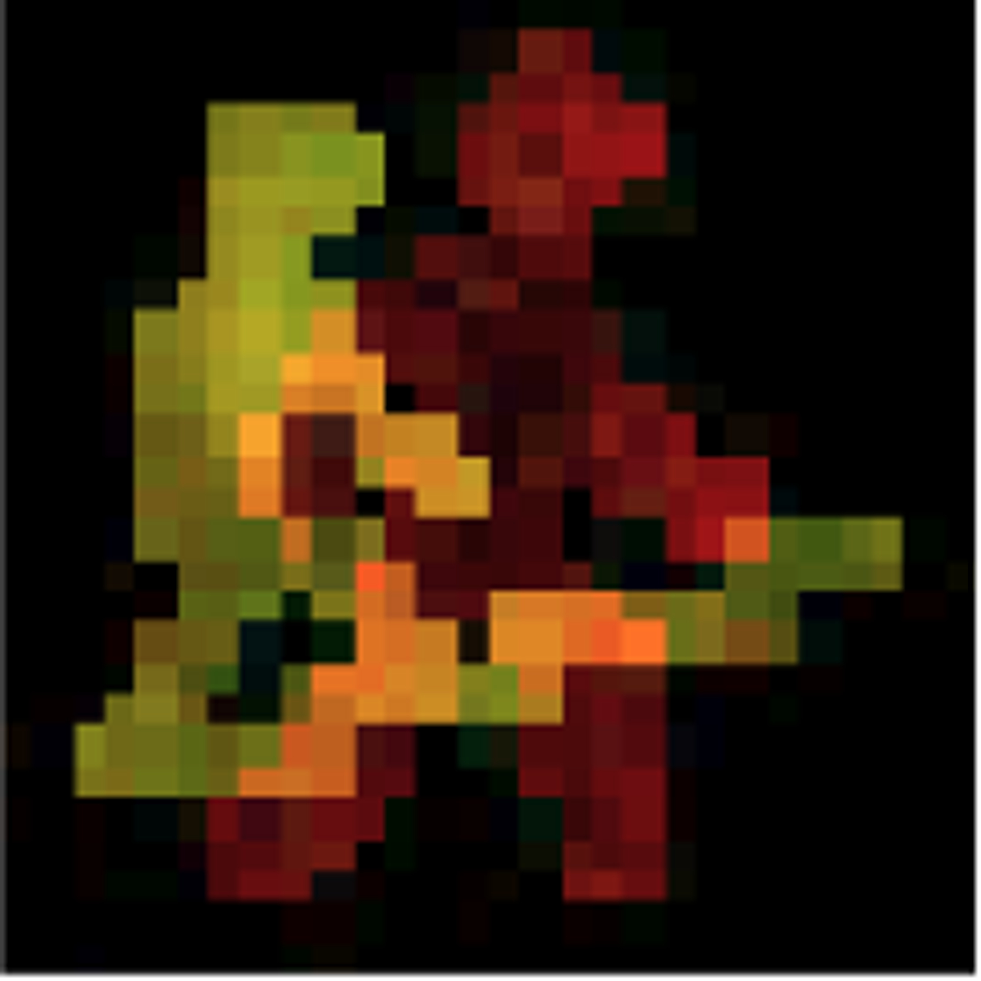
While we demonstrate the learning process using greyscale images, PIP can also learn colored prototypes. In cases containing a large number of classes, colored input images will further enhance interpretability of the blended prototypes that PIP learns. Such colors can be selected by the user based on domain knowledge. For example, in Figure 3 the user defines warmer colors for dynamic-movement activities (e.g., walking up/down stairs, walk) and cooler colors for static activities (e.g., sit, stand, lie down). Alternatively, a user may assign colors on opposite ends of the spectrum for classes that are similar to aid in distinguishing them. In future work, PIP will optionally assign these colors automatically to further boost interpretation.
Fig. 3:
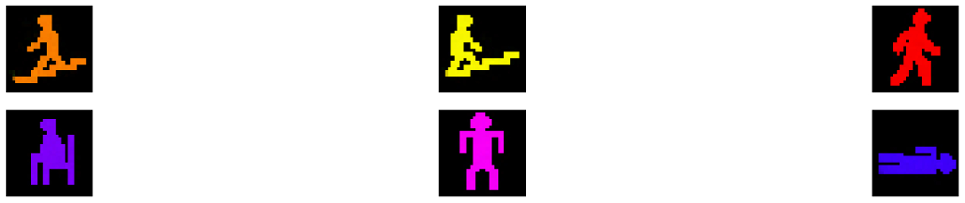
Example of learned color prototypes for HAR dataset.
In summary, PIP not only learns a set of prototypes but also generates images for each prototype. These prototypes aid in understanding the learned classes as well as the classification for a particular instance. By learning prototypes and corresponding images, PIP can provide insights into the data and learned concepts which were not available to the end-users otherwise. PIP does not merely map each target class onto a corresponding user-defined picture. Rather, PIP learns new prototypes which may represent a single input picture or a unique blend of these pictures. Considering Figure 4, pictures from similar activities such as “walking” and “walking upstairs” blend into a unique generated prototype which exhibits aspects of each original picture. Such blending occurs for cases that appear on the boundary between target classes.
Fig. 4:
Example of a learned blend of pictures.
IV. Experiments
The goal of this work is to create a time series classifier that is both accurate and interpretable. To assess PIP’s performance for both of these objectives, we evaluate the algorithm based on end-user evaluations of raw time series and alternative ML models. Model interpretability is estimated by quantifying:
The user’s ability to correctly classify samples using the prototypes.
The user’s confidence about their answer.
The user’s trust in the learned models.
The time that the user spent manually classifying samples based on the prototypes.
a). Datasets:
We selected three time series datasets to evaluate PIP. The datasets are UCI-HAR (human activity recognition) [24], UCR-FordA (automotive diagnosis) [25], and UEA-SpokenArbaicDigits (spoken Arabic digits) [25]. These are selected from multiple domains with varying complexity to evaluate PIP’s broad applicability (see Table I). We designed a 28 × 28 gray scale picture for each class (see Figure 5). Each user can design a picture and train PIP to receive a personalized explanation. Since our study participants come from a diverse range of backgrounds, we created images that provide general understandability. Future experiments that target a specific user group will utilize images designed by that group.
TABLE I:
Dataset summary.
| Dataset | time steps | channels | classes | training | testing |
|---|---|---|---|---|---|
| UCI-HAR | 128 | 9 | 6 | 7352 | 2947 |
| UCR-FordA | 500 | 1 | 2 | 3601 | 1320 |
| UEA-ArabicDigits | 93 | 13 | 10 | 6600 | 2200 |
Fig. 5:
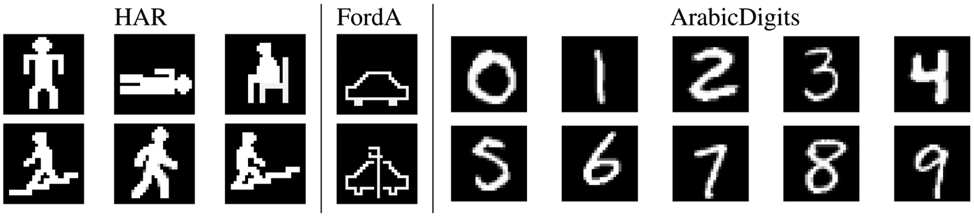
Pictorial representations for each class used in the experiments.
b). Experiment Design:
For each dataset, we pose a series of questions:
Participants score the interpretability of raw time series data by looking at graphs of the series values.
Participants emulate the model’s prediction based on the provided interface (this task is timed).
Participants assess a specific model’s interpretability on the given dataset.
Interpretability responses are provided on a Likert scale from Extremely easy = 1 to Extremely difficult = 5. To conclude the survey, participants are asked to choose the most interpretable model, as well as their preference for either a highly-accurate or a highly-interpretable model.
We recruited 35 end-user participants to evaluate the generated prototypes. Previous studies indicate that age, education, and experience impact task performance [26], [27]. To evaluate PIP interpretability for a broad audience, we included a diverse sample of participants. Participant age is 35 ± 11, and education ranges from high school to advanced degree (PhD, MD). The participants are grouped into three categories: STEM (n=19), Clinician (n=10), and Other (n=6), based on their discipline and experience with ML.
c). Interpretability Metrics:
To measure the interpretability of PIP’s jointly learned model and prototypes, we draw on the metrics of end-user accuracy, end-user response time, model accuracy, end-user understandability, and end-user trust. The first three metrics build on work by Kim et al. [28]. The authors define model interpretability as “the degree to which a human consistently predicts the model’s result.” We mirror this definition by measuring human accuracy, human response time, and model accuracy. Because the goal of the ML algorithm is to correctly predict the target attribute of a data point, usability can be measured as the speed and accuracy with which an end-user can replicate the learned model’s prediction using the explanation. These metrics are consistent with traditional evaluation in the human-computer interaction literature, in which user speed and accuracy are utilized to measure a person’s attitude toward a system [29]. To ensure that the end-user provides predictions that are consistent with ground truth, we also need to evaluate the predictive performance of the learned model itself.
Furthermore, according to the user-centered design supported by the work of Xu et al. [30], an interpretable model must incorporate the preferences and skills of target users. The explanation must ensure that end-users can understand the learned model. We measure these components by asking end-users to rate their understandability of the raw time series data as well as the learned model. These two points provide an estimate of the amount that PIP improved comprehensibility in comparison with the raw time series data and the other evaluated ML models.
Finally, Hoffman et al. [31] argue that trust is a concern for explainable systems. Lack of initial trust or loss of trust will significantly reduce the use of a learned model. We, therefore, add the interpretability metric of trust and reliance to our experimental design and evaluation.
d). Models:
The participants evaluate four interfaces: raw time series data (Raw), a decision tree model of the learned concept (DT), non-pictorial representation of prototypes (Ptype), and PIP pictorial representation of prototypes (PIP). The first baseline measures the interpretability of raw time series data. Traditionally, experts have examined such time series graphs as part of their job, such as physicians looking at EKG graphs. The method proposed by Gee et al. [18] converts learned prototypes back to such a raw representation; thus, this is an important baseline to include. The second baseline, a decision tree (DT), has previously been adopted in clinical settings because of its explainability [32]. The third baseline, a non-pictorial representation of prototypes (Ptype), generates prototypes that have not been transformed into their graphic representation. This interface reflects the representation of the prototypes described by Ming et al. [5].
In the survey, we provide the network scores for Ptype and PIP above their depicted prototype, representing the similarity between the input data and each prototype (see Figure 6). Participants did not receive any information about the accuracy of any of the models prior to completing the survey. Participants judge the interpretability of the models based solely on their interface, as shown in Figure 6.
Fig. 6:
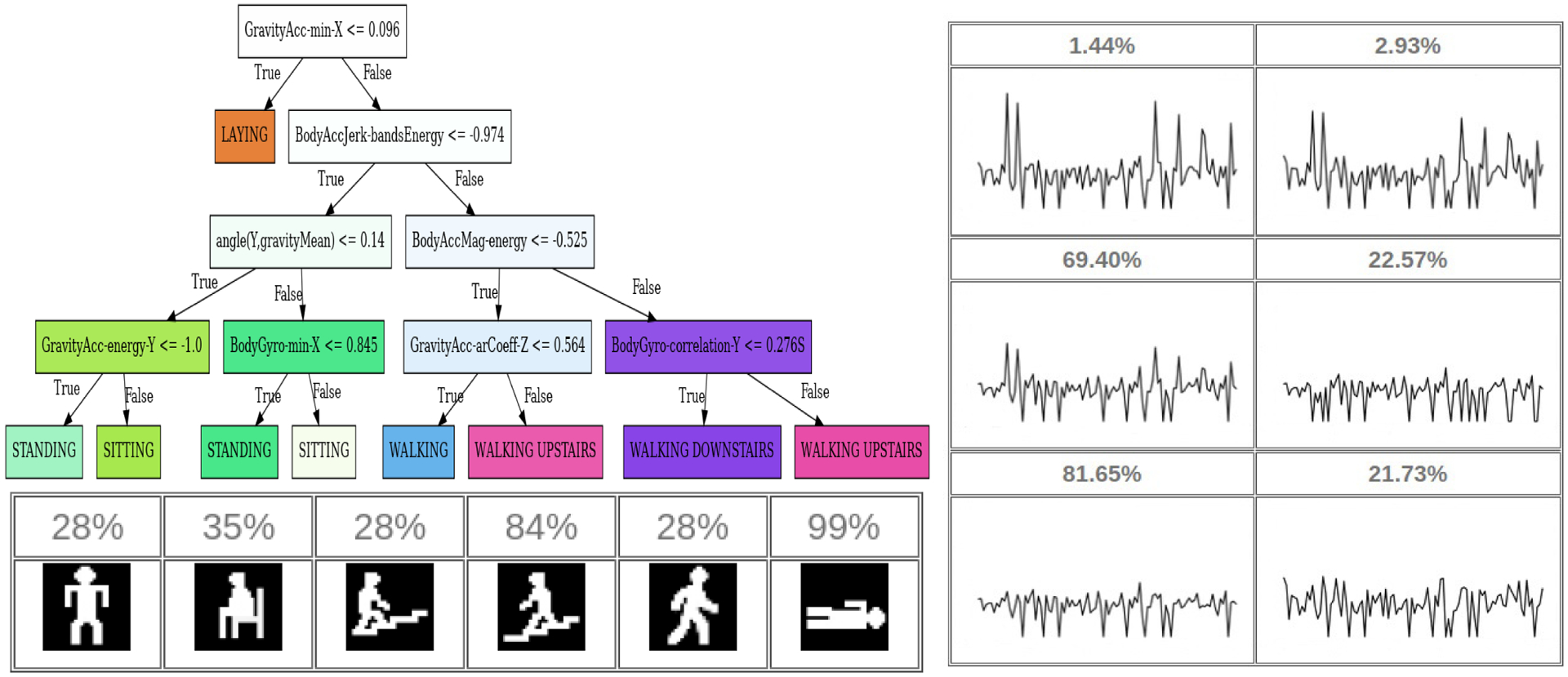
Example model interfaces using (top-left) Decision tree (right) non-pictorial prototype representation (PType), and (bottom-left) PIP pictorial representation (PIP) for UCI-HAR datasets.
In addition, we compared PIP’s accuracy with DT, Residual Networks (ResNet) [10], and RandOm Convolutional KErnel Transform (ROCKET) [33]. We select DT because it is one of the most widely used interpretable models by many experts in different domains. We also compute accuracy for ResNet, a method that optimizes only accuracy and not interpretability. According to a survey by Fawaz et al. [20], ResNet performs consistently best over a variety of time series domains. Finally, we compare classification performance with ROCKET, another recent approach to time series classification that was selected both because of its consistent performance and computational efficiency [33].
e). PIP Architecture and Hyperparameter Selection:
The architecture of PIP is similar for all datasets except the encoding length and number of prototypes. The encoder consists of two layers of a 1D-CNN (kernel size = 16) followed by a Maxpool layer and a fully connected layer (length = encoding size). The generator consists of a fully-connected layer (length = 1568) followed by three 2D-CNN layers (kernel sizes = 64, 32, 1). The number of prototypes in the prototype layer is equal to the number of prototypes defined by the user (length = encoding size). This layer is followed by a fully connected layer (length = number of classes). Hyperparameters τ and ϵ are selected empirically. For our experiments, we observe that τ = 0.1 and ϵ = 0.08 perform well across diverse datasets. Similarly, we terminate weight updates after observing 10 to 20 consecutive epochs of decreasing values. The hyperparameters are summarized below.
Learning rate {3e−3, 2e−3, 1e−3, 1e−2}
Batch size {16, 32, 64}
Encoding size {32, 64, 128}
Weight learning rate (ϵ) {0.5, 0.1, 0.08, 0.05}
Weight threshold (τ) {0.1, 0.05}
Updating weight period {10, 20, 30}
We employed a grid search to find the set of hyperparameters that are most effective across multiple datasets. The reason for selecting the same hyperparameters for each reported experiment is to study the effect of the number of prototypes on PIP’s accuracy. We optimized the cross-entropy loss using Adam [34] with base learning rate = 3e−3, batch size = 32, encoding size = 64, ϵ = 0.08, τ = 0.1, and updating weight period = 20. The number of prototypes selected is equal to the number of classes to increase the interpretability. As we show later, a larger number of prototypes will in some cases increase the accuracy of the model.
V. Results and Analysis
To validate PIP’s performance, we ran a user experiment to measure the interpretability of models generated by PIP. Moreover, we assessed the user’s trust to employ PIP for their application. Lastly, we compared PIP’s accuracy to other time series classifiers.
a). Interpretability of Raw Time Series Data:
The results of this experiment are summarized in Table II). These results reflect that raw time series data (Raw) do not provide adequate interpretability in most cases, as shown in Figure 7. Participants were asked to differentiate between multiple class pairs. These include walking vs. walking upstairs (UCI-HAR), walking vs. laying (UCI-HAR), malfunction vs. no malfunction (UCR-FordA) and number-one vs. number-three (UEA-Arabic). The results reveal that only in cases such as walking vs. laying, where the difference between two signals is noticeable, the overall averaged participant response is close to Extremely Easy (1). This contrasts with the other pairs, where the overall averaged participant response is close to Neither Easy nor Difficult(3) or Somewhat Difficult (4).
TABLE II:
Average Likert responses for raw time series data.
| STEM | Clinician | Other | Overall | |
|---|---|---|---|---|
| walking vs. walking upstairs | 3.1 | 3.4 | 2.0 | 3.0 |
| walking vs. laying | 1.3 | 1.1 | 1.5 | 1.2 |
| malfunction vs. no malfunction | 2.7 | 2.4 | 3.1 | 2.7 |
| number-one vs. number-three | 3.7 | 3.7 | 3.8 | 3.7 |
Fig. 7:
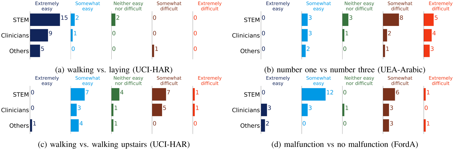
The number of participants’ response to the interpretability of raw time series data.
b). End-user Accuracy:
A fundamental measure of model interpretability is whether end-users can predict the outcome of a model based on its interface. As shown in Table III, most participants did select the correct outcome using the PIP pictorial representation. We observe that the participants’ performance increases as they progress in the survey for classification using decision trees. On the other hand, for PIP representations, participants did not experience a significant learning curve because their performance was high from the beginning. The survey results reveal that the Ptype representation is not an interpretable interface. For example, none of the participants could find the correct outcome of the Ptype interface for the UEA-Arabic dataset. It is evident that as the number of prototypes increases, it is harder for participants to distinguish between waveform graphs. This aligns with our result from the interpretability of raw sensor data. The results demonstrate that users are less prone to making a mistake when using the PIP pictorial representations. As Table III shows, the novice group (Other) was able to predict the outcome of PIP without having any prior knowledge. However, that was not the case when using DT or Ptype.
TABLE III:
Accuracy of participant classification for three alternative approaches, averaged over all of the datasets.
| STEM | Clinician | Other | Overall | |
|---|---|---|---|---|
| PIP | 0.92 | 0.90 | 0.83 | 0.90 |
| DT | 0.87 | 0.83 | 0.40 | 0.79 |
| Ptype | 0.29 | 0.33 | 0.55 | 0.35 |
c). End-user Response Time:
The time a user spends finding the outcome of a model is an essential indicator of interpretability. Although many of the participants were familiar with decision trees, the participants spend more time discerning its prediction. As shown in Table IV, PIP decreases interpretation time by >24 seconds in comparison with Ptype, which method also suffered from model misinterpretation.
TABLE IV:
Time spent by participants (in seconds) to perform prediction for three alternative approaches, averaged over all of the datasets.
| STEM | Clinician | Other | Overall | |
|---|---|---|---|---|
| PIP | 6.89 | 15.86 | 20.50 | 11.79 |
| DT | 36.03 | 75.33 | 110.00 | 58.47 |
| Ptype | 21.43 | 49.63 | 60.38 | 36.17 |
d). End-user Perceived Understandability:
To investigate users’ perception towards the interpretability of the model, we ask users: How easy was the task you performed? The easier a task is to perform, the greater is the likelihood of user understanding. To measure the participants’ perception, they provided a Likert-scale response on task simplicity. The Likert-scale values range from 1 (Extremely Easy) to 5 (Extremely Difficult). As shown in Figure 8, the pictorial representation of PIP was the easiest model to use, and raw time series data was the hardest. The result of the experiment (see Table V) aligns with the end-user accuracy result in that all participant groups perform better using PIP than any of the other model interfaces.
Fig. 8:
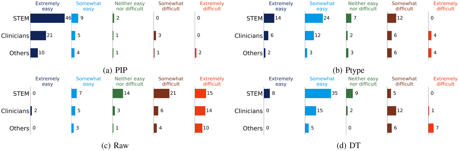
The number of end-user perceived understandability of performing a task for alternative methods.
TABLE V:
Participant Perceived Understandability in four alternative representations, averaged over all of the datasets.
| STEM | Clinician | Other | Overall | |
|---|---|---|---|---|
| PIP | 1.22 | 1.53 | 1.94 | 1.43 |
| DT | 2.19 | 2.96 | 3.83 | 2.69 |
| Ptype | 2.29 | 2.66 | 3.38 | 2.59 |
| Raw | 3.77 | 3.83 | 4.16 | 3.85 |
e). End-user Trust and Reliance:
At the end of each task, participants assess if they trust and would rely on the explanation provided by the given model. To measure trust and reliance, we take the attitudinal viewpoint proposed by Lee et al. [35], which has been widely used in empirical studies of trust in human-machine interaction [36]. Lee et al. [35] define trust as “the attitude that an agent will help achieve an individual’s goals in a situation characterized by uncertainty and vulnerability.” We employ a similar assessment as has been utilized to measure human trust in automation [37]. The Trust scale asks participants: Does the explanation of the model increase your trust to use it compared to a black-box model (a model with no explanation)? The Reliance scale asks participants: Does the explanation provided by the model make the prediction of the model clear? We average participant responses from Strongly Agree = 1 to Strongly Disagree = 5 to measure models’ trustworthiness. We observe that the additional details provided by a DT may increase trust for some users, as shown in Table VI. However, PIP reliance score was better than the other two models as shown in Table VII. Figures 9 and 10 depict participants’ views of user trust and user reliance, respectively, for each model.
TABLE VI:
Participant trust in three alternative types of explanation, averaged over all of the datasets.
| STEM | Clinician | Other | Overall | |
|---|---|---|---|---|
| PIP | 2.45 | 2.13 | 2.55 | 2.38 |
| DT | 2.14 | 1.93 | 2.83 | 2.20 |
| Ptype | 3.03 | 2.56 | 3.38 | 2.96 |
TABLE VII:
Participant reliance in three alternative types of explanation, averaged over all of the datasets.
| STEM | Clinician | Other | Overall | |
|---|---|---|---|---|
| PIP | 1.66 | 1.46 | 2.38 | 1.73 |
| DT | 1.71 | 2.20 | 3.38 | 2.14 |
| Ptype | 2.84 | 2.93 | 3.44 | 2.97 |
Fig. 9:
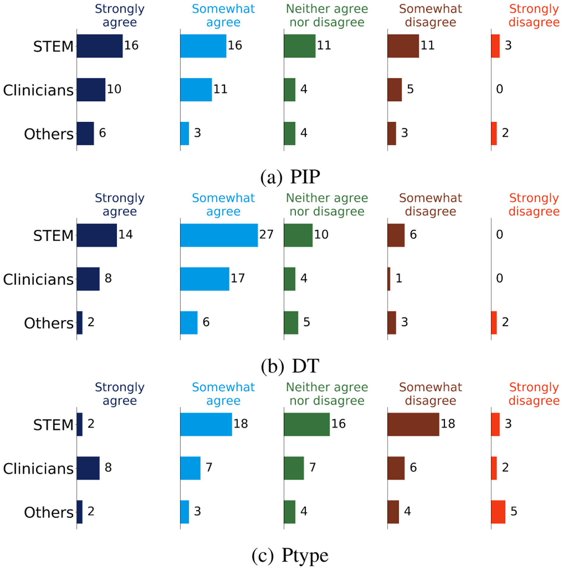
Participant responses to the trust of performing a task.
Fig. 10:
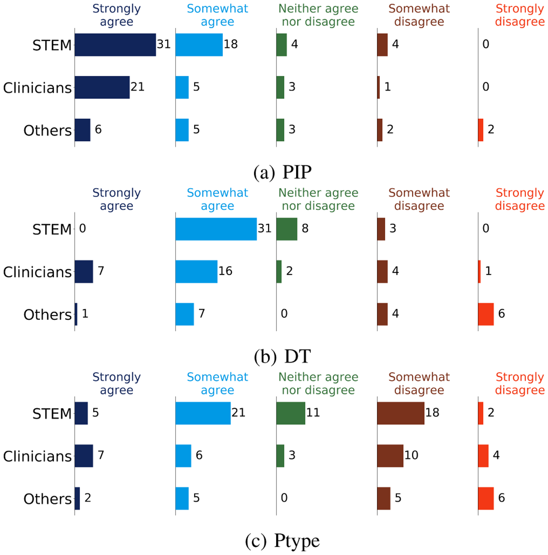
Participant responses to the reliance of performing a task.
f). PIP Accuracy:
In addition to interpretability, we consider PIP’s accuracy. Table VIII summarizes PIP’s performance, averaged over 10 random initializations. We note that an increase in the number of prototypes beyond #classes + 5 does not improve the PIP’s accuracy. In some cases, several of the prototypes look repetitive. Other times, PIP blends two or more of the base pictures, as illustrated in Figure 11 (5th picture from the left), likely because the learned prototype lies on class boundaries. While PIP’s accuracy is lower than that of ResNet and ROCKET, PIP provides a blend of accuracy and interpretability that cannot be achieved by ResNet or DT. The question of whether to prefer accuracy or interpretability is often dependent on the needs of each user. Accordingly, we ask our participants how they value interpretability versus accuracy. The participants select a point on a linear scale, where 0 indicates a preference for interpretability, and 100 prefers accuracy. The average selection was 64 ± 21 (STEM:65±21, Clinician:82±21, Other:54±21). This result indicates that users prefer a blend of interpretability and accuracy. At the end of the survey, participants chose the most interpretable model. 24 participants selected PIP, while 11 participants selected the decision tree. Interestingly, 10 out of the 11 participants who selected the decision tree as the most interpretable model in our survey are from the STEM group. Most participants who selected PIP are clinicians or work in other non-STEM disciplines.
TABLE VIII:
Dataset summary and test error. Here p is the number of prototype and c is the number of classes. w/o R1 means PIP training without R1, w/o R2 means PIP training without R2, and w/o M means PIP training without the generator.
| PIP (p=c) | PIP (p=c+1) | PIP (p=c+2) | PIP (p=c+3) | PIP (p=c+4) | PIP (p=c+5) | w/o R1 | w/o R2 | w/o M | ResNet | ROCKET | DT | |
|---|---|---|---|---|---|---|---|---|---|---|---|---|
| UCI-HAR | 10.2±0.9 | 10.2±0.6 | 10.9±1.3 | 9.7±0.7 | 9.7±0.6 | 10.2±0.9 | 10.3±1.2 | 53.8±35.57 | 10.7±1.2 | 4.4±0.9 | 10.7±0.4 | 19.04 |
| UCR-FordA | 15.5±1.3 | 15.8±1.8 | 16.5±1.9 | 15.1±1.1 | 16.2±3.0 | 15.8±2.8 | 48.0±0.0 | 48.0±0.0 | 16.3±1.4 | 8.0±0.4 | 5.5±0.3 | 27.20 |
| UEA-ArabicDigits | 4.7±0.6 | 4.5±0.5 | 5.4±1.0 | 4.9±0.9 | 4.9±0.5 | 4.9±0.9 | 6.4±0.8 | 5.6±1.4 | 5.0±0.8 | 0.4±0.1 | 2.9±0.3 | 48.32 |
| Average | 10.1±0.9 | 10.1±0.9 | 10.9±1.4 | 9.9±0.5 | 10.2±1.3 | 10.3±4.6 | 21.5±0.6 | 35.8±12.4 | 10.6±3.4 | 4.2±0.4 | 6.3±0.3 | 31.52 |
Fig. 11:

Example PIP-generated prototype pictures for UCI-HAR.
To assess the impact of algorithmic parameters, we performed an ablation study to investigate the effect of each regularizer (R1, R2) and the prototype generator (M) on PIP’s performance. The results are shown in Table VIII. Eliminating R1 or R2 can destabilize the learning, especially for smaller datasets. We observe that R2 has a greater effect on the results than R1. When both regularizers are removed, the learned prototypes represent multiple copies of the same image or heavily-blended versions of multiple images. While the role of M is primarily to support generation of understandable prototypes, omitting M does not have a large impact on recognition accuracy.
While Gee et al. [18] note that a large number of prototypes can increase accuracy at the cost of making the prototypes noisy, we did not observe that increasing the number of prototypes improved PIP’s accuracy nor created noisier prototypes. We advocate that the number of prototypes be systematically increased until performance converges.
VI. Conclusions
In this paper, we proposed a method for interpretable time series classification (PIP) that helps the end-user to understand model prediction. PIP-generated prototypes provide a simple, intuitive explanation of model predictions. While the decision tree provides a detailed explanation of the prediction method, clinicians and people from other disciplines preferred the PIP pictorial representation. In fact, clinicians provided specific feedback that they “would not spend time viewing either the raw data graph or the decision tree in a time-sensitive clinical setting”. Based on the clinicians’ feedback, they prefer the PIP pictorial representations in particular because the prototypes help them to make a fast decision in emergency conditions. On the other hand, 52% of participants in the STEM group prefer the decision tree’s interpretability because they can understand the decision model and fix the model or data. PIP provides a blend of interpretability and accuracy. Furthermore, the PIP’s ability to incorporate user-provided picture prototypes makes this method applicable to a larger group of end-user preferences. The result of our experiment illustrates that most people, especially those with less expertise, prefer a simple and understandable ML model interface. However, we believe that DT is still a powerful method, and as some participants reminded us, they appreciate seeing how the decision tree was constructed.
A limitation of the current PIP design is the difficulty of interpreting prototype images when user-provided pictures are blended or morphed. The process is most effective when simple sketches are provided. We postulate that interpretability may be challenging when the initial pictures are very detailed diagrams. A future research direction is to systematically determine the impact of picture detail on prototype interpretability. In this study, we focus on designing an interpretable model for an end-user who is not able to directly interpret raw time series data. Our goal is to create an easy-to-understand explanation that such a user can interpret without the requisite time series expertise. Our experiments highlight the unique features and benefits of PIP.
In future work, we will analyze the impact of learning more complex image prototypes. Future experiments that target specific user group will also utilize images designed specifically by that group. Moreover, we would like to explore the possibility of representing time series prototypes as videos or text captions. These new directions will indicate the generalizability of the approach to multiple types of interfaces. To further investigate PIP usability, we will also conduct experiments with user-provided prototypes for applications that span multiple disciplines.
Acknowledgment
The authors would like to thank all the participants in our study. This work was supported by the National Institutes of Health under Grants R01NR016732 and R01EB009675.
Footnotes
References
- [1].Song Z, “English speech recognition based on deep learning with multiple features,” Computing, vol. 102, no. 3, pp. 663–682, 2020. [Google Scholar]
- [2].Haghayegh S, Khoshnevis S, Smolensky MH, Diller KR, and Castriotta RJ, “Deep neural network sleep scoring using combined motion and heart rate variability data,” Sensors, vol. 21, no. 1, p. 25, 2021. [DOI] [PMC free article] [PubMed] [Google Scholar]
- [3].Eiband M, Schneider H, Bilandzic M, Fazekas-Con J, Haug M, and Hussmann H, “Bringing transparency design into practice,” in International Conference on Intelligent User Interfaces, 2018, pp. 211–223. [Google Scholar]
- [4].Eykholt K, Evtimov I, Fernandes E, Li B, Rahmati A, Xiao C, Prakash A, Kohno T, and Song D, “Robust physical-world attacks on deep learning visual classification,” in IEEE Conference on Computer Vision and Pattern Recognition, 2018, pp. 1625–1634. [Google Scholar]
- [5].Ming Y, Xu P, Qu H, and Ren L, “Interpretable and steerable sequence learning via prototypes,” in ACM International Conference on Knowledge Discovery & Data Mining, 2019, pp. 903–913. [Google Scholar]
- [6].Caruana R, Lou Y, Gehrke J, Koch P, Sturm M, and Elhadad N, “Intelligible models for healthcare: Predicting pneumonia risk and hospital 30-day readmission,” in ACM International Conference on Knowledge Discovery and Data Mining, 2015, pp. 1721–1730. [Google Scholar]
- [7].Lundberg S and Lee S-I, “A unified approach to interpreting model predictions,” in Advances in Neural Information Processing Systems, vol. 30, 2017, pp. 4765–4774. [Google Scholar]
- [8].Guillemé M, Masson V, Rozé L, and Termier A, “Agnostic local explanation for time series classification,” in IEEE International Conference on Tools with Artificial Intelligence, 2019, pp. 432–439. [Google Scholar]
- [9].Wiley J, “Picture this! effects of photographs, diagrams, animations, and sketching on learning and beliefs about learning from a geoscience text,” Applied Cognitive Psychology, vol. 33, no. 1, pp. 9–19, 2019. [Google Scholar]
- [10].Wang Z, Yan W, and Oates T, “Time series classification from scratch with deep neural networks: A strong baseline,” in International Joint Conference on Neural Networks, 2017, pp. 1578–1585. [Google Scholar]
- [11].Arnout H, El-Assady M, Oelke D, and Keim DA, “Towards a rigorous evaluation of XAI methods on time series,” in IEEE/CVF International Conference on Computer Vision Workshop, 2019, pp. 4197–4201. [Google Scholar]
- [12].Siddiqui SA, Mercier D, Munir M, Dengel A, and Ahmed S, “Tsviz: Demystification of deep learning models for time-series analysis,” IEEE Access, vol. 7, pp. 67 027–67 040, 2019. [Google Scholar]
- [13].Strodthoff N and Strodthoff C, “Detecting and interpreting myocardial infarction using fully convolutional neural networks,” Physiological Measurement, vol. 40, no. 1, p. 015001, 2019. [DOI] [PubMed] [Google Scholar]
- [14].Rudin C, “Stop explaining black box machine learning models for high stakes decisions and use interpretable models instead,” Nature Machine Intelligence, vol. 1, no. 5, pp. 206–215, 2019. [DOI] [PMC free article] [PubMed] [Google Scholar]
- [15].Madiraju N and Karimabadi H, “Instance explainable temporal network for multivariate timeseries,” arXiv preprint arXiv:2005.13037, 2020. [Google Scholar]
- [16].Tang W, Liu L, and Long G, “Interpretable time-series classification on few-shot samples,” in International Joint Conference on Neural Networks. Glasgow, United Kingdom: IEEE, 2020, pp. 1–8. [Google Scholar]
- [17].Snell J, Swersky K, and Zemel R, “Prototypical networks for few-shot learning,” in Advances in Neural Information Processing Systems, 2017, pp. 4077–4087. [Google Scholar]
- [18].Gee AH, Garcia-Olano D, Ghosh J, and Paydarfar D, “Explaining deep classification of time-series data with learned prototypes,” in International Workshop on Knowledge Discovery in Healthcare Data, vol. 2429, 2019, pp. 15–22. [PMC free article] [PubMed] [Google Scholar]
- [19].Li O, Liu H, Chen C, and Rudin C, “Deep learning for case-based reasoning through prototypes: A neural network that explains its predictions,” in AAAI Conference on Artificial Intelligence, 2018, pp. 3530–3537. [Google Scholar]
- [20].Fawaz HI, Forestier G, Weber J, Idoumghar L, and Muller P-A, “Deep learning for time series classification: a review,” Data Mining and Knowledge Discovery, vol. 33, no. 4, pp. 917–963, 2019. [Google Scholar]
- [21].Bagnall A, Lines J, Bostrom A, Large J, and Keogh E, “The great time series classification bake off: a review and experimental evaluation of recent algorithmic advances,” Data Mining and Knowledge Discovery, vol. 31, no. 3, pp. 606–660, 2017. [DOI] [PMC free article] [PubMed] [Google Scholar]
- [22].Arora S, Hazan E, and Kale S, “The multiplicative weights update method: A meta-algorithm and applications,” Theory of Computing, vol. 8, no. 1, pp. 121–164, 2012. [Google Scholar]
- [23].Chen C, Li O, Tao D, Barnett A, Rudin C, and Su JK, “This looks like that: deep learning for interpretable image recognition,” in Advances in Neural Information Processing Systems, 2019, pp. 8928–8939. [Google Scholar]
- [24].Anguita D, Ghio A, Oneto L, Parra X, and Reyes-Ortiz JL, “A public domain dataset for human activity recognition using smartphones.” Sensors, vol. 20, no. 8, 2020. [DOI] [PMC free article] [PubMed] [Google Scholar]
- [25].Dau HA, Keogh E, Kamgar K, Yeh C-CM, Zhu Y, Gharghabi S, Ratanamahatana CA, Hu Yanping, B., Begum N, Bagnall A, Mueen A, Batista G, and Hexagon-ML, “The UCR time series classification archive,” 2018.
- [26].Benbasat I and Taylor RN, “Behavioral aspects of information processing for the design of management information systems,” IEEE Transactions on Systems, Man, and Cybernetics, vol. 12, no. 4, pp. 439–450, 1982. [Google Scholar]
- [27].Lee C-C, Cheng HK, and Cheng H-H, “An empirical study of mobile commerce in insurance industry: Task–technology fit and individual differences,” Decision Support Systems, vol. 43, no. 1, pp. 95–110, 2007. [Google Scholar]
- [28].Kim B, Koyejo O, Khanna R et al. , “Examples are not enough, learn to criticize! criticism for interpretability.” in Advances in Neural Information Processing Systems, 2016, pp. 2280–2288. [Google Scholar]
- [29].Chin JP, Diehl VA, and Norman KL, “Development of an instrument measuring user satisfaction of the human-computer interface,” in Human Factors in Computing Systems, 1988, pp. 213–218. [Google Scholar]
- [30].Xu W, “Toward human-centered AI: a perspective from human-computer interaction,” Interactions, vol. 26, no. 4, pp. 42–46, 2019. [Google Scholar]
- [31].Hoffman RR, Mueller ST, Klein G, and Litman J, “Metrics for explainable AI: Challenges and prospects,” arXiv preprint arXiv:1812.04608, 2018. [Google Scholar]
- [32].Sasani K, Catanese HN, Ghods A, Rokni SA, Ghasemzadeh H, Downey RJ, and Shahrokni A, “Gait speed and survival of older surgical patient with cancer: Prediction after machine learning,” Journal of Geriatric Oncology, vol. 10, no. 1, pp. 120–125, 2019. [DOI] [PMC free article] [PubMed] [Google Scholar]
- [33].Dempster A, Petitjean F, and Webb GI, “ROCKET: exceptionally fast and accurate time series classification using random convolutional kernels,” Data Mining and Knowledge Discovery, vol. 34, no. 5, pp. 1454–1495, 2020. [Google Scholar]
- [34].Kingma DP and Ba J, “Adam: A method for stochastic optimization,” in International Conference on Learning Representations, 2015. [Google Scholar]
- [35].Lee JD and See KA, “Trust in automation: Designing for appropriate reliance,” Human Factors, vol. 46, no. 1, pp. 50–80, 2004. [DOI] [PubMed] [Google Scholar]
- [36].Kulms P and Kopp S, “A social cognition perspective on human-computer trust: The effect of perceived warmth and competence on trust in decision-making with computers,” Frontiers in Digital Humanities, vol. 5, p. 14, 2018. [Google Scholar]
- [37].Adams BD, Bruyn LE, Houde S, Angelopoulos P, Iwasa-Madge K, and McCann C, “Trust in automated systems,” Toronto: Ministry of National Defence, 2003. [Google Scholar]